Kibbe Soft Dramatic Essence Guide

After something like a year and a half of having it sit unfinished in my drafts folder, I finally finished the guide to the Soft Dramatic Image Identity. I think it took me so long because while of course I know all about these stars, I actually hadn’t seen many of their movies.

But I did it, and I hope to complete one of these a week, going in the order of the book. So the next guide will be to Romantics.

Enjoy!

P.S.: I also finally got an Instagram, so you can follow me there in addition to Facebook.

TCI vs. 12 Blueprints

Note: I have since spoken with a TCI-trained analyst who says that she does see more unusual coloring/season combinations, such as DAs with blonde hair and blue eyes like myself, in her practice. I wish Amelia’s website made it more clear that the unusual is not impossible in the way she teaches Sci\ART.

Since True Colour brought its color analysis training to the United States, the color analysis community on Facebook has been rocked by the changes this new perspective on Sci\ART has brought. Analysts that were formerly under the 12 Blueprints banner were retrained, some of them even draping into different seasons themselves.

At first, I was excited about the prospect of a new voice in color analysis in the US. I had had my doubts about the 12Blueprints way of doing things for a while. Many people feel that 12Blueprints produces too many Bright seasons. I’ve seen people say things like Bright Winter was the only way they were visible under the heavy lights used during the draping, or that Bright Winter ended up as kind of a default because it was the closest to providing what they needed. To me, it seemed strange that a season as strong as BW was being used as any kind of default or “well, there’s nothing better, so…” season!

What happened, however, was more disappointing to me than a parade of Brights. It was Soft Party USA.

Here’s a quote from the TCI Facebook page:

“I came into training thinking harmony cleaned things up on a person, or gave them a ‘zing’ or ‘wow’ factor. But I walked out thinking it maintained a person exactly as they were, that harmony looked different for every season, but it would never distort or change what you saw about their face against the neutral gray. And that might incidentally produce a zing, or be cleaner than something less harmonious, but that was not the primary goal.”
Heather Whitely
Fort Worth 2016

Now, here’s the thing. I don’t think looking disharmonious is desirable. I don’t think needing lipstick to show up in your season is a good thing. But I want to look my best.

From TCI’s blog:

I originally became a color analyst in search of harmony, however I started on a path that used Sci\ART terminology but sought and celebrated other things—intensity of eyes, definition of bone structure, the appearance of a slimmer or younger face, removal of redness, and cultural interpretations of beauty that pushed people to a point far more intense than their natural beauty could accommodate. There was heavy reliance on makeup to make the picture work, and an obsession with finding the exact perfect shade of lipstick since so many of them were far too much for the client. “Unusual” coloring became highly usual – “light” darks, “soft” brights, cool-toned people with warm “overtones,” blonde and redheaded winters… So many people walked away surprised by their assigned color space. And these were not just my clients – many more were the clients of my colleagues, practicing with the same philosophy and methodology.

Now, obviously, as a blonde in Dark Autumn, I’m naturally going to bristle at this a little. Dark Autumn just… works. When it comes to lipstick, for instance, this is the first time in my life when I’m finding it easy to find lipstick that works on my face. I never wore lipstick before because the direction I’d been pointed in as a blonde looked odd and unnatural on me, and I had no idea how to go about finding what my correct boundaries were. Same thing with clothes–I basically only wore black and gray. With Dark Autumn, even the colors that many people view as “ugly”–pea green, brownish yellow–look great, and I have confidence that if I have a Dark Autumn color on, I’ll look great.

Anyway, what the vast majority of the redrapings seem to be is putting someone into one of the two Soft seasons. Amelia admits that she sees these two seasons the most often.

When see I Soft after Soft, however, I don’t feel “wowed” the way I often do when someone has been properly analyzed. Soft seasons can look beautiful–this is a great example. Often, though, person is just… there.

But me? I want to look my best. I’m fairly certain I would end up a Soft if I went to a TCI-trained analyst:

img_0422

img_0424

Soft top, Dark bottom. Drape images from PrismX11.

I’ve never really tried Soft Autumn, but I remember when I tried the Soft Autumn draping cards–basically, nothing happens. Maybe that’s harmony, I don’t know. But I do know that I prefer how I look and feel in Dark Autumn.

Some people do prefer the TCI approach and results. That’s fine! To me, no matter how much it’s advertised as a “science”–I think it’s actually pretty subjective. What do you want to look like? Which aesthetic do you prefer? My advice is–when you’re thinking about getting an analysis, look at the analyst’s client portfolio. Do you like how the people look in their season? Does your aesthetic match the analyst’s? Don’t just go to whomever happens to be closest. Getting draped is a major investment.

PrismX11 Dark Autumn Palette Review, Part 2: Palette Comparisons

There is now another brand of Sci\ART palettes at a similar price point to the standard True Colour International and Invent Your Image palettes. They are by PrismX11, and have been developed with a Munsell color scientist. Each color on the palettes has been measured using a spectrophotometer. I go into the specifics of this palette in the first part of the review.

Today, I’m going to talk about the differences in the colors on the palette.

TCI (left) and PrismX11 (right)

TCI (left) and PrismX11 (right)

The general first impression is that the PrismX11 is significantly darker. Part of this is because the dark colors are at the top of the palette. The Invent Your Image palette similarly seems darker, even though the colors are actually more or less the same as the TCI’s. But the PrismX11 does not have the brightest colors on the TCI palette, the saturated colors along the top.

Direct Comparisons

prismx11-dark-autumn-palette-strip1

The first strip has grays. The darkest gray and black seem warmer; the lighter shades seem cooler. The TCI lighter grays I would describe more as stones or taupes; the PrismX11’s are true grays.

prismx11-dark-autumn-palette-strip2

The second strip has some deep, neuutral olive greens and a nice avocado/pistachio color. This strip of olives is less yellow than the TCI versions, and there are no real midtones. The light color is more complex than the one found on the icies strip. It was hard to get the colors to render correctly in Photoshop, but I did the best I could. The photo of the palette as a whole is probably a better representation of what this strip looks like.

prismx11-dark-autumn-strip3-1

Strip three is pale oranges/creams and some browns. The TCI versions have a pinker cast to them. Even the lighter brown is more yellow on the PrismX11 palette. Note the dark brown, for which there is no TCI equivalent–this palette has a LOT more browns. If you are looking for a palette with more neutrals, this is a good option.

prismx11-dark-autumn-strip4

Strip four is more browns and a yellow. This yellow falls between the two shades on the TCI palette. The closest shades on the TCI palette to the bottom two are the olives, but unlike the first olives we saw, these are less green than the TCI olives.

prism-x11-dark-autumn-palette-strip5

Strip five is more browns and oranges, and the darkest browns are redder than any of the ones of the TCI palette. The shades that are similar have more depth and more yellow in the TCI version. The pale color basically looks like a medium-warm skin tone.

prismx11-dark-autumn-strip6

Strip six has blood reds. I think this would be a great strip to have when you go lipstick shopping. Many of our lipsticks are in the category, and the TCI palette doesn’t have great equivalents. The colors I have here are much cooler, kind of plummy. As far as the light shades go, the lighter shade from the TCI palette is a light warm coral/pink, and the TCI color is basically a band-aid color.

prismx11-dark-autumn-palette-strip7

Strip seven is full of great lipstick colors! The biggest difference is probably the color at the bottom. Its closest TCI equivalent is the bright coral shade, and I think the more muted and deeper version in PrismX11 will probably be considered more wearable by most DAs. Otherwise, the colors are a little richer/less clear, apart from the pretty rosy brown that is missing altogether.

prismx11-dark-autumn-palette-strip8

Strip eight has purples, and I think the fact that the TCI palette has only orchid or very dark purples is one of the most confusing things about it. Here we have some true purple and red-violet shades, which I’m sure will be welcome. The bottom two shades would also function nicely as bold wintry lipstick choices. It’s a little less red than its TCI equivalent. And the darkest purple here is slightly lighter and cooler than the TCI version.

prismx11-dark-autumn-palette-strip9

Strip nine has even more purples and we start to move into the blues. The light purple here is kind of unexpected for DA, but I’m into it. And again the darker purple is cooler. It’s a very classic darkish purple, no real strong plummy tones. The one blue I did find that works with this strip of blues from the TCI palette fits nicely, but it’s that odd lone blue found on the strip of olives. Here this blue is taken darker as well.

prismx11-dark-autumn-palette-strip10

Strip ten’s blues are pretty similar to ones found on the TCI palette, but you can see the brightness level never gets quite as high as it does on TCI.

prismx11-dark-autumn-palette-strip11

The blue-greens of strip 11 are a similar story. There is just an increased complexity that is hard to describe. The brightest blue-green on TCI is one you could easily mistake for a spring color. The brightest/lightest green on the PrismX11 palette is one I could perhaps imagine on the walls of a stately country home.

prismx11-dark-autumn-palette-strip12

Strip 12 is green with no additional descriptors needed–it’s not jade or teal or pea or olive. It’s just plain old shades of green. Grass, maybe? I like these kinds of colors on myself, so I’m glad to have this added branch of the green family.

prismx11-dark-autumn-palette-strip13

Strip 13 is the pea greens, mainly, but oddly enough, I couldn’t find much in common with the TCI pea greens. They are much more in your face, I guess. These feel more like a yellower version of Strip 12.

prismx11-dark-autumn-palette-strip14

And last is strip 14. There are similar colors on the TCI palette, but the PrismX11 are almost-blacks, and I had to hold them up to the light to see what they really were.

My Thoughts
The PrismX11 Dark Autumn palette has a certain sophistication. It’s darker all over, the colors are complex, and it has a much better range of neutrals. If I were going shopping for makeup, this is definitely the palette I’d take with me, no question. If I were putting together a Level Two wardrobe, I’d also probably take this palette.

As a lighter Dark Autumn, though, I find that the brighter colors that are missing are important to me, especially as a Flamboyant Gamine–I need to use color in fun and bold ways. I would miss that bright marigold yellow! I am really glad to have options for purple and green beyond orchid and pea, though.

So which should you get? I would consider how you like to use color, or really just which appeals to you more. I think darker DAs will likely prefer the PrismX11, because I have heard from some that they struggle with the bright colors, whereas DAs who appear more spring-like might like the TCI one better. I think that if you already have the TCI palette, the PrismX11 is a better buy than the TCI Corporate palette, since for DA, the difference between the two TCI palette versions seem minimal. The PrismX11 will give you a far greater range of neutrals.

Which do you like better? Have you compared the PrismX11 in your season to its TCI equivalent?

Three Levels of Dress: Gamine Summer Casual (Bonjour Tristesse)

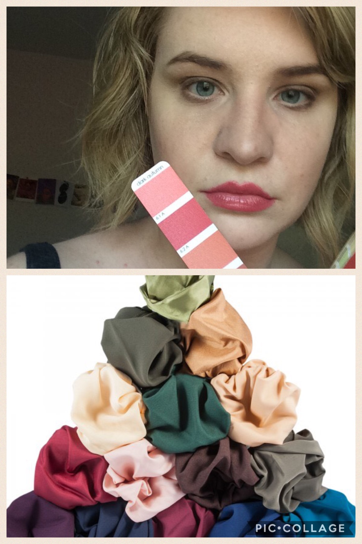
If you’ve been waiting for the palette comparison–I have the photos ready, although getting them was challenging, since I’m so far north that I don’t have many daylight hours, but I’ve been sick, so I haven’t had a chance to sit down and work on the post. I decided to write this post first because some of the items are on sale, so it’s a little more time-sensitive.

Lately, I’ve had some interest in the Gamine Kibbe recommendations. I don’t know what we’re supposed to do with the recommendations for Gamine, Natural, and Classic–David Kibbe hasn’t given an answer to this, and I’m not sure if we’re supposed to be able to work them into our Soft or Dramatic/Flamboyant Image ID recs or ignore them altogether. Regardless, I actually see a lot of things in the Gamine recommendations that work for me, like the tailored dresses and geometric shapes. There are also Gamine celebrities I feel a connection to that David hasn’t moved to SG or FG yet, like Paulette Goddard and especially Jean Seberg. The comparisons to her I’ve gotten were one of keys to figuring out that I’m FG.

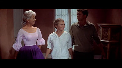
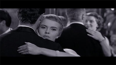
Last night I decided to watch a movie, and I checked out Otto Preminger, since I loved Laura so much. Once I saw he had directed Bonjour Tristesse, that was it for me. (For some reason, I had always thought it was a Godard film.) I started watching it immediately, and when I saw this title card I almost had to pause the film out of excitement:

title_card

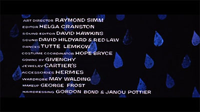
Givenchy in the credits: Always a good omen for gamine fashion.

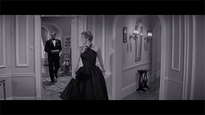
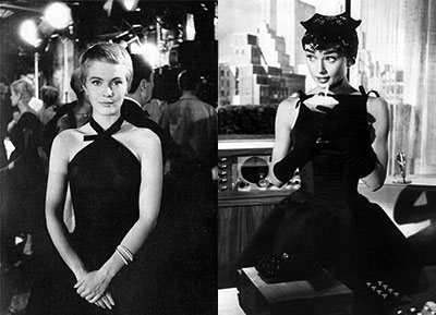
Indeed, the little black dress in this movie may be one I fantasize about having in my wardrobe even more than the one in Sabrina:

little_black_dress

jean_audrey

But the real star of the movie for me–and the reason behind this post–is Cécile’s (Jean Seberg) French Riviera summer wardrobe. I’ve always had a hard time when it comes to dressing for summer. I find dressing easier when I can make use of layers. I usually end up in an oversized Ramones tank top and some frayed denim shorts and call it a day. But seeing Cécile’s version of summer inspired me. It still looks so fresh and chic, despite being nearly 50 years old. I see this a lot with gamine styles, actually–they don’t really tend to look dated.

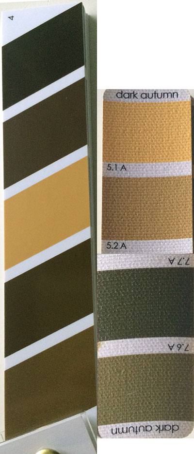
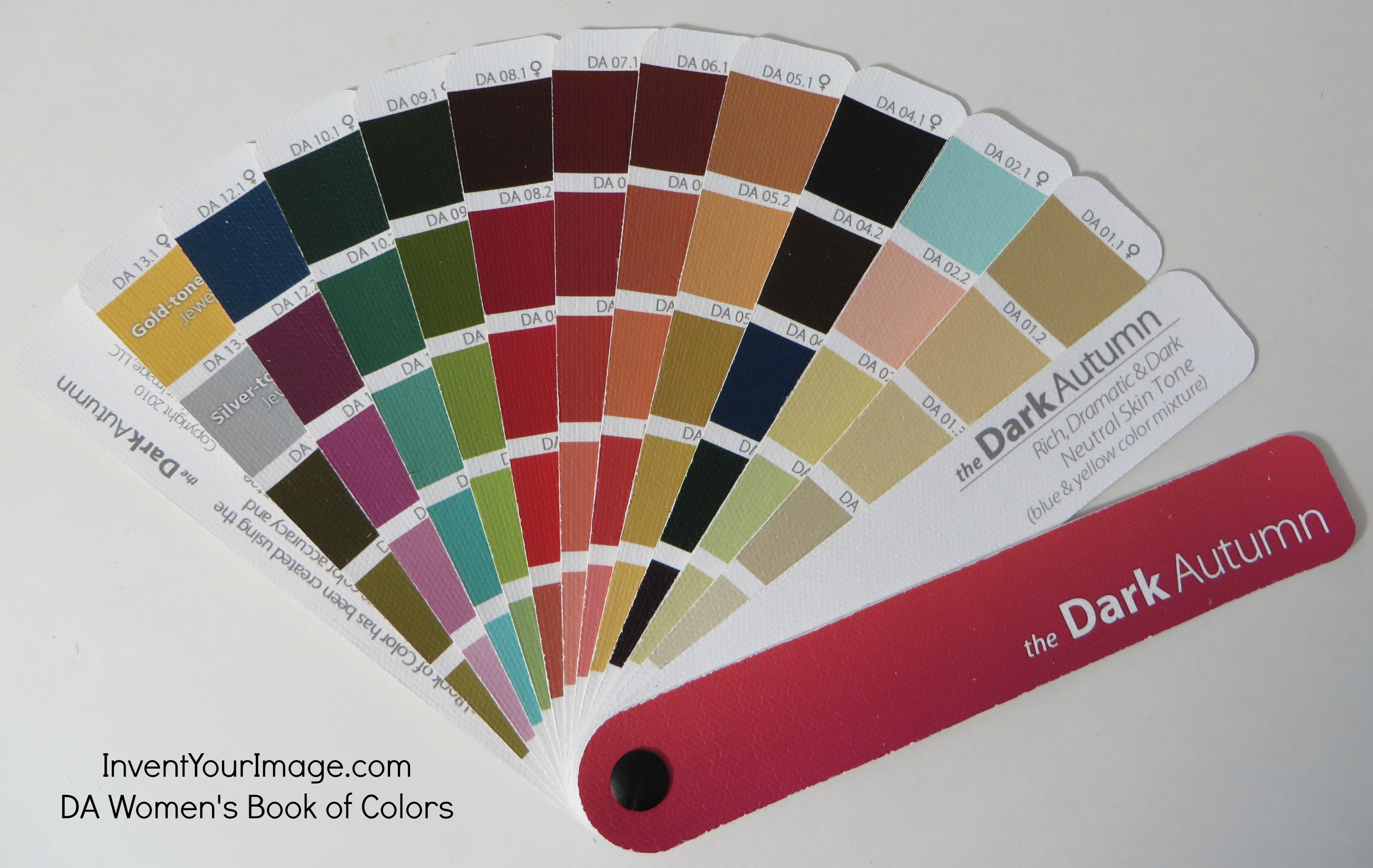
Her frequent use of men’s shirts in this movie is iconic–this hasn’t ever really been a look I’ve been into very much myself, but she makes me like it. I wonder what DA color would work best… The traditional light blue isn’t really for me.

mens_shirt

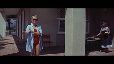
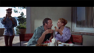
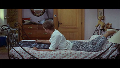
A hangover has never looked so chic:

hangover

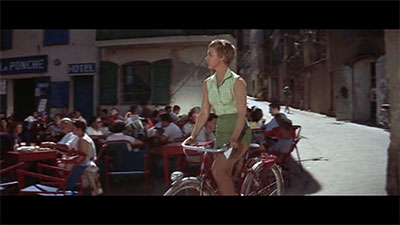
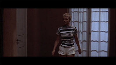
And yes, a sleeveless blouse and high-waisted shorts are definitely going on my list:

gingham_bike

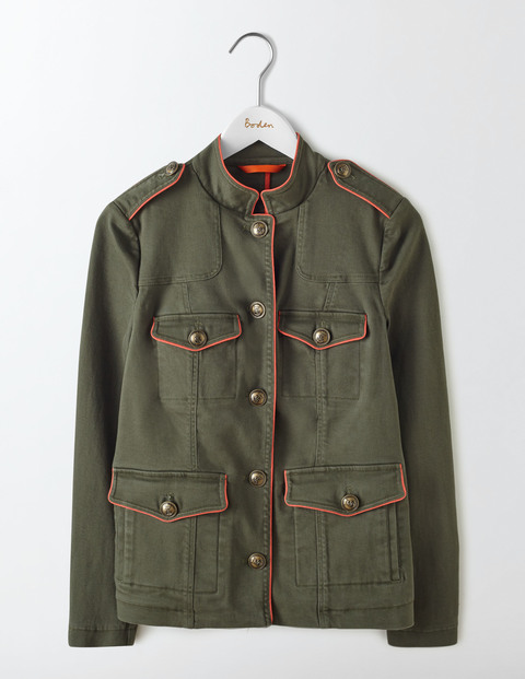
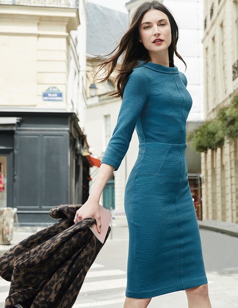
I love this kind of collar, but it’s hard to find nowadays:

rolled_neck

rolled_neck_3

The only thing I’ve seen it on recently is this dress from Boden, but it definitely doesn’t fit into the “summer casual” theme.

BodenMarisa Dress

Marisa Dress, Boden, $103.60-$118.40

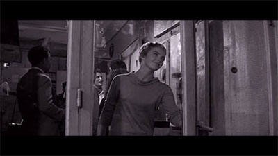
Another fun outfit is this one, with a white button-down blouse that is kind of a modified sailor shirt, with a regular front but the rectangular collar in the back, so from the front it looks kind of like a hooded shirt:

white_shirt

It’s paired with patterned cropped pants, which I’m also going to hunt for:
patterned_pants

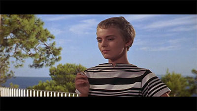
But my absolute favorite outfit is her striped-shirt-and-white-shorts outfit:
stripes_outfit

The neckline of the t-shirt makes it just a little more interesting than your basic shorts-and-a-t-shirt combo:

stripes_closeup

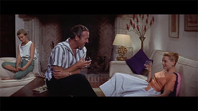
Accessories-wise, in the summer, she doesn’t go much beyond sunglasses and sandals or white flats, but she pairs the stunning Givenchy black dress with some slightly oversized studs and a pearl bangle:

earrings

I think the simpler approach to accessories is so fresh for summer.

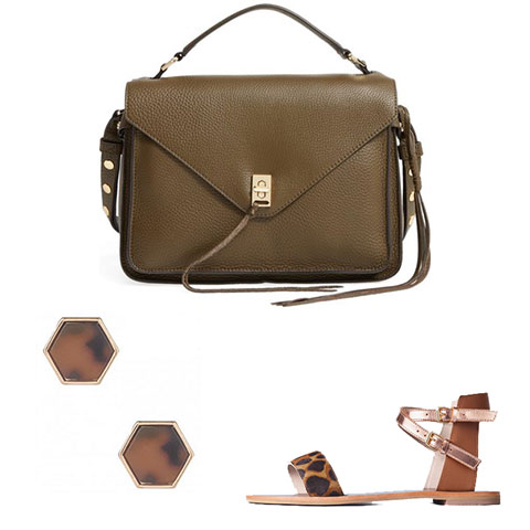
While we’re still in the midst of winter, since there have been so many sales going on, I’ve already picked up a few things, mainly accessories.

bag/earrings/shoes

1) Rebecca Minkoff Small Darren Leather Messenger Bag, Nordstrom, $172.49; 2)Type 3 Leopard Lover Earrings, Dressing Your Truth, $8.78; 3) Ingrid Sandal, Boden, $43.20-$54.00.

1) Rebecca Minkoff Small Darren Leather Messenger Bag, Nordstrom, $172.49.
Olive is a great neutral for me, and gold hardware is a must. The small size keeps the bag from looking too Classic, and it’s also just right for my needs.

2) Type 3 Leopard Lover Earrings, Dressing Your Truth, $8.78.
Oversized studs are Cécile’s main accessory throughout the film. I love the geometric shape and nod to leopard print in this pair.

3) Ingrid Sandal, Boden, $43.20-$54.00.
Obviously, some simple sandals are essential for any easy summer look. These have the added bonuses of leopard print and rose gold.

Other things on my list:

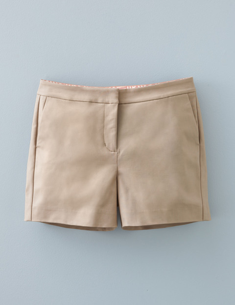
1. Simple linen shorts.
I’m not going to go as short as Cécile does in the movie. I like these because they don’t have any visible buttons or cuffs. Very clean.

Boden Shorts

Richmond Shorts, Boden, $27.40-$41.10

2. High-waisted shorts.

3. Men’s or Men’s-style shirt.
Still on the lookout for the perfect color.

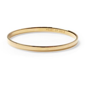
4. A simple gold bangle.
I think a bangle would really complete things. Something super simple, like this Kate Spade bangle:

Kate Spade  Bangle

Heart of Gold Bangle, Kate Spade, $32.00

5. Simple necklace.
I have a necklace at my mother’s house that was hers in the 60s that would suit this perfectly.

6. Sleeveless blouse.

7. Patterned cropped pants.

8. Plain cropped pants.

9. T-shirt out of thick material with a high neckline.

10. Lightweight but stiff long-sleeved shirt.

Have any movies inspired you, fashion-wise? What are you dreaming about wearing in the summer?

Prism X11 Dark Autumn Palette Review, Part 1

I recently purchased the Prism X11 Dark Autumn palette. This is a new alternative to the True Colour International/Invent Your Image/Indigo Tones palettes already on the market for people who have been draped in or have DIYed a Sci\ART color space. While the other brands’ palettes all look relatively similar–the TCI and IYI ones especially–these look radically different.

The other fans more or less match up with the original Sci\ART fans created by Kathryn Kalisz.
sciartda

There might be a few colors added here or there, but even the order is pretty much the same. The new Prism X11 fans were not created from these palettes, although Nikki Bogardus, the creator, does have original Sci\ART drapes at her disposal and was trained by Kalisz. Instead, they were created in collaboration with a Munsell color scientist, using a Spectrophotometer to determine the exact level of hue, value, and chroma in a given color. Each palette contains 70 “core” colors for your season. I will be doing a color-by-color comparison of the TCI Dark Autumn palette and the Prism X11 palette in another post. Outside of their similarity to Kalisz’s palettes, I am not sure how the exact colors for the other palettes were determined.

palette closed

For this post, I’d like to focus on the PrismX11 palette itself, and how it differs overall from the other palette I have. First, the packaging. It comes in a plastic case that is open on one side. I like this because I’m always misplacing the plastic sleeve my TCI palette came in. I take it out of the sleeve, set the sleeve down somewhere, and then start swatching, completely forgetting where I put the sleeve. The PrismX11 is held together with a fastener that unscrews, enabling you to add more color swatches as they become available, which is an interesting concept. I don’t think these extra colors are available yet, but the expandability is a nice bonus feature. It comes secured with a rubber band–the case is hard and there is extra space for the additional pages. Nikki sells some accessories for the palettes, like tassels in your colors and leather cases, but some kind of elastic band would also be maybe a nice thing to add as an option.

palette open

The palette itself is printed on thick glossy paper, rather than the canvas of the TCI palettes. The colors seem much more complex and rich than the canvas ones, but I’m not sure if it’s better for fabric swatching, due to the difference in material.

palette full

The palette also has more features than the TCI palettes. It even has an index. The extras include information on the season from Kathryn Kalisz (including some information on design lines!), which I really like having, plus the names of colors she mentioned for the season. It also has a visual representation of the season’s hue/value/chroma settings, which I’m assuming replicate the settings for the Spectrophotoometer.

palette contents

The palette definitely has a darker and more muted feel than the other palette I have. Partially it’s because the darker colors are at the top of the fan. Some Dark season people prefer this, because they find their darkest colors to be the most important. I like to have it the other way around. The light colors are the hardest to get right, and the worst when they’re wrong–for me, anyway. It also just makes the palette seem darker and heavier than it actually is. I’ll go more in depth on this in my next post, but while it looks a lot darker than the other palette, a lot of the colors are very similar–it just doesn’t have the lightest and brightest of the TCI DA fan’s colors, nor does it have an icy strip.

My overall thoughts, so far, are that I’m excited to have two options as far as Dark Autumn palettes go. I’m not sure if I would have picked this up if I didn’t want to review it and see if there were a decent option beyond the fan I already own, but now that I have it, I think it’s good to know that there is a scientific basis for these particular colors being on the palette. I will go more into the colors and how they compare to the other fan in my next post, but they are less overwhelmingly dark than it may seem from photographs or from your first impression, and I think a lot of DAs are going to find this a better option, especially if they struggle with certain aspects of the other DA palettes (i.e., the lighter and brighter colors are difficult for them to wear). I feel like our makeup options are represented better on this palette, too.

The fans can be ordered directly from the PrismX11 website and cost 54 USD. Shipping is $3.99 within the US. When I tried to order from the site, it said shipping to Europe was also $3.99, and since that didn’t make sense to me, I contacted Nikki, and she told me shipping was $13.50 and I placed my order with her personally via email. So if you’re in the US, it’s significantly cheaper than buying from TCI, whose fans are $60, but if you’re in Europe, it’s about the same.

Nikki also sells a book with the colors from all the palettes, which I think is a great tool for DIYers or for the merely color-obsessed.

Part 2 of my review, with color comparisons to the TCI palette, will be up Friday.

On My Color Experience

I got the PrismX11 palette in the mail yesterday, and I’m really excited to be able to share this palette with everyone. Before I do, though, I thought it was necessary to clarify some things about my experience with and approach to color, in case some people haven’t been reading from the beginning.

I’m going to be reviewing the Dark Autumn palette, and comparing it to the True Colour International version. I think it’s important for people to know that I have never been draped as anything. I came to Deep Autumn completely on my using, using the Color DIY process I have outlined.

So I don’t make any judgments in my review as to how this palette works for me as a Dark Autumn. People who practice Caygill have told me that they see me as something between Spring and Autumn. I have heard between “light spring and soft autumn.” This means, I think, that I am a lighter person, on the warm side, but too muted for Light Spring. Soft Autumn is too muted. I think I ended up in Dark Autumn as a need for an autumn that is brighter than SA.

I don’t know if this is what a color analyst would see if I sat in the draping chair and under the lights. I find that the Dark Autumn colors feel right on me, the makeup works on my face, and I think they are right for my energy.

I do find, generally, that dark colors are easier for me to wear than light ones. The wrong light color reacts horribly with my complexion. A dark color that is too cool makes me look a little gray but nothing too noticeable; the wrong light color makes me look hungover.

TCI (left) and PrismX11 (right)

TCI (left) and PrismX11 (right)

You can see that the very brightest DA colors (mainly the ones at the top of the TCI palette) are the ones that are missing from the new palette. These colors work well for me, as a lighter person, but I know that a lot of other DAs struggle to make these colors work and stick to the darker colors in the palette. If I were going by the color selection alone, as a lighter person, I’d probably go with TCI for myself, although I love the new purples and greens the PrismX11 has. I think most draped DAs, however, are darker than I am, and will find the absence of the colors I mentioned and overall increased dark impression of the PrismX11 palette to be a welcome change.

Breakout Roles: Alexis Bledel

Previously: Natalie Portman

This is occasional series I’ve started where I give my best guess on a celebrity’s Kibbe Image Identity–I look at their roles and image, versus an analysis of their physical features and body type. Last time, I decided that Natalie Portman is SG. This time, I’m going to reach a similar conclusion about an actress who is rather similar to her, with a similar debate about her type.

I’ve never seen Gilmore Girls until recently, when I decided to start binge watching it while laid up in bed with a upper respiratory tract infection. So far, I’m up to season four, and for me, the clues about Alexis’s type come less from what kind of character Rory Gilmore is and more about what other people on the show say about her.

One of the ways David Kibbe characterized gamines in general in our FG Facebook group is that “you can’t be sure if she is a waif under the bridge… Or a princess in waiting!” I think you’d be hard-pressed to find a modern example of an actress that fits this characterization better than Alexis.

paris waif
audrey1
audrey2
audrey3

It is, in fact, easy to put Alexis into Audrey’s roles. The princess out for a day of fun in Roman Holiday, the bookstore intellectual-turned-model in Funny Face… She’d be perfect. She has similar qualities of vulnerability, charm, and intelligence that make her appealing.

After thinking about it, it’s hard for me to understand why her Flamboyant Gamine Image ID isn’t more obvious to people, and I have no idea why she is put into Dramatic Classic and Soft Classic on Pinterest. She is a deer, which huge eyes and a surprisingly long body for her face (5’7″). I could easily seen her as a 1960s teen sensation like Twiggy.

Classics, to me, have a more solid presence on screen. In fact, I think that if Rory Gilmore had been played by a Classic, it would have been too much. Of course the Grace Kelly facsimile got in Harvard, Princeton, and Yale; had every boy fall in love with her at first sight; and had mega-millionaire grandparents! But that little added Gamine charm helps to make her more appealing on screen (not that Classics don’t have enormous appeal, but at some point, there is just too much perfection).

Final Verdict: Flamboyant Gamine

Home Decorating with Flamboyant Gamine, Type 3, and Dark Autumn

This post uses affiliate links. A click or a purchase may result in a commission, although nothing in this post is sponsored.

I recently wrote about adding Type 3 to my style mix. In addition to clothing style, however, I am also interested in interior design, and as I look to the next year, I’ve also started thinking about the new room I’ll have after my move. Now, I have no idea how things will work out financially, but I’ve decided that the time has come for me to break up with IKEA.

I would like my space to express my energy type and my individual style. I’ve decided that the things I’ll be looking for are:
-mid-century modernesque lines/modern/art deco (FG)
-rich, saturated color palette (DA, T3)
-texture (T3)
-fun (FG)

Things I’m trying to avoid are cool metals, black, and gray. My preferred metal is brass, but gold is okay too. Textiles are something I’m going to concern myself with later, but so far, this is what I have picked out for my room… provided I somehow end up with thousands of dollars to spend on furniture.

1. Mid-Century Wall Desk, $799, West Elm.
West Elm actually has an entire Mid-Century collection, and while it’s tempting and easy to just get the whole collection, I think taking a more eclectic approach looks more contemporary. But it means that there are shelves that pair perfectly with them, if you have the space (and the cash).
walldeskshelves

2. Dondra Bed, $899, CB2.
I like the textured look of the wood in this bed (very Type 3), as well as the clean lines. I want a bed with a solid headboard, but I don’t like the upholstered ones. I’m a little concerned how this wood would look with the rest of what I picked out, but it’s something I’d have to see in person.

Sanford Chair, $499, Pottery Barn.
This chair reminds me of the kind of a chair you’d find on a very fashionable 1930s film set. It was actually relatively hard to find a chair that was brass instead of silver. I’m not sure how comfortable this would be, and I may have to continue searching for an office chair, but I think this would be great as a chair to sit in and do my makeup at…

4. Memento Mirror Cabinet, $749, CB2.
I love this. As I said, I would use it as a dressing table, but it’s also something that is very flexible, and in the future, when I have an entire house or apartment to decorate, it would go great in an foyer, for example, or it could serve as a liquor cabinet (if you want a mirror above your liquor cabinet, that is…).

5. SAIC Sling Nightstand-Side Table, $249, CB2.
Yes, this has some black, but I think it makes for a very cool nightstand. The brass will pick up the other brass in the room, while also breaking up all the wood. It’s also just such a unique, creative design. There is a desk from the same line that is also unique and cool, but while I’m willing to compromise with a touch of black, so much metal that isn’t brass or gold isn’t happening.

6. Shop Blue Chest, $429, CB2.
This will also break up the wood and add some color. It’s a little small, but buying two and pushing them togehter would work, as you can see in this picture with the Dondra Bed:

shop-blue-chest2

Now, my hope is that this would also look purposefully eclectic, rather than just mismatched… but I guess I’d have to see everything in person to be sure. If not, well, back to the drawing board–not like it’s likely I’ll be getting any of this anytime soon, unless I win the lottery.

A lamp, however, is well within my reach.

These lamps from West Elm are especially cool because they have USB PORTS built into them. No struggling with a wall outlet behind the nightstand, or between the bed and the wall. Technology is amazing.

Anyway, these are my fantasy picks for when I start furnishing a room with “adult” furniture, keeping my various types in mind. How do you furnish your living space? Do you consider your style types?

Back to Dressing Your Truth

This post uses affiliate links.

Dressing Your Truth was one of the first systems I discovered, which I’m sure is true for many of you as well. I quickly moved onto Kibbe and then onto systems like Zyla, but while I never dressed in a Type, I always maintained an interest in the system, at least the psychological aspects of it.

Recently, though, I’ve signed up for the Lifestyle service, since I have always liked watching Carol Tuttle’s videos, even if I never really seriously tried to dress my Truth. I think that the style quotient has been upped since I first discovered it, and I’m started to see how Type 3 (I believe I’m 3/4) can be integrated with Flamboyant Gamine and Dark Autumn.

One thing I noticed when I was trying other seasons is that I could physically feel like they were wrong. Bright Spring, for instance, made me feel tired. I couldn’t keep up with that level of chroma. I can see and feel why Type 3 makes sense for me. Swiftness, angularity, rich colors–all things I need.

Another aspect of Dressing Your Truth that intrigues me is the idea that dressing in the correct way for you supports you and improves other areas of your life. This is present to an extent in other systems, such as Kibbe, and I’m actually working on a separate post about this right now. But I’ve recognized that I’ve spent a lot of my life leaning too much on my Type 4 secondary, which has led to me being seen in a negative way at times. Or perhaps it’s that when I wear black and gray, which is still my default, although I’m trying to wean myself off them, my natural Type 3 “push” comes off as rude or unexpected. So I’m excited to try and work on making sure my Type 3 dominates, and making sure that what I put on my body supports that.

Also, despite having a blog about it, I haven’t been the best at always dressing head to toe, or even correctly for my colors and type. Dressing Your Truth puts a lot of emphasis on doing this in a way that is accessible. Doing my hair and makeup and wearing jewelry every day is something that can make a real difference, and I don’t currently do that. I’m not planning on getting a new wardrobe overnight, even though I know Dressing Your Truth suggests committing to dressing in your type completely for a month. What I am going to do is not buy silver jewelry or the aforementioned black and gray, and focus on doing my hair and makeup and wearing jewelry every day.

One thing I will be careful of, however, is not to go too far into Flamboyant Natural territory. This is something I learned last year when I was experimenting with Gamine Autumn and Mellow Autumn. Things that look too handmade or like something you’d find on an archaelogical dig aren’t for me. This embossed leather cuff, with the paisley design and raw edges, isn’t for me. Instead, for a cuff I’d choose something like these:

These have a cleaner and more modern feel, while still being textured, edgy, and substantial. Then if I wanted to layer, I could add something like this bangle from the DYT store.

Since delving into the Lifestyle content, I’ve realized that Dressing Your Truth really is about you, and just because these styles that look more FN look right at home on some of the Type 3 experts doesn’t mean that all Type 3s will dress that way, or that it will feel right on them. I can have my own Type 3 style, and use Type 3 and FG in combination to support each other to have a style that is all my own.

Stylesyntax.com is a participant in the Amazon Services LLC Associates Program, an affiliate advertising program designed to provide a means for sites to earn advertising fees by advertising and linking to Amazon.com.

Instinct vs. Desire

As someone who has never had a professional analysis of any kind, I’ve relied entirely on my own experience and instincts. Naturally, I have doubts. What these doubts boil down to is this: Am I seeing what is there, or am I seeing what I want to see?

Carol Tuttle often mentions our “beauty sixth sense.” Sometimes I question whether I’m actually listening to that, or just going with what I like. For instance, I’ve always been attracted to what is shown as the stereotypical Flamboyant Gamine look. In high school, there were periods where I dressed mod. Audrey Hepburn and Edie Sedgwick were my fashion idols.

FG feels good; often, when I have doubts about something, I go into the FG section of the book and realize that what was giving me doubts is actually an FG “no”–wide, unconstructed dresses, for example. But I have small hands and feet, and my length is in my torso. So sometimes I question whether I’m actually an SG or an SN. When I tried SN, though, not only did I feel lumpy, but I felt tired without the structure of FG supporting me. So while I’m not sure whether it’s what David would give me, FG is how I feel my best.

Color is a bit trickier. I put myself in the Dark Autumn palette, which seems counter-intuitive on paper. But out of the 12 seasons of Sci\ART, it’s the one that seems to work the best. Spring is too bright; the Softs seem too muted. A brighter Autumn seems to be what works. But sometimes I wonder, is this really harmonizing with me? Am I fooling myself and these lipsticks are too dark and I’d look better in Soft Autumn or Soft Summer?

Today I ordered one of the new Prism X11 palettes. These palettes are created using a Spectrophotometer to measure the colors’ levels of hue. value, and chroma.

click to enlarge

click to enlarge

As you can see, compared to the Invent Your Image palette, this new palette seems a little darker and maybe even a bit cooler. (I am VERY excited to get my hands on those purples, though!) I will see how it works for me. I will do a full review and compare it to the palette I already own.

But still, seeing the depth of this palette really makes me question whether the DA color space is where I belong. In the end, though, I think what actually matters is how I feel in these colors and whether I look healthy and awake in them. I just have to be careful and make sure it’s not just because I happen to like these colors.

1 9 10 11 12 13 26