What I Got at the Nordstrom Anniversary Sale

This post contains affiliate links.

Yesterday I went to the first day of early access for the Nordstrom Anniversary Sale, and as you can imagine, it was a madhouse. I picked up three things, but I only got one of them while I was physically in the store.

After wandering through the little walled-off sections of clothes, I went to the accessories section, where I found these sunglasses. I needed sunglasses that I could wear when I had my contacts in, since my sunglasses have prescription lenses, and these looked good on me.

They are my answer to Audrey’s sunglasses in Breakfast at Tiffany’s.

maxresdefault

There was a dress that I had seen in the presale catalog that I had really wanted, but the catalog had mentioned a “Rust” colorway and the store only had Blue/Gray, plus they didn’t have my size. I was sad, but I knew I could get it on the site. But the site was so overloaded that they gave everyone 10X THE NORDSTROM POINTS if they made a purchase yesterday, so it basically took me all day, and Rust was nowhere to be found, even online. I guess that the production of Rust didn’t work out, but I liked the dress enough to buy it, even if it’s not exactly in my season. Rust may appear in the future, but $50 was too big of a discount to pass up.

Betsey Johnson Asymmetrical Dress, $104.90, $158 after sale

Betsey Johnson Asymmetrical Dress, $104.90, $158 after sale

I was a little concerned when I saw it in person because I wasn’t expecting it to be a knit and they are generally not my friends, but this one has enough construction and a thick enough material that it smooths over lumps and bumps anyway. I think it really fits the Cat recommendations and the puffed shoulder detail brings in that Angel quality.

The last thing I picked up I just ordered a little while ago, after deciding to browse the coats on the website on a whim. I didn’t really like any of the coats my store had in stock, but I saw that the one I liked the most actually came in a color that suited me. My store only had light gray, but the site also had a dark bluish green.

coat

Halogen Asymmetrical Zip Boiled Wool Blend Coat in Green Ponderosa, $129.90, after sale $199

This probably falls into my usual fashion habit of going too yang, but I really needed a wool coat because I donated all of my winter coats when I moved. I had black jacket in a similar style from Zara that I loved and wore for many years, so this seemed to be like a replacement for that. I think I will also buy a coat in a higher level of dress from Boden when all of their winter clothes come out and they send me an email with a discount code. But for now, this will be good for casual cooler fall/warmer winter days.

Have you gotten anything at the Nordstrom sale yet? Has anything caught your eye?

Like Style Syntax on Facebook!

Summer Makeup: RMS Lip2Cheek and NARS Tinted Moisturizer

This post contains affiliate links.

At this point, my collection of Dark Autumn makeup is fairly extensive. I can go into Sephora and leave emptyhanded, because I don’t feel like there’s anything I really need, save two products that had remained elusive for me–until now.

Back before I had discovered color analysis, and even into my color analysis explorations, when I thought I was a Light Spring, one of my favorite products was Benefit Posietint, a liquid lip and cheek stain in a light, clear, and warm pink. It was something I could just throw on when I wasn’t doing a full makeup look to add some color into my face without doing much work.

While makeup as a whole seems to have been tilted in the Autumn direction for a while now, this kind of product is still mainly found in Spring colors. I had no hope of finding anything to replace my beloved Posietint until I came across this post on one of my favorite makeup blogs, Killer Colours. A lip/cheek stain in a burnt plummy rose? Exactly what I’d been searching for.

RMS Beauty Lip2Cheek in Illusive is blendable and buildable, and comfortable to wear–unlike Posietint, it actually feels like a balm on the lips. This is the kind of color I like for daytime wear in summer–burnt rose/orange/red but sheer–and when winter comes, I’ll probably pick this up in Diabolique, which is Burgundy and ehading towards Dark Winter. (I think Soft Autumns might like Illusive as well.)

I still had to find the other product I had been searching for, however. I’m very pale, and there aren’t many foundation ranges that make a shade light enough for me, and this goes double for tinted moisturizers, where the sheer nature of the formulas allows brands to feel like they can release a very limited range of shade. I’ve had store employers swear up and down that a shade is very light and have it look okay in stores, only to come home and discover in normal lighting that I looked like I had applied self-tanner.inally,

So I went to Ulta and swatched every light shade of tinted moisturizer I had. Tarte, Urban Decay, Philosphy… No dice. Finally, I went to the teeny-tiny NARS display, hoping they’d decided to include the tinted moisturizer. NARS is one of the only brands that makes a good foundation for people who are very pale, yet more yellow than pink, so I was hopeful that their tinted moisturizer range would include a good shade for me. Funnily enough (probably just to me), I was too light for even Finland, which caused the self-tanner effect, but Terre Neuve was perfect, and my search was over.

rms_nars

I am very happy to have found products in these genres that actually work for my season and skin tone. And as much as I roll my eyes at the term, these products paired together create a great “no-makeup makeup” look.

What are your favorite summer makeup products? What makeup products have thus far eluded you in your season?

Fantastical Beauty Animal Familiar: Cat

I know it’s been a long time since my last blog post. I was in the middle of a major move, and my mind was occupied with other things. But now I’m all settled in, and I hope to return to blogging regularly, as well as going through my archived posts and reworking some things so that there isn’t any misinformation about Kibbe’s system or anything else.

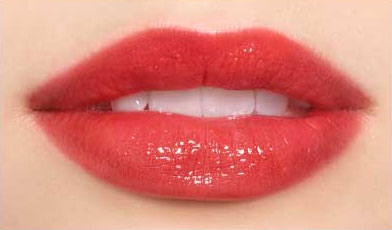
Today I’d like to talk about something I commissioned a couple of weeks ago: The Cat Animal Familiar in Fantastical Beauty. If you’re new to this system, I’d suggest going to Kati’s site and signing up for her mailing list so that you can receive the PDF that lays out the different elements of her system. In Fantastical Beauty, your Animal Familiar is the element that covers the particulars of your lines and facial features. It doesn’t have anything to do with vibe or personality.

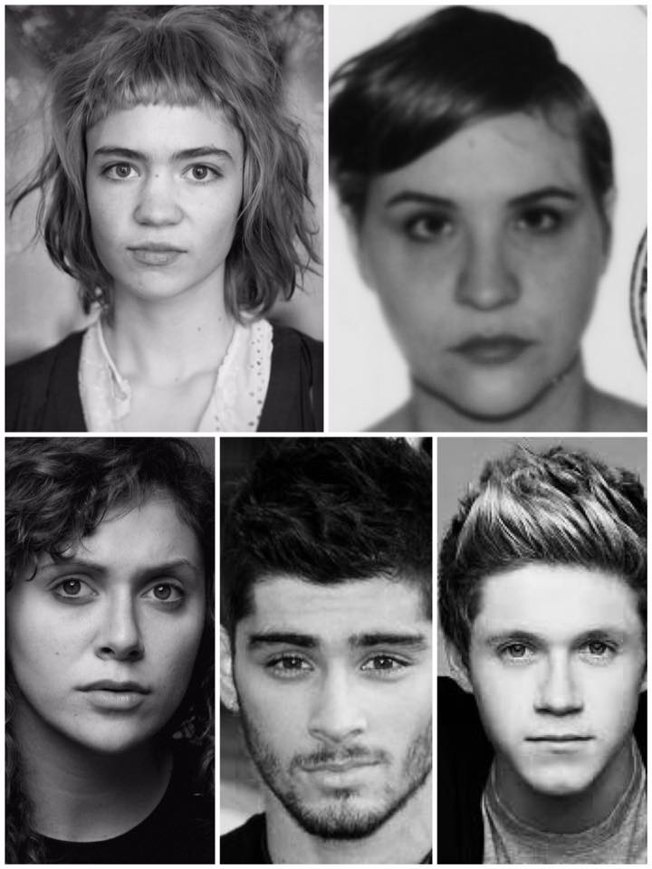
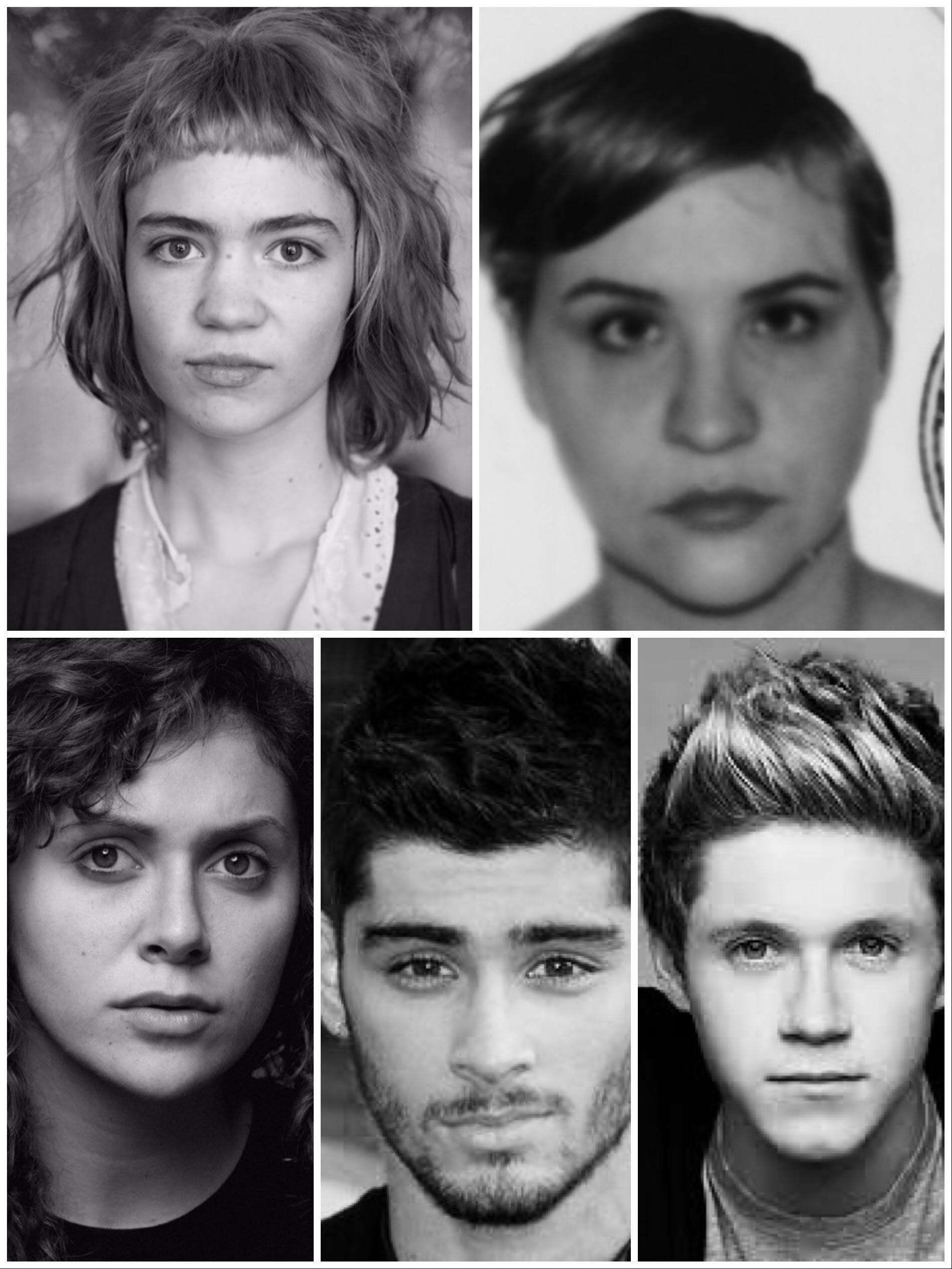
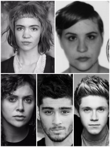
The best way to figure out your AF, in my opinion, is simply to go through the list and rule out the ones that could not possibly apply to you. Unlike in, say, Kibbe, there’s no wiggle room for things like height. “Looking tall” doesn’t matter; only people who are literally tall will end up in a Tall Animal Familiar. So, for instance, in my process, I knew I wasn’t going to be “Tall” at 5’4″, so I eliminated Hawk, Snake, Panther, Wolf, and Lion immediately. Looking at what was left, it was pretty easy to come up with Cat: medium-short, medium-small, full and sharp mix of features. A collage with the Cat celebrities seemed to prove me right:

cat_collage

Unlike the Fantastical Beauty 9 types, however, since AF is really the literal lines and shapes that suit you, I couldn’t do much with this information. There wasn’t even a Pinterest board. So I decided to commission a guide, along with two other women who split the cost with me. What I wanted to see was how well I fit into the type, and whether it would deviate or replicate the line information I had from Flamboyant Gamine.

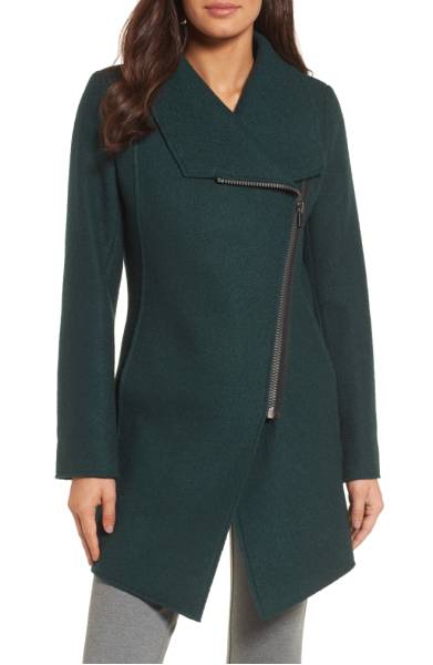
You can see the Pinboard that accompanied the guide here, but basically Cat is very similar to Flamboyant Gamine, but the physical description resonates with me more. In the back of my mind, while I couldn’t really see any other Image ID actually working, I had been questioning Flamboyant Gamine, because I have small hands and feet and my length is in my torso, not my legs, my shoulders are tapered, etc. My body lines are too yang for SG, and so is my face, but I wasn’t sure if I was quite yang enough for FG. And SN was always on my mind, since the text of the book description seemed to fit.

I’ve had some realizations in the past few weeks, though. Being inspired to try a more Gamine style has really altered my whole image, and I realized that a lot in the Gamine description fit. I felt secure that wherever I ended up exactly, the Gamine group contained the only Image ID themes that would work for me. This was only compounded by a comment David Kibbe made when I posted a picture of my haircut in the FG group on Facebook, wherein he mentioned Mia Farrow to me:
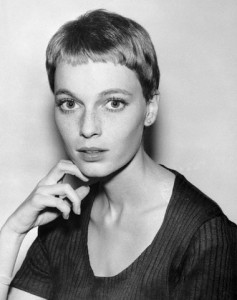
Mia Farrow
(Source)

Mia is a Kibbe Gamine in the book, and she’s one of the ones he hasn’t yet moved to either SG or FG. I think I could see an argument either way, but looking at a bunch of pictures of her, I think I’d go FG. Anyway, I don’t think he would have brought her up to me if the Gamines weren’t the right Image Identity family for me, so I’m really focusing on making sure that I don’t go too yang, as I am wont to do, as my friend’s very astute husband pointed out, and respecting my own place on the yin/yang scale, where my juxtaposed yin and yang are almost equal, with yang coming out on top just slightly, and being able to pull from a wide spectrum of Gamine ideas. The Cat physical description seems to hit right at that spot, too, so it’s good “custom” guide for me.

Have you checked out Animal Familiars? Have you found a perfect spot for yourself?

Fantastical Beauty: Style Personality Exercises #1 and #2

This post uses affiliate links.

Kati has started posting videos on Fantastical Beauty and other style-related topics to her YouTube channel. Two of the videos she’s posted so far are Style Personality exercises:

Since I’ve been deeply involved in my style personality crisis, despite having my own workbook to help me, I decided to do these to help jog my thought process. (I’ve also started a new pinboard, but that’s private for now.) The first exercise is a series a questions about your preferences to help you see patterns. I’m copying my answers here.

1. Favorite movie
Sunset Boulevard,
Sabrina, and Bonjour Tristesse

2. Favorite Book
Harriet the Spy/The Long Secret

3. Favorite Song
Confetti by Cold Cave

4. Favorite Animal
Cats and dogs

5. Favorite Style Icon
Audrey Hepburn, Jean Seberg, Edie Sedgwick

6. Favorite Cake
Funfetti with vanilla icing

7. Three Words That Describe Your Personality
Smart, creative, bossy

8. Three to Five Words That Describe What You Want to Communicate
Edgy, fun, youthful, smart, stylish

Then you are supposed to go back and add some adjectives for each of your answers and look for patterns. What I found is that I had a heavy 50s and 60s influence, with a playful tomboy/gamine slant, but also just a little bit of edge and darkness, which goes along with what I’ve been thinking. In recent years, I’ve really concentrated on this edgy and dark side, and ignored my love for vintage Gamine style. In high school, my style was heavily influenced by this and I wore a lot of nods to the 60s, especially.

The next exercise is to create a Polyvore set of statement pieces: a coat, a pair of shoes, a pair of pants, a statement necklace, and a blouse. When I was thinking about it, I realized that I don’t really like statement necklaces that much, so I chose a cuff, and then the kind of blouse I like is hard to find, so I chose a coat that I could wear indoors as part of an outfit instead.

statement

I don’t know how successful this Polyvore is at conveying this style idea, but it’s a process.

Have you attempted these personality style exercises?

Stylesyntax.com is a participant in the Amazon Services LLC Associates Program, an affiliate advertising program designed to provide a means for sites to earn advertising fees by advertising and linking to Amazon.com.

Fantastical Beauty: Iris Subtype

Watching Bonjour Tristesse led to a shift in how I see my style that I haven’t really fully reconciled yet. In conversations with other people, I’ve realized that I’ve been going too hard in the yang direction, and ignoring my yin. I’m not a Dramatic. I need both, in almost equal amounts, and it’s important to keep that in mind.

I connect with the Jungian archetype of Creator, so I downloaded the Mermaid guide. Some of it appealed to me, but “fun and frothy yet elusive” didn’t really seem to get to the core of who I am. The FB 9, I think, are supposed to really address something deep inside you. Nymph did to a point, with the emphasis on acquiring and dissemninating knowledge, and for a while, I thought Woodland Puck was it. It was a punky version of Nymph. But I still struggled because it seems like that’s what I was doing all along, but there were still pieces that weren’t being addressed. When I started considering Mermaid, I figured that maybe Sea Puck would be it. I concentrated on thinking about Kibbe and DYT, and let Fantastical Beauty go for a while.

A couple of days ago, Kati put up a video, and I hope it becomes a series. In the video, she makes a cocktail and then discusses Angel and its subtypes. (If you’re just interested in the Angel stuff, skip to around 8:30):

I realized that for me, words are the center of what guides me. Writing, translating, communication. Iris, a bolder, more aggressive Angel, with an emphasis on carrying messages, is something that connects to me on a deep level. (Skip to 12:00 in the video for Kati’s description of Iris.)

Iris
(Source)

I’ve even been cast as Iris in a play before, in a rainbow minidress sprayed with glitter.

I see Iris as something that helps to iron out the things I’ve been struggling with, style identity-wise, over the past few months. It’s a reminder to me to address the dark and light, the yin and yang, and to not go too far in either direction, while also remaining myself.

Dark Season Lip Gloss: Chanel Coco Rouge Moisturizing Glossimer and Top Coat

This post uses affiliate links.

Even as a lighter Dark Autumn, lip gloss isn’t a product I’ve had much luck finding. Most of the ones on the market don’t have enough pigment for me to wear on their own, and just simply putting a clear gloss on top generally leads to the color underneath pulling too pink or just losing its necessary depth. A lot of dark seasons favor mattes, but I like my lip products to feel like a balm and I don’t think that matte is the most flattering finish for my particular lip shape.

I don’t like to admit it, but I think we’ve all bought a makeup or skincare product after seeing one of those YouTube “guru” put it in their favorites or use it in a tutorial. When I saw the new Coco Rouge Moisturizing Glossimer, it seemed like an answer to my Dark Autumn prayers. An opaque lip gloss that feels like a balm?! Where have you been all my life?!

Chanel describes their new gloss formula as “a non-sticky, ultra-light formula leaves lips visibly smooth and plump, and perfectly brilliant. An innovative, dual-sided applicator ensures optimal, even coverage and high precision. In 24 shades to collect, layer and love. Enriched with Coconut Oil, Peptides and Vitamin E, along with an exclusive Hydraboost Complex, to offer hours of comfort and moisture.” It really does feel like a balm and it looks great, and comes in a wide range of colors with several different finishes (sheer, opaque, semi-opaque). You can see a breakdown of all the shades here, although I have to say that the shade I have (Opulence) looks more like it does on the swatch on the Chanel website than it does the one on the blog post.

Opulence swatch

I went with Opulence because, while there are colors that seem darker (Decadent, blackberry, and Epique, oxblood), Opulence (described as cranberry) is warmer. I might get Epique at a later date, but to start, I wanted a color that would make a good everyday color for me.

I did end up getting two, because it was just one of those weeks where you stand in front of the Chanel counter and say, “Screw it. This is a two lip gloss kind of week.” I ended up getting Caviar, which is a limited-edition transforming topcoat. This is something that is really handy for both Dark Autumns and Dark Winters. It’s a sheer black lip gloss meant to deepen the color of whatever lipstick you’re wearing underneath, which solves the problem of lip glosses making lipsticks lose their depth. (They also have an orange one for warmth and a gold for brightness, for True warms and Brights).

lip glosses

I swatched them, and then used Caviar on top of MAC’s All Out Gorgeous.

swatches

L to R: Opulence, Caviar, Caviar on top of All Out Gorgeous, All Out Gorgeous

So if you’re a Dark Autumn or a Dark Winter and you struggle to find lip glosses that retain their depth, I suggest checking these out, and if you can only get one, pick up Caviar while it’s still available so you can use it with all your other lipsticks. There are colors for other seasons too, of course, but I’ve never found glosses that work so well for Dark Autumn before.

Animal Familiars

Kati has revamped her Fantastical Beauty system, replacing Base 5 (a yin/yang-based system with clear parallels to Kibbe Image IDs) with Animal Familiars, which plays the same role in her system as Base 5 did–accounting for things like height, scale, and line. I’m glad to see that Kati has moved away from something where you can make a one-to-one association with a Kibbe Image ID (i.e., Gamine Linear=Flamboyant Gamine), and has come up with something original that adds to your knowledge of yourself and the lines of your body and face.

The Animal Familiars are fairly straightforward, ranging from the tall and angular Hawk to the short and round Rabbit. Although there is some personalization possible, height isn’t really flexible, so you can immediately dismiss the ones that are out of your height range–I consider myself at 5’4″ to be on the shorter side of medium, so looking at the list, I decided I’d likely be found in either Cat, Ocelot, or Koala:

Cat
Medium-Short, medium-small build, full and sharp mix of features. Large eyes, full mouth, sloping nose, and always up to something.
Alyson Stoner, Claire Boucher, Zayn Malik, Niall Horan.

Ocelot
Short-Medium, narrow build, mixed features with accent touches of sharp/angular. Sleek and sharp in a smaller package.
Kristen Stewart, Ellen Page, Natalie Portman, Daniel Radcliffe.

Koala
Short-Medium, wide/full build, blunt features. Wide spaced features, straighter figure, mix of blunt/full features.
Melissa McCarthy, Lena Dunham, Mila Kunis, Johnny Galecki.

Looking at the rest of the characteristics, I don’t see myself as particularly narrow or wide/full. I feel like you get a different feeling from my face than either the sharp/angular/mix in Ocelot or the blunt/full in Koala. The full and sharp facial features and the build that is on the smaller side without being noticeably narrow seemed to describe me very well, so Cat was the obvious choice.

On Facebook, lots of us have been making collages. Collages are fun and so is discussing, but I really suggest narrowing the list down to which height description is realisitic for you, and then looking at the build and face descriptions. Still, though, when I made a collage, Cat seems like a good fit for me:

cat collag

Not that many materials are available yet–I can’t really do anything with the information that I am a Cat–but there is a Snake Guide, and a few Pinterest boards. Hopefully more guides and boards will be coming soon, though!

I’ve also been looking at the nine Fantastical Beauty types again, and have gotten the Mermaid guide, but that is a blog post for another day…

Have you looked at the Animal Familiars yet? Have you found yourself?

Style Transitions

This post contains affiliate links.

As I’ve been working on the mini “create your own archetype” workbook, I’ve been struggling a bit because I’ve realized I’m in a bit of a transitional phase with my own style. Ever since I saw Bonjour Tristesse, I’ve found myself drawn to more traditional Gamine looks. I’ve been looking at places I’ve eschewed for years, like JCrew. Since it’s an archetype workbook, it’s led me to wonder whether the Archetype I’ve been working with since I wrote the original workbook almost two years ago, “Grown-up Punk,” is going to continue to work for me.

I think we all go through these periods of transition with our style. Things that once felt authentic now feel off as we move through different stages in our lives. Perhaps this is what is happening to me right now.

Basically, I know that Flamboyant Gamine is where I want to stay, and I want to do it better. But I’m torn between combining that with Type 3 and trying to support my energy type, and taking it in a more vintage-inspired/classic direction. A leopard-print leather cuff isn’t necessarily going to go very well with cute Bonjour Tristesse-inspired outfits.

I don’t know which feels better to me right now. Type 3 is probably closer to the direction I’ve been moving in since I started this color and style journey–“grown-up punk,” edgy, supportive of who I am. But I also find myself drawn to this other side of FG, one that is less reliant on these aspects and is more of a timeless style. A friend’s husband, who is very perceptive about all things Kibbe, said I need to respect my yin more. I think this is true. I tend to forget that FG is almost half yin. I have probably gone too far in the “punk” direction at times. I don’t know if this is what is really expressing who I am anymore. I’m no longer in my twenties; I’m on the precipice of some major life changes.

There are two solutions I see. One is to utilize head-to-toe, and to just have separate outfits entirely. This way, I can experiment and see which feels authentic. Some days I can wear a lot of leather jewelry and leopard print and substance, and in others I can wear things that are more tailored and a little lighter in feel (always keeping FG in mind, though!). The other solution is to try to find a way to combine them in a way that doesn’t look disjointed.

One way to do this is to find pieces like these shoes, which do a good job of pulling these two style ideas together:

Campbell Fringed Heels

Campbell Fringed Heels, Boden, $200-$230

(Yes, I did buy these. They were expensive, but sometimes you see something and it sticks in your mind and you end up on the Boden website at 4am…)

Perhaps this is the key for me–a personal style that brings together the classic vintage gamine that inspires me while also retaining the elements that I need to feel true to myself. Will “Grown-up Punk” still be the archetype I’ll use to guide my fashion choices? I’m not sure yet, but luckily I’m in the middle of writing a new workbook that will help me explore this question in a deeper way… Regardless, now that I’ve sort of found my spot in systems (Zyla notwithstanding; I think I’ll have to see the man in person for that), apart from historical and theoretrical posts, my blog will move from working on finding my Syntax to working on refining my style.

Have you gotten to a similar transitional stage in your own style journey?

Everything’s Gone Green

This post uses affiliate links.

Since I’ve gone back to Dressing Your Truth, I’ve made a conscious effort to stop buying black and gray, even though the Dark Autumn palette has these colors. Instead of purchasing a wide variety of Dark Autumn/Type Three colors, though, I seem to just be buying everything in green/olive.

Olive, in my case, is the new black. Most of the stuff I’ve bought since I made that decision has been some kind of green/olive. Even just looking at the things I’ve mentioned in recent blog posts, you can see the pattern:

I recognized this pattern, and swore to myself that I would absolutely stop buying things in green or olive until I had rounded out my wardrobe with other colors. Then a few weeks ago, Boden emailed me, and I ended up buying this (in my defense, I had a coupon code):

Florence Jacket, Boden, $130.

Florence Jacket, Boden, $130.

Sometimes you just see an item and you can immediately picture all the ways you can use it in your wardrobe. That’s what happened to me with this jacket. It seemed like the kind of thing that could replace both a leather jacket and a denim jacket, something that can be worn for three seasons out of the year. The red piping just adds that little extra touch of design that makes it unique.

So, okay. I swear that was my last purchase of something green or olive for at least the next few months. Now, when I need something in a neutral–or something edging toward a neutral–I want to look for my browns, my dark reds, my peacock blues, my dark purples. There is so much more to my palette!

What color seems to dominate your wardrobe? Have you taken steps to rectify this?

Rethinking My Dressing Your Truth Secondary

While it’s not a system I’ve used consistently over my color and style journey–although I do feel they have upgraded in the style department recently–I figured out my Dressing Your Truth Energy Type relatively quickly. I’m a Type 3, active/reactive.

I’m an introvert in MBTI, though, and I figured that my secondary had to be an introverted Energy Type for this reason. So it was Type 2 or Type 4, and Type 4 was the obvious fit. A lot of my personality and behaviors are Type 4, although my movement is not.

But one thing I’ve seen as I’ve gone back to watching DYT videos is that facial features are super important to determining both your primary and your secondary Energy Type. And as much as I see Type 4 in my behavior, I don’t see it in my face at all. In addition to my Type 3 features (face shape, hairline, eyes, eyebrows, “lump-of-clay” nose), I have apple cheeks, fuller lips, and small, child-like hands. I had a real “a-ha” moment when I was looking at Carol Tuttle’s Facebook page and came across this post. I can see a lot of myself in this woman, and I have always felt like a bit of a fruad when I said I was a 3/4 because I just couldn’t see that 4 in my features.

Part of the purpose of your secondary is to work it into your style, and even while saying I was 3/4, I have definitely been dressing 3/1. When I buy things from the Type 3 store, I go for things that are more fun/animated and a little lighter in feel.

bag/earrings/shoes

Earrings from the DYT store.

For me, I suppose, considering myself 3/4 was more about how I act, versus what I would wear. I am interested to see if committing to dressing 3/1 will have an impact on my behavior or how I feel. I’m also curious whether it is possible to be an introvert in personality and be 3/1–it’s supposed to be the highest Energy combination.

I have been thinking about my introverted qualities, though, and as much as I like to sit at home and work on my projects, I actually do this in a pretty social way. I don’t just get wrapped up in a project–I have to talk about it with other people online. So maybe that’s my way of getting my Type 1 socializing in. And when I’m out with people, I do like to keep it fun and light. People are all different, and just because I don’t express my Type 1 secondary in the same way as another 3/1 doesn’t mean I’m not one.

Have you determined your secondary Energy Type? How do you see it expressed?

1 8 9 10 11 12 26