Archive of ‘Color’ category

2020 Style Update: Zyla High Autumn

This post uses affiliate links.


This music video is a little strange, but the song fits where I am with my style right now.

Sometimes, we treat our style and season as if it’s going to last our whole lives. Often, though, it’s more of a stop along the way, rather than a lifelong thing.

I have noticed that I tend to change my style in some way when something major in my life changes. I started looking at Kibbe and Dressing Your Truth after I felt a shift in my life toward coming into my adult self, having my first real job, etc. I stayed in a kind of autumnal space until it just didn’t feel right anymore, and I went with 4/3 for the entirety of my time in grad school.

Now that I am done with grad school, and am working in my profession, I am again faced with my color palette feeling off. Flamboyant Gamine has been pretty constant, but wearing the T4 color palette no longer feels right to me. I know that these colors do not exist in my body, and it feels like at this point in my life, I would feel more self-assured wearing the colors that exist in me.

Wearing my season or body colors has always been something I’ve had resistance to, because I don’t get black, or neon, or many other colors that 4/3 “allowed” me to wear. For a long time, it felt like a compromise. But perhaps I’ve gotten it out of my system, because wearing the colors I loved now feels somewhat artificial.

Zyla is a system that I have been looking into for as long as I have been looking into Kibbe, Dressing Your Truth, and Sci\ART (which I no longer have faith in). But it was one where I felt like I didn’t have an archetype that felt “right” out of the box, meaning the description in the book. Zyla customizes the archetypes to the person, so some people end up with recommendations that vary greatly from what is in the book, and I’ve long felt that I would be one of those people. I couldn’t even narrow down my season apart from ruling out Summer.

But as I was thinking about it this weekend, something clicked for me. High Autumn is an archetype where other people have said that I come to mind when they read the description in the book. High Autumn is a direct, take-charge type, and that describes me pretty well.

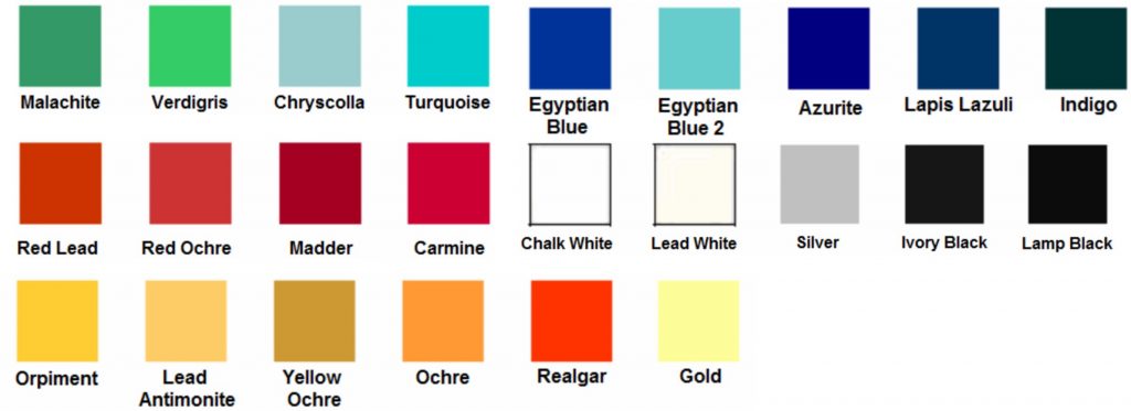
When I was in Dark Autumn, it worked for me because it is the brightest Autumn available in Sci\ART. I do not really have the depth of Dark Autumn, though, so that was where I ran into trouble. I felt like I was a brighter Autumn. High Autumn, on the other hand, is based around the colors of Ancient Egypt. If you google this, this is one of the results that comes up:

Indeed, I recognize many of these colors from Zyla’s High Autumn Pinterest board. In particular, the realgar color seems to be the classic High Autumn color, and one that actually many who know me in real life have referred to as my “signature” color. I also find all the colors in the top row in my eyes. I went hiking yesterday, and as I looked at the water, I wondered why I have been so resistant to my body colors:

Point Lobos, Carmel, CA. October 2020.

As odd as it may seem to use someone’s Ancient Egypt college project as my color palette, I think it seems like a suitable base for a wardrobe (apart from the black and white) until things open up again and I can make an appointment with Zyla. I will perhaps add an olive green and a honey brown as additional neutrals.

The bigger challenge, I think, will be making sure I retain my style personality with the new color palette. Black is an easy way to give an Edgy sensibility to your look, and without it, it can be easy to lose it at the Core of my palette. Sporty and Sophisticated should be much easier, but they’re also not my Core. I can see that this is where I had issues with the Autumn palette before–it could be difficult for me to retain my focus on expressing what I wanted with my style, and not just buying things in the right colors.

Another issue with this High Autumn approach is that there is so little information on High Autumn. David has his Pinterest board and his book, and I have seen some information from the handful of High Autumns in the community. But it’s not like, say, Tawny Spring, where there are a ton of people in the archetype within the online community, so there is a variety of versions of that archetype you can read about, and see where you resonate in terms of style.

I have created my own Pinterest board, using some of Zyla’s High Autumn pins, some other High Autumn pins on Pinterest, and some of my own.

  • Ancient Egyptian color palette as the basis of a Zyla High Autumn wardrobe.
  • Armani Privé Spring 2012 - Details
  • Bird of paradise

How my style will work with this new palette, and how to bring out the special qualities of High Autumn, are something I’m going to be working out as I plan new outfits over these next few months. It is definitely a new stage in my style evolution, and I’m excited to share it with you!

Note: I know it has been a while since I have worked on some of my other projects, like putting a new video on my YouTube channel, finishing my next Cheat Sheet, or continuing my series on The Looks Men Love. The changes that led to the change in my style have also made it harder for me to work on these projects that take a lot of time and energy, but I hope that as things settle and I adjust that I will be able to pick them back up. So don’t worry; I haven’t abandoned anything. 🙂

Stylesyntax.com is a participant in the Amazon Services LLC Associates Program, an affiliate advertising program designed to provide a means for sites to earn advertising fees by advertising and linking to Amazon.com.

Options for When You Don’t Like Your Season

Many people seem to default to a 12-season system for color, regardless of what else they follow. I have long had my doubts about it, however. I see a lot of people being draped as wildly different seasons, even within the same system, or just feeling boxed in by their season, and like it is a little limited or boring. Yet it still seems to be the most popular option, with people exploring many options for style, and yet sticking to the 12-season philosophy for color. But if you’re feeling dissatisfied with it and you’re not sure what your other options are, these are the ones I would recommend. My recommendations should come as no surprise to people who read this blog regularly, but they are the ones I see people being happy with once they look outside of the 12-season philosophy.

1. Four seasons

This one is pretty obvious. If you know your fit in 12 seasons, you can look to the parent season and expand your options. It’s also much simpler to only look for two qualities of color, rather than three.

Pros: It’s simpler and has a fair amount of information and systems to choose from. You will be less limited than you are with 12 seasons.
Cons: Not every color in your palette will be your “best.” If you don’t really like your season to begin with, going to a broader version of it may not help. And if your 12-season analysis was incorrect, you will have to go through the whole process again.

2. David Zyla

I know many people who are very, very happy with their David Zyla palette. It’s more limited, but because the colors are so specific to you, it often doesn’t feel that way in practice. He can also put together palettes that are more diverse than a seasonal palette, yet feel cohesive and focused. If you know your season works, but it feels limiting, or not like “you,” this can be a great option. (My Zyla tip, from people I know who have seen him: Go to see him with a look that is as “you” as possible. If you wear makeup every day, don’t go in as a bare-faced blank canvas. Showing him who you are will help you get the most “you” result possible.)

Pros: It’s custom and personalized and reflects who you are. It can go places that you wouldn’t find in a pre-made season.
Cons: It’s not cheap, and it’s hard to DIY. If you don’t like the end result, you are out a fair amount of money.

3. Dressing Your Truth

As readers of this blog know, this is the option I have gone with, because it gives me things no other system would. This is a good option if you want a color system that is fairly simple and if you feel like where you end up from your coloring doesn’t really fit who you are, which was my experience.

Pros: There are a lot of resources and it’s less complex than some others. You can easily identify where a garment would go. It can give you colors that you wouldn’t get in any other system, since it doesn’t use your coloring to get to your energy type.
Cons: Some people feel like it’s too simple and can be limiting, since only one type gets gray, only one gets black, you get either gold or silver and not both, etc. (This has been difficult for me, since gold is more fashionable now than silver at the moment.) And if you don’t like the colors of your energy type, there’s not much you can do except not dress your truth.

These are the systems that I see people have the most success with, once they decide to abandon 12-season systems. I know there are others out there, but these are the only ones I personally recommend at this point in time.

Do you still use a 12-season system? Have you tried out other things? Let me know in the comments.

Why Style and Color Matter

As a follow up to my last post, I thought I’d share a little bit of my own story and how it has affected my color and style philosophy. As I mentioned, it has changed over the years to reflect feeling authentic, versus following what is supposed to be objectively best for you. And this is why.

Two and a half years ago, I changed my life completely. I moved across the world with no real plan. I spent a year figuring it out, and in that time, I also realized that what I had thought I had been—a Dark Autumn 3/4–was wrong. I felt resigned to my clothing choices, and I longed for things like neon colors and black. I rarely felt like I was presenting my true self. I thought that this discomfort was due to not living my truth, and that I needed to extrovert more.

I now realize that if I were actually a 3/4, going through life head first would just be my natural state of being. I wouldn’t have to force it. And my clothes would support me in that, rather than just feeling like something I had been sentenced to.

Realizing that I’m a 4/3, abandoning Autumn altogether, and allowing myself the clothes that make me happy has changed my life. I have a clear vision of where I want to go with my career and the rest of my life… and I know what the outfits will look like, and how I can dress for any occasion and still feel like myself. I know how to take care of my strong, “slice-and-dice” energy that still needs to go within first. Being able to take care of myself means that I have been able to be successful in the things that are important to me, and going by season was actually a roadblock to me doing so.

Sometimes your result from a “scientific” process just isn’t the best for you. In my draping photos, for instance, optic white is awful. But then in candid photos, with all the T4 elements in place, I don’t see those same effects. I see me, as I want to be, and those effects just aren’t there. I think we all need to consider any kind of analysis, even DIY, very carefully, and whether a) it works as a part of a whole, and b) whether it feels right to us.

Have you also abandoned seasonal color, or do you still feel like it works for you?

What Are We Looking for?

This is something that has been on my mind lately, especially as I have been looking back at older posts. Why do some of us land on color and style analysis as an answer? And what question is it answering?

For me, I have always been interested in the idea that the perfect palette of colors for you exists, and that you could also fit some kind of archetype. And when I began looking at it seriously, it was because I was in my late 20s and working in my field, and I wanted to look less like a punk and more like someone that people would take seriously. I wanted to find my adult, sophisticated style.

But some people just want to find clothes that make them look better, or their best colors above all others. I think I have found the kinds of clothes that work best for me, and I have also learned where I can experiment and try something I might have felt like would be all wrong for me, if I didn’t have the knowledge I’ve gained from color and style analysis.

But on some points, my views have changed. I no longer believe in absolute truth on the color front, but an idea of what you want to look like; I know some people who tend to get a very narrow range of colors regardless of who they go to, but most people seem to get varying answers, depending on the analyst. That’s why I’ve gone with Type Four colors, because I feel the best in them and they make me the most happy when I look at my closet. I don’t think there is a color analyst around who would put me in those colors, but in the end, I’m the one getting dressed every day.

And that brings me to the main conclusion I’ve come to, which is that the purpose color and style analysis serves in my life is to help me be more myself, and to present myself to the world in that way. I always want to feel authentic in what I’m wearing, regardless of the occasion.

That’s why the next edition of the workbook is going to focus on that: creating a wardrobe that makes you happy and feels like you. To me, that is the end goal, not some kind of Ultimate Truth. What about you? What motivated you to seek out color and style analysis, and has that goal changed?

Color Resistance

I didn’t really have any Image ID resistance to being a Flamboyant Gamine. Many people come to the system with a “grass is greener” attitude, and that’s what made it hard to see themselves. I came to it with, “It can’t really be that easy or what I want; it has to harder than that.” Perhaps it’s my Enneagram 4 coming out, but I enjoy being a type that is less common and that can be disruptive to traditional beauty standards.

I have to come realize that the resistance I do have, in terms of my yin/yang balance, is that I can tend to go too yang, which is something that David identifies in the book as a problem common to gamines–that we tend to accept our yang side more easily than our yin side. It is important for me to remember that I am not yang-dominant; I am yang and yin, in a juxtaposed and almost-equal combination.

Similarly, I have a tendency to go heavier in my colors than I actually am. And this is where I really have resistance. In my heart of hearts, I love the Winter palette. I appreciate DYT, because it gives me permission to explore this desire, but I know that I am actually have more warmth, less contrast, and more delicate coloring. I can dress up and carry the movement and energy, but it is not going to be the perfect harmonious match for me. (Carol herself mentioned in a video I watched that she was draped as a Winter in the 80s. I don’t think it’s uncommon for your DYT type to not be a good fit for where you would be based on coloring alone.)

While I still think my skin generally looks OK in Dark Autumn, I think the heaviness can overwhelm me–my natural coloring can’t really hold it up. I suppose it was a bit of compromise for me–some brightness and warmth, but still with Winter. I also looked for that in Bright Spring, but it wasn’t the right combination for me, either–I think some of the colors go too cool in a way I can’t handle.

After consulting some of my most trusted Color and Style friends, I purchased a True Spring fan. I think it is a good starting point, and I like just having a fan to look at–sounds weird, but it’s true. When I read Christine Scaman’s True Spring chapter, a lot of it resonated with me, from my coloring as a child to the finishes I prefer in my makeup, which is more translucent acrylic than the oil painting of Autumn.

I don’t think, however, that my feelings on Sci\ART have really changed: I still feel like the color spaces are too limiting. Maybe they’re your top colors in a four-season space, but this exact color setting of hue/temperature/chroma isn’t representative of your entire color space.

What I have come to is simply Four Season Spring. It feels right to me because:

  • These are the colors I have surrounded myself with when I look at my interior decorating choices (See Johannes Itten and students choosing the colors that suit them without being aware of it)
  • These are the colors that I get complimented on. I did not get compliments in Autumn colors for the most part, except for my style choices. I worked retail for a while, and I heard a lot of opinions on my own choices!

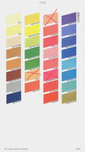
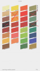
When looking at four seasons, it is understood that not every color in a palette will be good and some will be better than others. When pondering Spring and Autumn, I took the Color Me Beautiful palettes and crossed out all the colors that don’t work for me in Spring (the ones that bring out redness in my face) and the colors in Autumn that feel too heavy for me.

Spring

Rather than using a palette, however, I am just going to trust me own eye and go with colors that appear to be warm enough and clear enough. I have been doing this dressing T4 (since I feel that I still need red-orange and not fuchsia, for instance). My approach is to do both, sometimes separately, sometimes in combination, if there are colors that are warm enough for Spring but also pure enough for T4. This is made easier by David Kibbe’s philosophy of head-to-toe dressing, although he would not approve of anyone who is not a Winter wearing black! If I want to wear black and my silver jewelry, I can, in an outfit that is totally in line with the T4 pure hues; if I want to wear brown and my gold jewelry, I can, in an outfit that is all Kibbe/CMB Spring.

While this may seem like two wardrobes, I just think of Audrey Hepburn’s first wedding set, which was a stack of bands in gold, rose gold, and silver, because she was so into fashion and couldn’t be restricted to one metal. Rather than just choosing between two options, I want to have both options. Maybe one option will win out. Maybe I’ll just be happy to have options and wear whatever strikes my fancy on a particular day.

Are you dealing with two (or more!) color palettes/style philosophies? How do you handle it?

How To: Disobey Your Style and Color Recommendations

This post contains affiliate links.

In a perfect world, we’d all have closets full of only A+ for both style and color. Some of us will have that. For others, it can be a struggle to find things that tick both boxes. Or we just fall in love with something that doesn’t really fit.

Some of you will recoil at the thought at buying something outside of your perfect colors or perfect lines. (I think most of you in this category will be Winters, because being able to wear black and white makes life a lot easier ;)). But if sometimes you want to be a little naughty and rebel, read on.

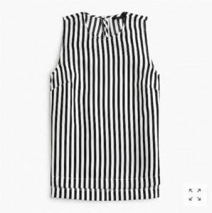
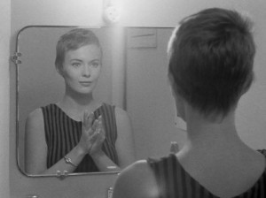
I recently bought a shirt that is striped black and white. This is something I have been avoiding for a long time. But I saw this top, and I immediately saw how perfect it was for my Modern Jean Seberg aesthetic.

J.Crew Striped Silk Top, was $88, now $59.99

Striped Silk Top, J.Crew, was $88, now $59.99


So once it went on sale (I won’t pay $88 for something that isn’t A+!), I bought it. Here are my tips for disobeying:

1) It should still be A+ for one part of your recommendations.

Don’t get something that doesn’t fit you well in both line and color. Go off palette or go off style, but not both at the same time.

2) Buy it as part of a complete outfit.

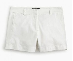
Don’t buy it as something you have to mix into your wardrobe. It may cause you to buy a lot of other things that aren’t A+. Buy it as an outfit so that it is isolated. Don’t try to mix and match your “off-brand” stuff. Buy it as a complete look so you maintain the integrity of your wardrobe otherwise. I bought the striped top with some shorts:

And then my sandals have black soles, so I figure they will go well enough:

(This is also a good tip for when you get a new set of recommendations and you want to transition your wardrobe. Don’t try to buy things that will work with what you already have. Buy complete outfits and put them in a separate section of your closet.)

3) For color, don’t wear your worsts.

Black isn’t my worst. It just isn’t my best. It is a little blah on me. But no cut or details are worth optic white or spring coral or melon. If you have identified your worst colors, avoid them at all costs.

4) For a piece that is off style-wise, try to make up the difference.

David Kibbe says garments don’t have yin/yang balances on their own. So something may work for you, regardless of how distant it seems from your idea of your best lines. And make sure that the rest of your outfit is on point. Jewelry, shoes, other articles of clothing. See if you can’t style your way from B- to A+.

4) For color, consider your makeup.

With a black-and-white outfit, I’m not going to wear my brownest lipstick. I’m going to go in the coolest and brightest direction I can, while remaining within the boundaries of what’s flattering on me.

5) Wear what you love.

Buying something outside of your recommendations isn’t a sign of moral failure. Style is fun. Allow yourself to have some freedom.

Have you purchased anything recently that falls out of the range of what you’re “allowed” to do? How have you managed to make it work for you?

Vibrant Autumn

In recent months, I’ve felt myself become disillusioned with the Sci\ART system, at least as it is practiced today. There are a couple of reasons for this.

1. My issues with the two main schools of thought.

The two branches of Sci\ART that are the most widespread, with the most analysts, are True Colour International and 12 Blueprints. I have issues with both, although these issues are different. I wrote about it before, but I simply don’t like the results True Colour gets. They drape a lot of Softs, and I think that the look they go for is flattening and graying. They make a lot of fuss about redraping former 12 Blueprints analysts and clients, and I don’t see an improvement. I don’t look at a TCI client and go, “Wow, this woman looks fabulous.” I see someone who now blends into the background.

I tend to prefer the way 12 Blueprints/Your Natural Design clients look, but the intertwining of this branch of analysts and the Best Dressed Kibbe knockoff system means that I can’t support them, either. My feelings on this subject are well known, but suffice to say, there are so many 12BP analysts that are now offering typing in this system that I feel I can no longer endorse it. I take Kibbe’s legacy very seriously; his system totally upends conventional wisdom and is so honoring of individual beauty, and he is such a wonderful and generous person to boot. The Best Dressed system undoes what it great about Kibbe.

2. The palettes feel limiting.

Despite the fact that Zyla gives you a limited color palette, many people who come from Sci\ART still feel liberated when they get their color palette. He gives people colors that are great for them, but may fall into various Sci\ART seasons. Sci\ART palettes can begin to feel a little confining, in my opinion. You need to hit all three markers of hue, chroma, and value, and then soemtimes it feels like your season is a compromise, which I will explain in a bit.

The wrong way to solve the latter problem, in my opinion, is to further limit your palette and make it more specific, like the systems do that have 16 or more seasons. I find that they are often redundant, further limiting your Sci\ART palette over adding new options. In recent months, I have actually begun to favor a four-season approach, which would have shocked me of a couple of a years ago. I’ve been using my T3 palette from DYT, actually.

After reading Tina’s blog post on her House of Colour experience, I feel like I’ve found my solution. House of Colour drapes you into one of four seasons, and then further refines it into a subseason, but you can use all of the colors of the main season–the subseason just has your bests.

On the Kettlewell (which I think is close to House of Colour), I found a blog post that has a Vibrant Autumn, which I think best describes me. I put myself into Dark Autumn from Sci\ART because it’s the brightest Autumn, and less because it’s the darkest. The coolest colors in DA are not my best, for sure. I stock my wardrobe with colors that are bright, but still have that muted/dirty autumnal quality.

kettlewell_vibrantautumn
(source)

These are the kind of colors you’ll mainly find in my wardrobe, and the ones I get compliments on. From the descriptions on the site, it sounds like I could be their Soft Autumn (which is far less Soft than a Sci\ART Soft Autumn), since people frequently think I’m a Summer until they see how much cool colors drain me, but I think these colors are truly the best from the Autumn family for me. The Dark/Blue Autumn in Kettlewell and House of Colour is very cool, to my eye–I know we have had some people in the Dark Autumn group on Facebook who come from this methodology, and the colors they can wear are far cooler.

As I write this, I realize that the approach is very similar to what Kibbe does. He has one palette for each of the four seasons, but then the way you use the palette varies. So like with style in general, maybe once again it is Kibbe who holds the key to what works for me.

Have you looked at House of Colour at all? What do you think about what is basically a four-season approach versus Sci\ART?

Summer Makeup: RMS Lip2Cheek and NARS Tinted Moisturizer

This post contains affiliate links.

At this point, my collection of Dark Autumn makeup is fairly extensive. I can go into Sephora and leave emptyhanded, because I don’t feel like there’s anything I really need, save two products that had remained elusive for me–until now.

Back before I had discovered color analysis, and even into my color analysis explorations, when I thought I was a Light Spring, one of my favorite products was Benefit Posietint, a liquid lip and cheek stain in a light, clear, and warm pink. It was something I could just throw on when I wasn’t doing a full makeup look to add some color into my face without doing much work.

While makeup as a whole seems to have been tilted in the Autumn direction for a while now, this kind of product is still mainly found in Spring colors. I had no hope of finding anything to replace my beloved Posietint until I came across this post on one of my favorite makeup blogs, Killer Colours. A lip/cheek stain in a burnt plummy rose? Exactly what I’d been searching for.

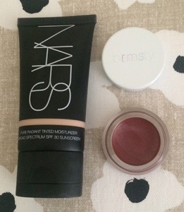
RMS Beauty Lip2Cheek in Illusive is blendable and buildable, and comfortable to wear–unlike Posietint, it actually feels like a balm on the lips. This is the kind of color I like for daytime wear in summer–burnt rose/orange/red but sheer–and when winter comes, I’ll probably pick this up in Diabolique, which is Burgundy and ehading towards Dark Winter. (I think Soft Autumns might like Illusive as well.)

I still had to find the other product I had been searching for, however. I’m very pale, and there aren’t many foundation ranges that make a shade light enough for me, and this goes double for tinted moisturizers, where the sheer nature of the formulas allows brands to feel like they can release a very limited range of shade. I’ve had store employers swear up and down that a shade is very light and have it look okay in stores, only to come home and discover in normal lighting that I looked like I had applied self-tanner.inally,

So I went to Ulta and swatched every light shade of tinted moisturizer I had. Tarte, Urban Decay, Philosphy… No dice. Finally, I went to the teeny-tiny NARS display, hoping they’d decided to include the tinted moisturizer. NARS is one of the only brands that makes a good foundation for people who are very pale, yet more yellow than pink, so I was hopeful that their tinted moisturizer range would include a good shade for me. Funnily enough (probably just to me), I was too light for even Finland, which caused the self-tanner effect, but Terre Neuve was perfect, and my search was over.

rms_nars

I am very happy to have found products in these genres that actually work for my season and skin tone. And as much as I roll my eyes at the term, these products paired together create a great “no-makeup makeup” look.

What are your favorite summer makeup products? What makeup products have thus far eluded you in your season?

Dark Season Lip Gloss: Chanel Coco Rouge Moisturizing Glossimer and Top Coat

This post uses affiliate links.

Even as a lighter Dark Autumn, lip gloss isn’t a product I’ve had much luck finding. Most of the ones on the market don’t have enough pigment for me to wear on their own, and just simply putting a clear gloss on top generally leads to the color underneath pulling too pink or just losing its necessary depth. A lot of dark seasons favor mattes, but I like my lip products to feel like a balm and I don’t think that matte is the most flattering finish for my particular lip shape.

I don’t like to admit it, but I think we’ve all bought a makeup or skincare product after seeing one of those YouTube “guru” put it in their favorites or use it in a tutorial. When I saw the new Coco Rouge Moisturizing Glossimer, it seemed like an answer to my Dark Autumn prayers. An opaque lip gloss that feels like a balm?! Where have you been all my life?!

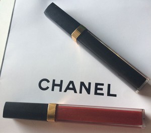
Chanel describes their new gloss formula as “a non-sticky, ultra-light formula leaves lips visibly smooth and plump, and perfectly brilliant. An innovative, dual-sided applicator ensures optimal, even coverage and high precision. In 24 shades to collect, layer and love. Enriched with Coconut Oil, Peptides and Vitamin E, along with an exclusive Hydraboost Complex, to offer hours of comfort and moisture.” It really does feel like a balm and it looks great, and comes in a wide range of colors with several different finishes (sheer, opaque, semi-opaque). You can see a breakdown of all the shades here, although I have to say that the shade I have (Opulence) looks more like it does on the swatch on the Chanel website than it does the one on the blog post.

Opulence swatch

I went with Opulence because, while there are colors that seem darker (Decadent, blackberry, and Epique, oxblood), Opulence (described as cranberry) is warmer. I might get Epique at a later date, but to start, I wanted a color that would make a good everyday color for me.

I did end up getting two, because it was just one of those weeks where you stand in front of the Chanel counter and say, “Screw it. This is a two lip gloss kind of week.” I ended up getting Caviar, which is a limited-edition transforming topcoat. This is something that is really handy for both Dark Autumns and Dark Winters. It’s a sheer black lip gloss meant to deepen the color of whatever lipstick you’re wearing underneath, which solves the problem of lip glosses making lipsticks lose their depth. (They also have an orange one for warmth and a gold for brightness, for True warms and Brights).

lip glosses

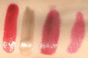
I swatched them, and then used Caviar on top of MAC’s All Out Gorgeous.

swatches

L to R: Opulence, Caviar, Caviar on top of All Out Gorgeous, All Out Gorgeous

So if you’re a Dark Autumn or a Dark Winter and you struggle to find lip glosses that retain their depth, I suggest checking these out, and if you can only get one, pick up Caviar while it’s still available so you can use it with all your other lipsticks. There are colors for other seasons too, of course, but I’ve never found glosses that work so well for Dark Autumn before.

Everything’s Gone Green

This post uses affiliate links.

Since I’ve gone back to Dressing Your Truth, I’ve made a conscious effort to stop buying black and gray, even though the Dark Autumn palette has these colors. Instead of purchasing a wide variety of Dark Autumn/Type Three colors, though, I seem to just be buying everything in green/olive.

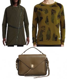
Olive, in my case, is the new black. Most of the stuff I’ve bought since I made that decision has been some kind of green/olive. Even just looking at the things I’ve mentioned in recent blog posts, you can see the pattern:

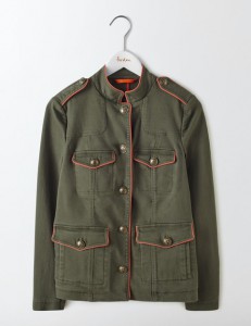
I recognized this pattern, and swore to myself that I would absolutely stop buying things in green or olive until I had rounded out my wardrobe with other colors. Then a few weeks ago, Boden emailed me, and I ended up buying this (in my defense, I had a coupon code):

Florence Jacket, Boden, $130.

Florence Jacket, Boden, $130.

Sometimes you just see an item and you can immediately picture all the ways you can use it in your wardrobe. That’s what happened to me with this jacket. It seemed like the kind of thing that could replace both a leather jacket and a denim jacket, something that can be worn for three seasons out of the year. The red piping just adds that little extra touch of design that makes it unique.

So, okay. I swear that was my last purchase of something green or olive for at least the next few months. Now, when I need something in a neutral–or something edging toward a neutral–I want to look for my browns, my dark reds, my peacock blues, my dark purples. There is so much more to my palette!

What color seems to dominate your wardrobe? Have you taken steps to rectify this?

1 2 3 5