Posts Tagged ‘dark autumn’

2020 Style Update: Zyla High Autumn

This post uses affiliate links.


This music video is a little strange, but the song fits where I am with my style right now.

Sometimes, we treat our style and season as if it’s going to last our whole lives. Often, though, it’s more of a stop along the way, rather than a lifelong thing.

I have noticed that I tend to change my style in some way when something major in my life changes. I started looking at Kibbe and Dressing Your Truth after I felt a shift in my life toward coming into my adult self, having my first real job, etc. I stayed in a kind of autumnal space until it just didn’t feel right anymore, and I went with 4/3 for the entirety of my time in grad school.

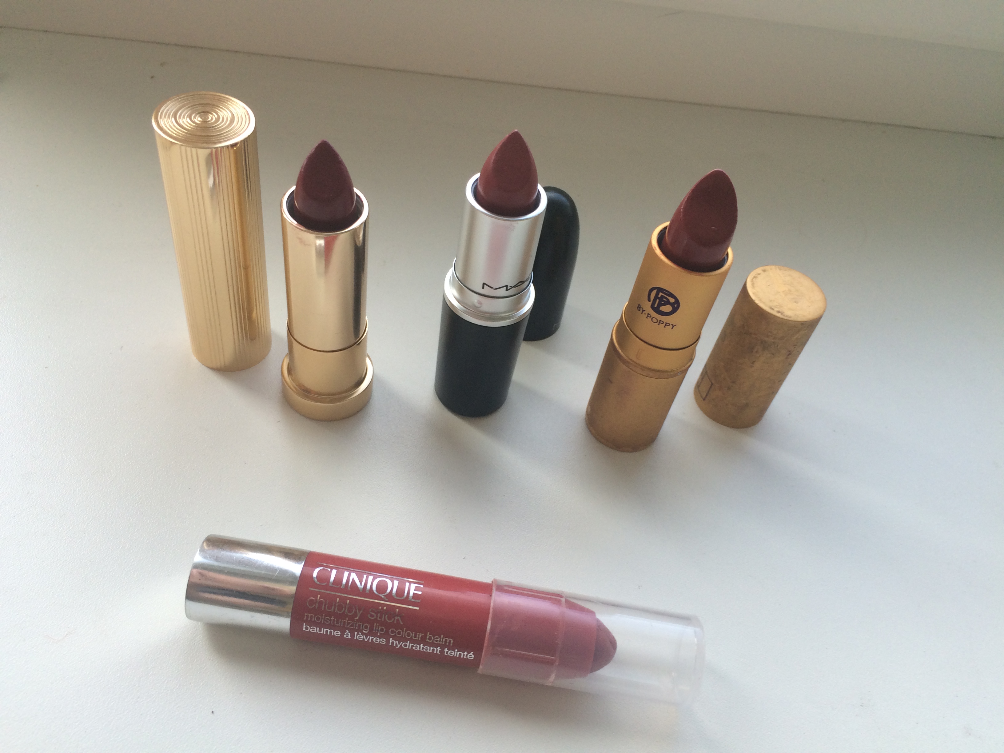
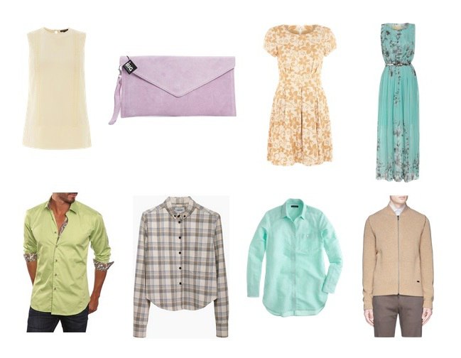
Now that I am done with grad school, and am working in my profession, I am again faced with my color palette feeling off. Flamboyant Gamine has been pretty constant, but wearing the T4 color palette no longer feels right to me. I know that these colors do not exist in my body, and it feels like at this point in my life, I would feel more self-assured wearing the colors that exist in me.

Wearing my season or body colors has always been something I’ve had resistance to, because I don’t get black, or neon, or many other colors that 4/3 “allowed” me to wear. For a long time, it felt like a compromise. But perhaps I’ve gotten it out of my system, because wearing the colors I loved now feels somewhat artificial.

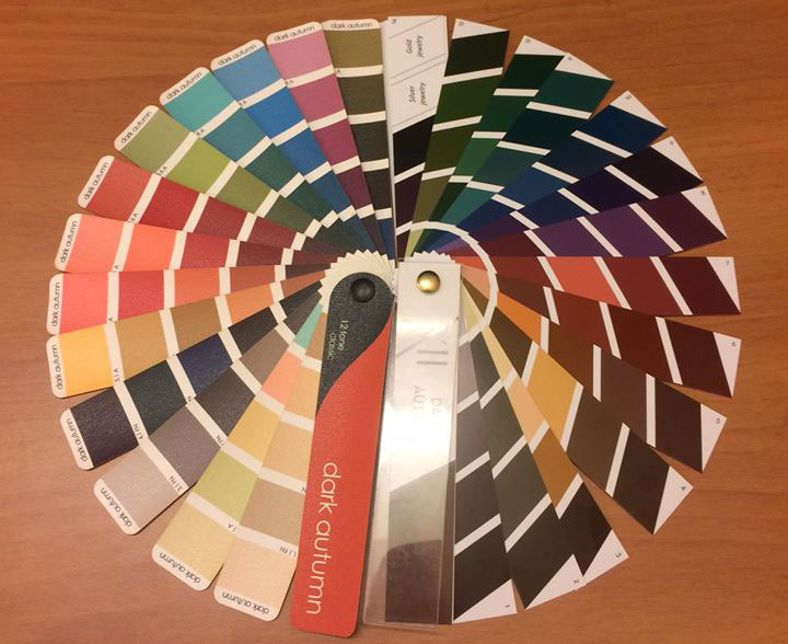
Zyla is a system that I have been looking into for as long as I have been looking into Kibbe, Dressing Your Truth, and Sci\ART (which I no longer have faith in). But it was one where I felt like I didn’t have an archetype that felt “right” out of the box, meaning the description in the book. Zyla customizes the archetypes to the person, so some people end up with recommendations that vary greatly from what is in the book, and I’ve long felt that I would be one of those people. I couldn’t even narrow down my season apart from ruling out Summer.

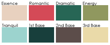
But as I was thinking about it this weekend, something clicked for me. High Autumn is an archetype where other people have said that I come to mind when they read the description in the book. High Autumn is a direct, take-charge type, and that describes me pretty well.

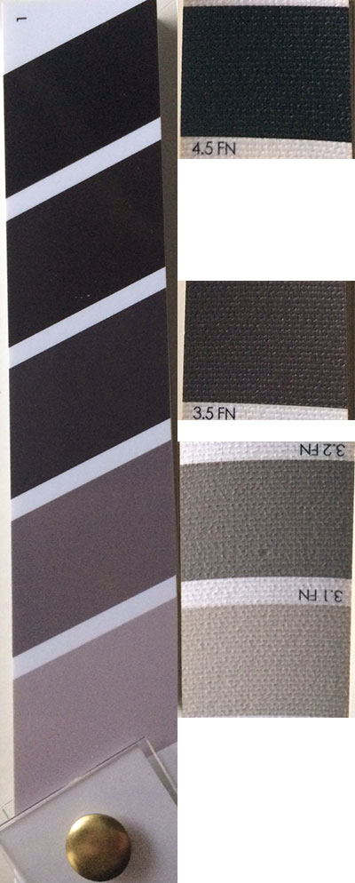
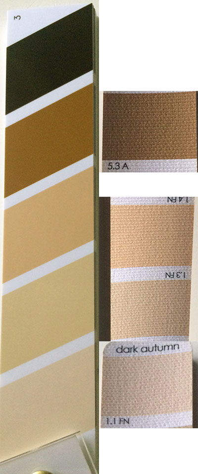
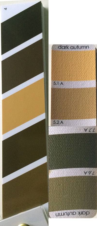
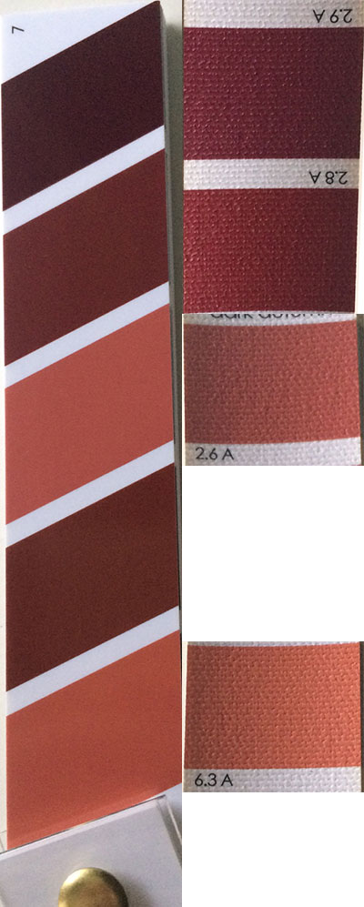
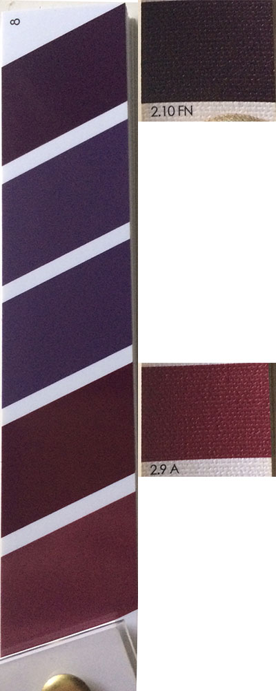
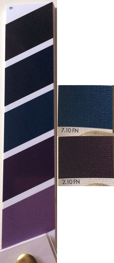
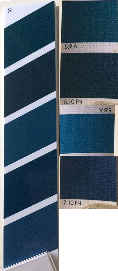
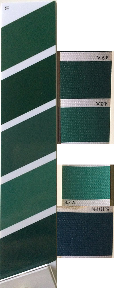
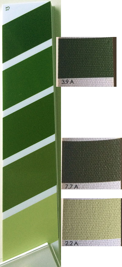
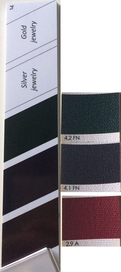
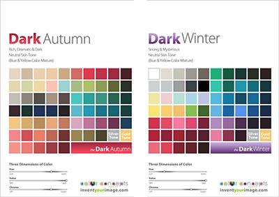
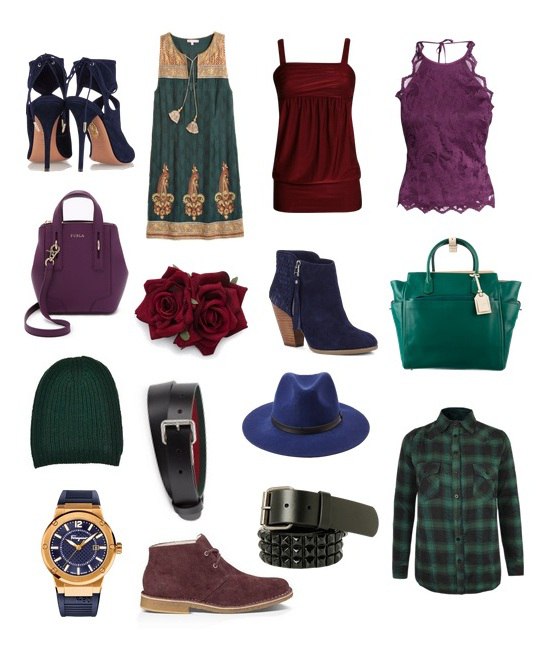
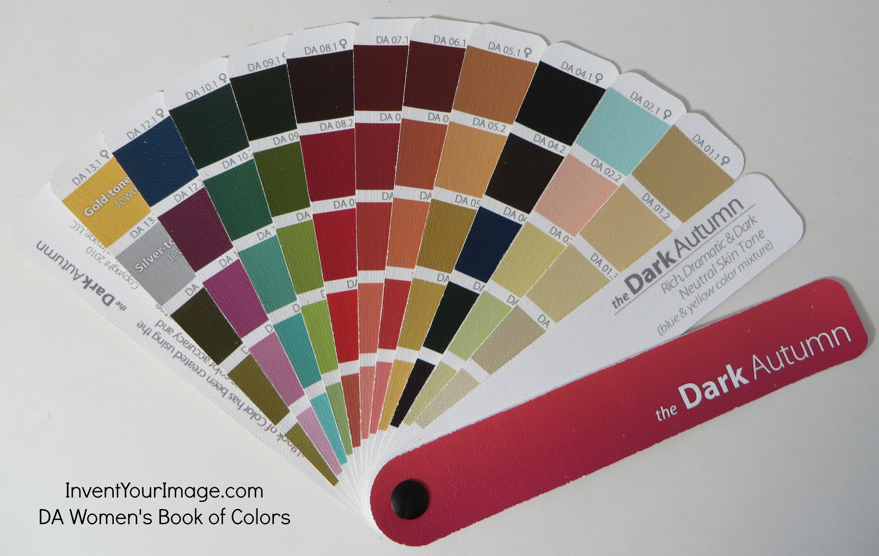
When I was in Dark Autumn, it worked for me because it is the brightest Autumn available in Sci\ART. I do not really have the depth of Dark Autumn, though, so that was where I ran into trouble. I felt like I was a brighter Autumn. High Autumn, on the other hand, is based around the colors of Ancient Egypt. If you google this, this is one of the results that comes up:

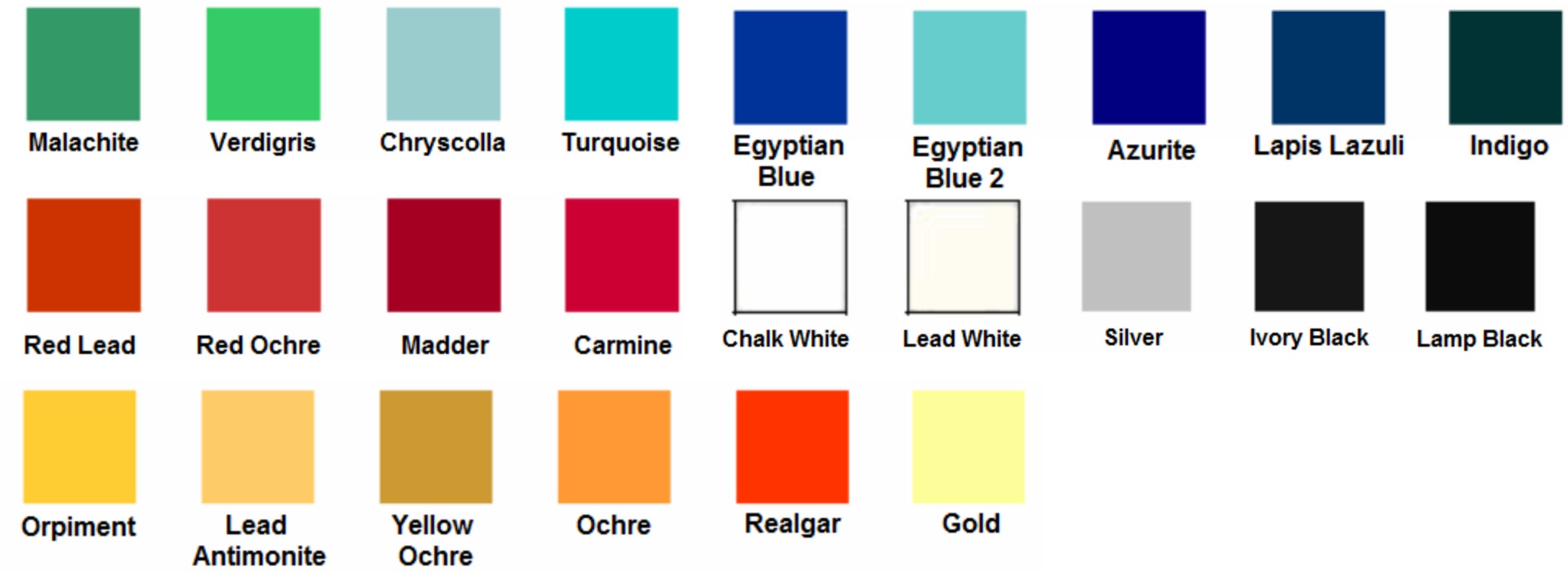
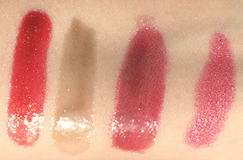
Indeed, I recognize many of these colors from Zyla’s High Autumn Pinterest board. In particular, the realgar color seems to be the classic High Autumn color, and one that actually many who know me in real life have referred to as my “signature” color. I also find all the colors in the top row in my eyes. I went hiking yesterday, and as I looked at the water, I wondered why I have been so resistant to my body colors:

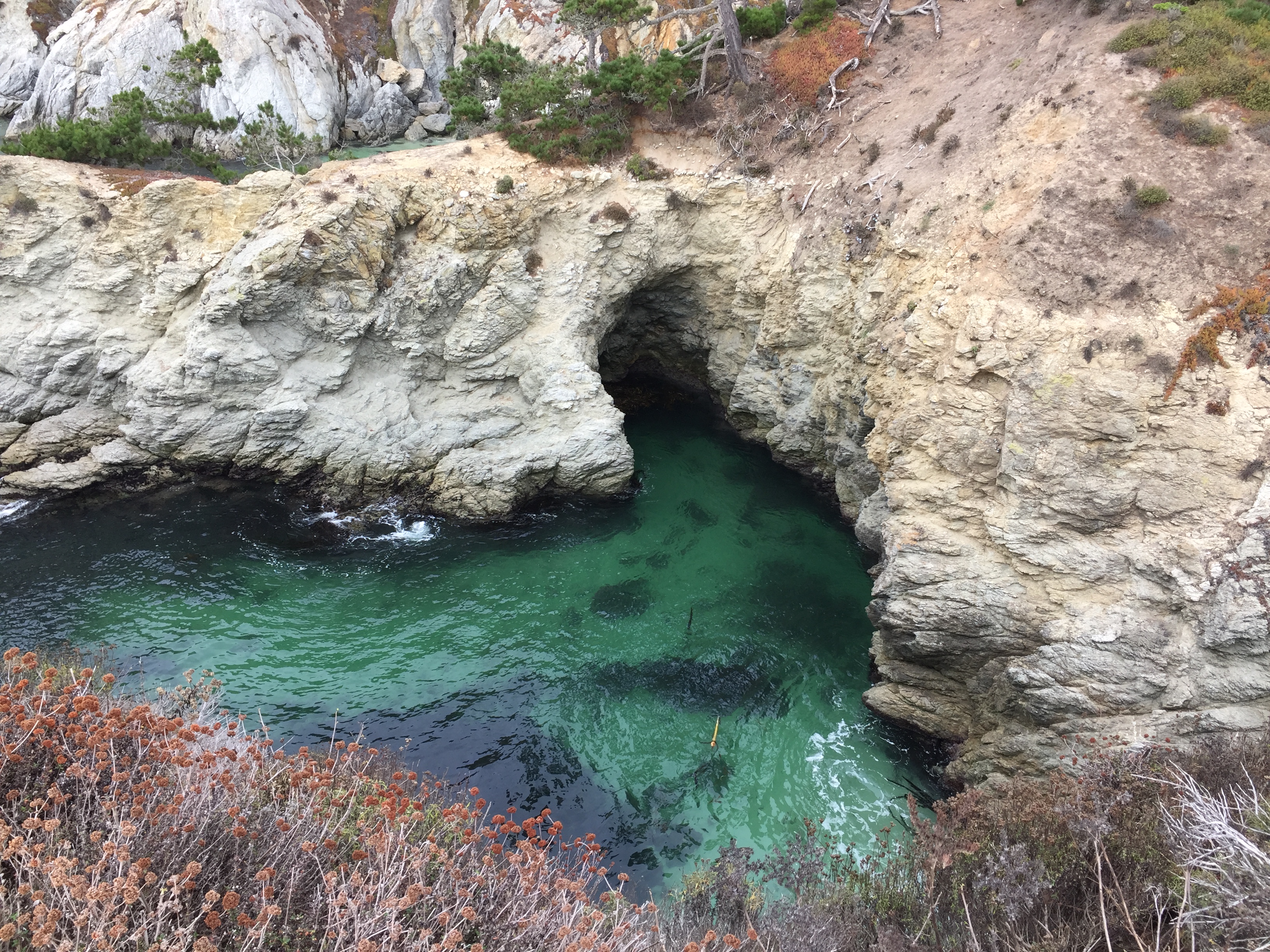
Point Lobos, Carmel, CA. October 2020.

As odd as it may seem to use someone’s Ancient Egypt college project as my color palette, I think it seems like a suitable base for a wardrobe (apart from the black and white) until things open up again and I can make an appointment with Zyla. I will perhaps add an olive green and a honey brown as additional neutrals.

The bigger challenge, I think, will be making sure I retain my style personality with the new color palette. Black is an easy way to give an Edgy sensibility to your look, and without it, it can be easy to lose it at the Core of my palette. Sporty and Sophisticated should be much easier, but they’re also not my Core. I can see that this is where I had issues with the Autumn palette before–it could be difficult for me to retain my focus on expressing what I wanted with my style, and not just buying things in the right colors.

Another issue with this High Autumn approach is that there is so little information on High Autumn. David has his Pinterest board and his book, and I have seen some information from the handful of High Autumns in the community. But it’s not like, say, Tawny Spring, where there are a ton of people in the archetype within the online community, so there is a variety of versions of that archetype you can read about, and see where you resonate in terms of style.

I have created my own Pinterest board, using some of Zyla’s High Autumn pins, some other High Autumn pins on Pinterest, and some of my own.

  • Ancient Egyptian color palette as the basis of a Zyla High Autumn wardrobe.
  • Armani Privé Spring 2012 - Details
  • Bird of paradise

How my style will work with this new palette, and how to bring out the special qualities of High Autumn, are something I’m going to be working out as I plan new outfits over these next few months. It is definitely a new stage in my style evolution, and I’m excited to share it with you!

Note: I know it has been a while since I have worked on some of my other projects, like putting a new video on my YouTube channel, finishing my next Cheat Sheet, or continuing my series on The Looks Men Love. The changes that led to the change in my style have also made it harder for me to work on these projects that take a lot of time and energy, but I hope that as things settle and I adjust that I will be able to pick them back up. So don’t worry; I haven’t abandoned anything. 🙂

Stylesyntax.com is a participant in the Amazon Services LLC Associates Program, an affiliate advertising program designed to provide a means for sites to earn advertising fees by advertising and linking to Amazon.com.

Why Style and Color Matter

As a follow up to my last post, I thought I’d share a little bit of my own story and how it has affected my color and style philosophy. As I mentioned, it has changed over the years to reflect feeling authentic, versus following what is supposed to be objectively best for you. And this is why.

Two and a half years ago, I changed my life completely. I moved across the world with no real plan. I spent a year figuring it out, and in that time, I also realized that what I had thought I had been—a Dark Autumn 3/4–was wrong. I felt resigned to my clothing choices, and I longed for things like neon colors and black. I rarely felt like I was presenting my true self. I thought that this discomfort was due to not living my truth, and that I needed to extrovert more.

I now realize that if I were actually a 3/4, going through life head first would just be my natural state of being. I wouldn’t have to force it. And my clothes would support me in that, rather than just feeling like something I had been sentenced to.

Realizing that I’m a 4/3, abandoning Autumn altogether, and allowing myself the clothes that make me happy has changed my life. I have a clear vision of where I want to go with my career and the rest of my life… and I know what the outfits will look like, and how I can dress for any occasion and still feel like myself. I know how to take care of my strong, “slice-and-dice” energy that still needs to go within first. Being able to take care of myself means that I have been able to be successful in the things that are important to me, and going by season was actually a roadblock to me doing so.

Sometimes your result from a “scientific” process just isn’t the best for you. In my draping photos, for instance, optic white is awful. But then in candid photos, with all the T4 elements in place, I don’t see those same effects. I see me, as I want to be, and those effects just aren’t there. I think we all need to consider any kind of analysis, even DIY, very carefully, and whether a) it works as a part of a whole, and b) whether it feels right to us.

Have you also abandoned seasonal color, or do you still feel like it works for you?

Summer Makeup: RMS Lip2Cheek and NARS Tinted Moisturizer

This post contains affiliate links.

At this point, my collection of Dark Autumn makeup is fairly extensive. I can go into Sephora and leave emptyhanded, because I don’t feel like there’s anything I really need, save two products that had remained elusive for me–until now.

Back before I had discovered color analysis, and even into my color analysis explorations, when I thought I was a Light Spring, one of my favorite products was Benefit Posietint, a liquid lip and cheek stain in a light, clear, and warm pink. It was something I could just throw on when I wasn’t doing a full makeup look to add some color into my face without doing much work.

While makeup as a whole seems to have been tilted in the Autumn direction for a while now, this kind of product is still mainly found in Spring colors. I had no hope of finding anything to replace my beloved Posietint until I came across this post on one of my favorite makeup blogs, Killer Colours. A lip/cheek stain in a burnt plummy rose? Exactly what I’d been searching for.

RMS Beauty Lip2Cheek in Illusive is blendable and buildable, and comfortable to wear–unlike Posietint, it actually feels like a balm on the lips. This is the kind of color I like for daytime wear in summer–burnt rose/orange/red but sheer–and when winter comes, I’ll probably pick this up in Diabolique, which is Burgundy and ehading towards Dark Winter. (I think Soft Autumns might like Illusive as well.)

I still had to find the other product I had been searching for, however. I’m very pale, and there aren’t many foundation ranges that make a shade light enough for me, and this goes double for tinted moisturizers, where the sheer nature of the formulas allows brands to feel like they can release a very limited range of shade. I’ve had store employers swear up and down that a shade is very light and have it look okay in stores, only to come home and discover in normal lighting that I looked like I had applied self-tanner.inally,

So I went to Ulta and swatched every light shade of tinted moisturizer I had. Tarte, Urban Decay, Philosphy… No dice. Finally, I went to the teeny-tiny NARS display, hoping they’d decided to include the tinted moisturizer. NARS is one of the only brands that makes a good foundation for people who are very pale, yet more yellow than pink, so I was hopeful that their tinted moisturizer range would include a good shade for me. Funnily enough (probably just to me), I was too light for even Finland, which caused the self-tanner effect, but Terre Neuve was perfect, and my search was over.

rms_nars

I am very happy to have found products in these genres that actually work for my season and skin tone. And as much as I roll my eyes at the term, these products paired together create a great “no-makeup makeup” look.

What are your favorite summer makeup products? What makeup products have thus far eluded you in your season?

Dark Season Lip Gloss: Chanel Coco Rouge Moisturizing Glossimer and Top Coat

This post uses affiliate links.

Even as a lighter Dark Autumn, lip gloss isn’t a product I’ve had much luck finding. Most of the ones on the market don’t have enough pigment for me to wear on their own, and just simply putting a clear gloss on top generally leads to the color underneath pulling too pink or just losing its necessary depth. A lot of dark seasons favor mattes, but I like my lip products to feel like a balm and I don’t think that matte is the most flattering finish for my particular lip shape.

I don’t like to admit it, but I think we’ve all bought a makeup or skincare product after seeing one of those YouTube “guru” put it in their favorites or use it in a tutorial. When I saw the new Coco Rouge Moisturizing Glossimer, it seemed like an answer to my Dark Autumn prayers. An opaque lip gloss that feels like a balm?! Where have you been all my life?!

Chanel describes their new gloss formula as “a non-sticky, ultra-light formula leaves lips visibly smooth and plump, and perfectly brilliant. An innovative, dual-sided applicator ensures optimal, even coverage and high precision. In 24 shades to collect, layer and love. Enriched with Coconut Oil, Peptides and Vitamin E, along with an exclusive Hydraboost Complex, to offer hours of comfort and moisture.” It really does feel like a balm and it looks great, and comes in a wide range of colors with several different finishes (sheer, opaque, semi-opaque). You can see a breakdown of all the shades here, although I have to say that the shade I have (Opulence) looks more like it does on the swatch on the Chanel website than it does the one on the blog post.

Opulence swatch

I went with Opulence because, while there are colors that seem darker (Decadent, blackberry, and Epique, oxblood), Opulence (described as cranberry) is warmer. I might get Epique at a later date, but to start, I wanted a color that would make a good everyday color for me.

I did end up getting two, because it was just one of those weeks where you stand in front of the Chanel counter and say, “Screw it. This is a two lip gloss kind of week.” I ended up getting Caviar, which is a limited-edition transforming topcoat. This is something that is really handy for both Dark Autumns and Dark Winters. It’s a sheer black lip gloss meant to deepen the color of whatever lipstick you’re wearing underneath, which solves the problem of lip glosses making lipsticks lose their depth. (They also have an orange one for warmth and a gold for brightness, for True warms and Brights).

lip glosses

I swatched them, and then used Caviar on top of MAC’s All Out Gorgeous.

swatches

L to R: Opulence, Caviar, Caviar on top of All Out Gorgeous, All Out Gorgeous

So if you’re a Dark Autumn or a Dark Winter and you struggle to find lip glosses that retain their depth, I suggest checking these out, and if you can only get one, pick up Caviar while it’s still available so you can use it with all your other lipsticks. There are colors for other seasons too, of course, but I’ve never found glosses that work so well for Dark Autumn before.

PrismX11 Dark Autumn Palette Review, Part 2: Palette Comparisons

There is now another brand of Sci\ART palettes at a similar price point to the standard True Colour International and Invent Your Image palettes. They are by PrismX11, and have been developed with a Munsell color scientist. Each color on the palettes has been measured using a spectrophotometer. I go into the specifics of this palette in the first part of the review.

Today, I’m going to talk about the differences in the colors on the palette.

TCI (left) and PrismX11 (right)

TCI (left) and PrismX11 (right)

The general first impression is that the PrismX11 is significantly darker. Part of this is because the dark colors are at the top of the palette. The Invent Your Image palette similarly seems darker, even though the colors are actually more or less the same as the TCI’s. But the PrismX11 does not have the brightest colors on the TCI palette, the saturated colors along the top.

Direct Comparisons

prismx11-dark-autumn-palette-strip1

The first strip has grays. The darkest gray and black seem warmer; the lighter shades seem cooler. The TCI lighter grays I would describe more as stones or taupes; the PrismX11’s are true grays.

prismx11-dark-autumn-palette-strip2

The second strip has some deep, neuutral olive greens and a nice avocado/pistachio color. This strip of olives is less yellow than the TCI versions, and there are no real midtones. The light color is more complex than the one found on the icies strip. It was hard to get the colors to render correctly in Photoshop, but I did the best I could. The photo of the palette as a whole is probably a better representation of what this strip looks like.

prismx11-dark-autumn-strip3-1

Strip three is pale oranges/creams and some browns. The TCI versions have a pinker cast to them. Even the lighter brown is more yellow on the PrismX11 palette. Note the dark brown, for which there is no TCI equivalent–this palette has a LOT more browns. If you are looking for a palette with more neutrals, this is a good option.

prismx11-dark-autumn-strip4

Strip four is more browns and a yellow. This yellow falls between the two shades on the TCI palette. The closest shades on the TCI palette to the bottom two are the olives, but unlike the first olives we saw, these are less green than the TCI olives.

prism-x11-dark-autumn-palette-strip5

Strip five is more browns and oranges, and the darkest browns are redder than any of the ones of the TCI palette. The shades that are similar have more depth and more yellow in the TCI version. The pale color basically looks like a medium-warm skin tone.

prismx11-dark-autumn-strip6

Strip six has blood reds. I think this would be a great strip to have when you go lipstick shopping. Many of our lipsticks are in the category, and the TCI palette doesn’t have great equivalents. The colors I have here are much cooler, kind of plummy. As far as the light shades go, the lighter shade from the TCI palette is a light warm coral/pink, and the TCI color is basically a band-aid color.

prismx11-dark-autumn-palette-strip7

Strip seven is full of great lipstick colors! The biggest difference is probably the color at the bottom. Its closest TCI equivalent is the bright coral shade, and I think the more muted and deeper version in PrismX11 will probably be considered more wearable by most DAs. Otherwise, the colors are a little richer/less clear, apart from the pretty rosy brown that is missing altogether.

prismx11-dark-autumn-palette-strip8

Strip eight has purples, and I think the fact that the TCI palette has only orchid or very dark purples is one of the most confusing things about it. Here we have some true purple and red-violet shades, which I’m sure will be welcome. The bottom two shades would also function nicely as bold wintry lipstick choices. It’s a little less red than its TCI equivalent. And the darkest purple here is slightly lighter and cooler than the TCI version.

prismx11-dark-autumn-palette-strip9

Strip nine has even more purples and we start to move into the blues. The light purple here is kind of unexpected for DA, but I’m into it. And again the darker purple is cooler. It’s a very classic darkish purple, no real strong plummy tones. The one blue I did find that works with this strip of blues from the TCI palette fits nicely, but it’s that odd lone blue found on the strip of olives. Here this blue is taken darker as well.

prismx11-dark-autumn-palette-strip10

Strip ten’s blues are pretty similar to ones found on the TCI palette, but you can see the brightness level never gets quite as high as it does on TCI.

prismx11-dark-autumn-palette-strip11

The blue-greens of strip 11 are a similar story. There is just an increased complexity that is hard to describe. The brightest blue-green on TCI is one you could easily mistake for a spring color. The brightest/lightest green on the PrismX11 palette is one I could perhaps imagine on the walls of a stately country home.

prismx11-dark-autumn-palette-strip12

Strip 12 is green with no additional descriptors needed–it’s not jade or teal or pea or olive. It’s just plain old shades of green. Grass, maybe? I like these kinds of colors on myself, so I’m glad to have this added branch of the green family.

prismx11-dark-autumn-palette-strip13

Strip 13 is the pea greens, mainly, but oddly enough, I couldn’t find much in common with the TCI pea greens. They are much more in your face, I guess. These feel more like a yellower version of Strip 12.

prismx11-dark-autumn-palette-strip14

And last is strip 14. There are similar colors on the TCI palette, but the PrismX11 are almost-blacks, and I had to hold them up to the light to see what they really were.

My Thoughts
The PrismX11 Dark Autumn palette has a certain sophistication. It’s darker all over, the colors are complex, and it has a much better range of neutrals. If I were going shopping for makeup, this is definitely the palette I’d take with me, no question. If I were putting together a Level Two wardrobe, I’d also probably take this palette.

As a lighter Dark Autumn, though, I find that the brighter colors that are missing are important to me, especially as a Flamboyant Gamine–I need to use color in fun and bold ways. I would miss that bright marigold yellow! I am really glad to have options for purple and green beyond orchid and pea, though.

So which should you get? I would consider how you like to use color, or really just which appeals to you more. I think darker DAs will likely prefer the PrismX11, because I have heard from some that they struggle with the bright colors, whereas DAs who appear more spring-like might like the TCI one better. I think that if you already have the TCI palette, the PrismX11 is a better buy than the TCI Corporate palette, since for DA, the difference between the two TCI palette versions seem minimal. The PrismX11 will give you a far greater range of neutrals.

Which do you like better? Have you compared the PrismX11 in your season to its TCI equivalent?

Home Decorating with Flamboyant Gamine, Type 3, and Dark Autumn

This post uses affiliate links. A click or a purchase may result in a commission, although nothing in this post is sponsored.

I recently wrote about adding Type 3 to my style mix. In addition to clothing style, however, I am also interested in interior design, and as I look to the next year, I’ve also started thinking about the new room I’ll have after my move. Now, I have no idea how things will work out financially, but I’ve decided that the time has come for me to break up with IKEA.

I would like my space to express my energy type and my individual style. I’ve decided that the things I’ll be looking for are:
-mid-century modernesque lines/modern/art deco (FG)
-rich, saturated color palette (DA, T3)
-texture (T3)
-fun (FG)

Things I’m trying to avoid are cool metals, black, and gray. My preferred metal is brass, but gold is okay too. Textiles are something I’m going to concern myself with later, but so far, this is what I have picked out for my room… provided I somehow end up with thousands of dollars to spend on furniture.

1. Mid-Century Wall Desk, $799, West Elm.
West Elm actually has an entire Mid-Century collection, and while it’s tempting and easy to just get the whole collection, I think taking a more eclectic approach looks more contemporary. But it means that there are shelves that pair perfectly with them, if you have the space (and the cash).
walldeskshelves

2. Dondra Bed, $899, CB2.
I like the textured look of the wood in this bed (very Type 3), as well as the clean lines. I want a bed with a solid headboard, but I don’t like the upholstered ones. I’m a little concerned how this wood would look with the rest of what I picked out, but it’s something I’d have to see in person.

Sanford Chair, $499, Pottery Barn.
This chair reminds me of the kind of a chair you’d find on a very fashionable 1930s film set. It was actually relatively hard to find a chair that was brass instead of silver. I’m not sure how comfortable this would be, and I may have to continue searching for an office chair, but I think this would be great as a chair to sit in and do my makeup at…

4. Memento Mirror Cabinet, $749, CB2.
I love this. As I said, I would use it as a dressing table, but it’s also something that is very flexible, and in the future, when I have an entire house or apartment to decorate, it would go great in an foyer, for example, or it could serve as a liquor cabinet (if you want a mirror above your liquor cabinet, that is…).

5. SAIC Sling Nightstand-Side Table, $249, CB2.
Yes, this has some black, but I think it makes for a very cool nightstand. The brass will pick up the other brass in the room, while also breaking up all the wood. It’s also just such a unique, creative design. There is a desk from the same line that is also unique and cool, but while I’m willing to compromise with a touch of black, so much metal that isn’t brass or gold isn’t happening.

6. Shop Blue Chest, $429, CB2.
This will also break up the wood and add some color. It’s a little small, but buying two and pushing them togehter would work, as you can see in this picture with the Dondra Bed:

shop-blue-chest2

Now, my hope is that this would also look purposefully eclectic, rather than just mismatched… but I guess I’d have to see everything in person to be sure. If not, well, back to the drawing board–not like it’s likely I’ll be getting any of this anytime soon, unless I win the lottery.

A lamp, however, is well within my reach.

These lamps from West Elm are especially cool because they have USB PORTS built into them. No struggling with a wall outlet behind the nightstand, or between the bed and the wall. Technology is amazing.

Anyway, these are my fantasy picks for when I start furnishing a room with “adult” furniture, keeping my various types in mind. How do you furnish your living space? Do you consider your style types?

Three Levels of Dress: Kimono Blouse Two Ways

This post uses affiliate links.

As I’ve mentioned here before, I have some issues with Level Two in my wardrobe: I don’t really have any. Basically, I have formal dresses, and then jeans and sweatshirts.

There are several reasons for this, but the main one is that at the moment, dressing up is not required for my job. I am rarely in a situation where Level Two is required. I don’t usually want to allocate my not-so-sizable resources to clothes I won’t wear as often.

I’ve realized that this problem can be solved by just adding certain pieces to my wardrobe than can be dressed up or down. At the moment, getting a cute little FG pantsuit isn’t the most practical option for me. But adding things like sweaters and blouses that can be worn with many kinds of bottoms is a different matter.

I actually didn’t really own any blouses. I picked up my first one today. It’s a little out of my comfort zone, but I fell in love with it because it looks like Dark Autumns’s candlelight white to me, and I’ve been into floral prints lately. While I often have trouble with unstructured pieces, I decided that the cropped and boxy fit made it okay for Flamboyant Gamine. I came up with two outfits based around this piece, one for Level One and one for Level Two. I’ll walk you through these two outfits and my thought process.

The star of this post is, of course, this Floral Print Kimono Top from Zara. For a crop top like this, high-waisted skinny jeans, which are flattering on me, probably because I’m long-waisted and it balances me out, are an obvious choice. I went with a waxed version in merlot, because the floral print has some dark red in it and it’s more interesting than basic black. I also picked up the merlot in a studded wrap bracelet for a Fitbit Flex. I think this is a really cool piece, even though I don’t have a Fitbit. Part of why I don’t have one is that I don’t like accessories that look more like tech than accessories, so this is a fun, casual piece of jewelry to disguise it, if you do have one. I did select black for the shoes because I wanted to include the Wild Diva shoes from Amazon. These are fake Valentino Rockstuds, and they come in a huge range of styles, colors, and finishes, and they’re insanely cheap. I have them in the leopard-print, sueded, ballet-slipper version, which I also considered for this outfit, and I might do that in real life, because I’m going to be more limited in terms of my shoe collection, but I felt there wasn’t a true connection to the rest. Instead, I went with shiny black, which calls back to the black outline of the print on the top. I just found some fun ear jackets for the earrings.

I think that for some people, this skirt wouldn’t really seem like Level Two. But since my legs are short, it would look as short on me, and I think the rocker edge it has brings it where I need my Level Two to go. While I don’t think the Fitbit cuff would be inappropriate for Level Two–I’m sure people wear their Fitbits to work; otherwise, what’s the point?–I wanted to glam it up and a little more, and added a cuff that I liked so much, I bought it for myself–the danger of doing these posts, I guess! The black stones, again, pick up the black in the shirt’s print. With the
shoes, I switched to a heel, which I think goes better with the skirt, but if you can’t wear high heels, maybe some kind of bootie would work. The sueded version is a little more subdued, especially on Dark Autumn, although this exact one is currently sold out. Wild Diva is sold by several Amazon sellers, so you may find it somewhere else if you look for it. They do have a burgundy sueded version right now, which would also be a good option, although I generally don’t like to match my bottoms to my shoes. The earrings have spikes, but they are even more sparkly than the ones in the first outfit.

What I like about these two outfits is, apart from the jeans, since in my personal definition of the Three Levels, Level One is the only one that gets jeans, these pieces all work for both levels; it’s just all in how you style it. The accessories are basically interchangeable, as are the shoes; I could wear the heels with the jeans instead to add a little more to my first outfit, or I could exchange the blouse for a cropped t-shirt to bring the second outfit down a level. If you have a limited budget like I do, making sure your pieces are versatile is key. I’m planning on releasing my Three Levels of Dress workbook early next year, but until then, I hope to do more posts like this to give you an idea of how to work with them.

What something you’ve been lately that could work for multiples levels and situations?

Like Style Syntax on Facebook to be alerted to updates and my style-related thoughts that don’t warrant a full blog post.

Stylesyntax.com is a participant in the Amazon Services LLC Associates Program, an affiliate advertising program designed to provide a means for sites to earn advertising fees by advertising and linking to Amazon.com.

Dark Autumn Blonde: Favorite Everyday Lipsticks for Pale DAs

This post uses affiliate links.

Out of everything, being able to wear lipstick is the most important thing I’ve gained from color analysis. As a pale blonde, magazine article after magazine article pointed me towards light, clear colors. I would buy a lipstick, wear it once, and be greeted with comments like, “Oh, you’re wearing LIPSTICK.” The only lipsticks I can recall wearing with any regularity are Belle de Jour by NARS (picked up because Catherine Deneuve in that movie was my high school makeup inspiration) and Julianne’s Nude by L’oreal. On me, both of these take MLBB to WBWL–Why Bother Wearing Lipstick.

So when I realized that Dark Autumn was the season that suited me best, I finally had some direction in front of lipstick displays in stores. I first started with recommendations from Cate Linden’s post on the subject, but after over a year of living in DA, I have my own set of favorites.

My preferred texture for lipstick is cream–opaque but not matte, a little shiny but not glossy. I find this to be a compromise between DA’s matte recommendation and FG’s glossy recommendation. Also, these lipsticks tend to be the most moisturizing and comfortable, without being sticky like gloss. But during the day, I’ll also wear a lot of sheer/balm formulas, and most of the lipsticks in this post fall into this category.

Sometimes, it can seem like DA lipsticks are all a variation on reddish brown. While that’s definitely something you should have in your rotation, DAs can also wear coral or red violet or our version of pink. Here are the lipsticks I personally usually have on my person and reach for on a regular basis:

IMG_4756

Albeit Violette. Lately I’ve been into exploring the possibilities of violet for Dark Autumn lipsticks. This is a nice sheer version for testing the look out. Very comfortable and pretty. (September 6th, 2016: I’m wearing it today and I have no idea why I thought it was sheer! It’s definitely opaque.)

MAC Brick O La. It may seem shocking for someone who has the amount of makeup that I do, but this is the first MAC lipstick I’ve ever owned, and I just picked it up last week. I had a very goopy MAC lip gloss once, and the sugar-cookie scent/taste was overwhelming to the point that I didn’t want to bother. Luckily, the scent isn’t as strong with the lipsticks. Anyway, the idea of owning this particular lipstick won me over. It’s DA’s pinky nude.

Lipstick Queen Saint Rust. I’ve blogged about this before, but this is a great brownish-red in a sheer formula. The color also comes in a matte, opaque formula, called Sinner, but unfortunately I find that formula drying and horrible. You can see how much I’ve carried this one around with me–the tube is pretty banged up.

Clinique Mega Melon. A nice pinky coral option. This is one I’ll wear a lot when the weather gets warmer.

So these are my favorite lipsticks for day. Do you change up your lipstick from day to night? What are your favorites?

Dark Autumn Blonde, Part Eight: Clearing Up Misconceptions

The names of the seasons can sometimes lead people in the wrong direction. The two seasons where I think this comes into play the most is the two “dark” seasons. It was difficult for me to claim Dark Autumn for myself without a lot of support from the online community–I felt kind of crazy, being as as light-to-look-at as I am and claiming this rich, dark season.

This is what people think Dark Autumn looks like:

вф_судуиы
(Source)

But it can absolutely look like this.

I wouldn’t fit into the first image, and who knows if these women are even Dark Autumns at all. Out of the women and men I’ve seen who have gone to analysts and come back as Dark Autumns, you’ll find everyone from natural blondes to the darkest brunettes.

I do think that with the Light seasons, they do tend to look more like you imagine. The light-to-dark range in these palettes isn’t very dark, and you need to have a person who truly cannot handle a wide range of depth–this is especially true with Light Spring.

дыздыг

(Source)

You can see how wide the range is for Dark Autumn and Dark Winter in comparison:

da_dw

(These palettes are the Invent Your Image palettes.)

I was reminded by this the other day, when Color Harmony posted a blog post breaking down the Dark Autumn palette into groups–groups of color and then light/soft/dark/bright. (Blog post is in Russian, but you can run it through Google Translate.) Many seem to think that the only way the Dark Autumn palette can look in clothes is like this image from Sabira’s blog post, representing the dark colors in DA:

dark_da

But this set is no less Dark Autumn than the one above:

light_da

What Dark Autumn colors seem to have in common to me, and what I can see in myself, despite my apparent lightness, is that it is like all of the colors just have a touch of Burnt Umber in them. The colors can be bright or even light, but there is always that touch of brown. When I got my prescription sunglasses with dark brown lenses this summer, my first thought was, “Whoa, the entire world is Dark Autumn when I look through these.”

The names of the seasons are just that, names, helpful ways to categorize the seasons. Sure, Dark Autumn and Dark Winter go deeper than other seasons. But that doesn’t mean that’s the only trick they have up their sleeves. (For a look at Dark Winter through new eyes, check out Rachel’s blog post on Dark Winter’s brightness.)

Dark Autumn Blonde, Part Seven: Revisiting My “Zyla” Colors

A while back, I created a DIY Zyla palette for myself using the instructions in his book. Instead of using paint chips, I used my Dark Autumn palette, since I was already using that to guide my wardrobe. I found it easy to find my literal body colors on the palette, and my result looks like this, approximately (since the colors don’t render properly on the screen):

Untitled

While I find that the top row is perfect as it is, the bottom row was giving me some trouble. I would never wear the Third Base. The Tranquil didn’t connect with me one way or the other. The Second Base is the only one I really liked.

I asked for feedback on my possible Archetype in the Zyla group. There was a general consensus that my most likely type was Gamine Autumn, with Mellow as the runner up. With the help of some very educated Zyla eyes, I realized that the ring around my iris connected more with dark gray, rather than the petrol blue I had assumed would work. I thought more about the colors in Dark Autumn I’ve been drawn to since I claimed it as my season.

Zyla palettes are rarely literal. Zyla is not looking for exact matches, per se, but evocative colors, I think. So he’ll give people a purple base, even though they don’t really have purple hair or eyes. With that in mind, I thought about how colors function on me, and came up with this.

zyla_palette_new

Essence: 1.1 FN (unchanged)
Romantic: 2.8 A, 2.7 A, 6.2 A
Dramatic: 4.9 A, 4.8 A, 4.7 A, 4.6 A
Energy: 3.9 A, 2.8 A, 3.7 A
Tranquil: 5.3 A, 5.2 A, 5.1 A
First Base: 3.3 FN, 3.2 FN, 3.1 FN
Second Base: 6.10 FN, 6.9 A, 6.7 A
Third Base: 7.8 A, 7.7 A, 7.6 A

(Numbers correspond to the True Colour International Dark Autumn Classic fan)

These are the DA colors that have resonated with me the most, and the ones that have made their way into my wardrobe already. My favorite casual outfit this year has been a cropped sweatshirt in my lightest/brightest tranquil over a tunic tank top in my darkest 1st base with some lighter 1st base shades thrown in with jeans in the middle Second Base color. Yellow and purple may sound a bit garish, but I don’t think it reads that way on me at all–a good case for deep purple being a neutral for me.

I did have to sacrifice the base color I liked, but it can still act as an alternate. In this new version, with the addition of yellow and purple, I can see myself. It feels more like me. If you are going with a limited palette for wardrobe planning, it has to speak to you. If you’re looking to do the same with your own 12-season palette, I recommend starting with what you already own and love, and see if these colors don’t somehow fit into a framework like Zyla’s.

1 2