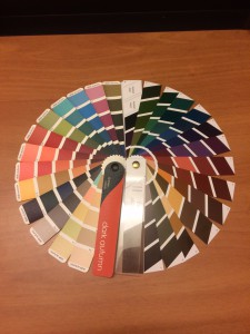
I got the PrismX11 palette in the mail yesterday, and I’m really excited to be able to share this palette with everyone. Before I do, though, I thought it was necessary to clarify some things about my experience with and approach to color, in case some people haven’t been reading from the beginning.
I’m going to be reviewing the Dark Autumn palette, and comparing it to the True Colour International version. I think it’s important for people to know that I have never been draped as anything. I came to Deep Autumn completely on my using, using the Color DIY process I have outlined.
So I don’t make any judgments in my review as to how this palette works for me as a Dark Autumn. People who practice Caygill have told me that they see me as something between Spring and Autumn. I have heard between “light spring and soft autumn.” This means, I think, that I am a lighter person, on the warm side, but too muted for Light Spring. Soft Autumn is too muted. I think I ended up in Dark Autumn as a need for an autumn that is brighter than SA.
I don’t know if this is what a color analyst would see if I sat in the draping chair and under the lights. I find that the Dark Autumn colors feel right on me, the makeup works on my face, and I think they are right for my energy.
I do find, generally, that dark colors are easier for me to wear than light ones. The wrong light color reacts horribly with my complexion. A dark color that is too cool makes me look a little gray but nothing too noticeable; the wrong light color makes me look hungover.
You can see that the very brightest DA colors (mainly the ones at the top of the TCI palette) are the ones that are missing from the new palette. These colors work well for me, as a lighter person, but I know that a lot of other DAs struggle to make these colors work and stick to the darker colors in the palette. If I were going by the color selection alone, as a lighter person, I’d probably go with TCI for myself, although I love the new purples and greens the PrismX11 has. I think most draped DAs, however, are darker than I am, and will find the absence of the colors I mentioned and overall increased dark impression of the PrismX11 palette to be a welcome change.
