I recently purchased the Prism X11 Dark Autumn palette. This is a new alternative to the True Colour International/Invent Your Image/Indigo Tones palettes already on the market for people who have been draped in or have DIYed a Sci\ART color space. While the other brands’ palettes all look relatively similar–the TCI and IYI ones especially–these look radically different.
The other fans more or less match up with the original Sci\ART fans created by Kathryn Kalisz.
There might be a few colors added here or there, but even the order is pretty much the same. The new Prism X11 fans were not created from these palettes, although Nikki Bogardus, the creator, does have original Sci\ART drapes at her disposal and was trained by Kalisz. Instead, they were created in collaboration with a Munsell color scientist, using a Spectrophotometer to determine the exact level of hue, value, and chroma in a given color. Each palette contains 70 “core” colors for your season. I will be doing a color-by-color comparison of the TCI Dark Autumn palette and the Prism X11 palette in another post. Outside of their similarity to Kalisz’s palettes, I am not sure how the exact colors for the other palettes were determined.
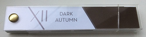
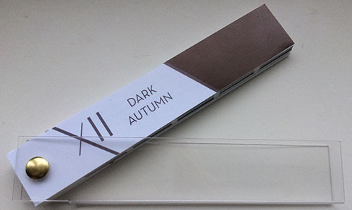
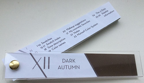
For this post, I’d like to focus on the PrismX11 palette itself, and how it differs overall from the other palette I have. First, the packaging. It comes in a plastic case that is open on one side. I like this because I’m always misplacing the plastic sleeve my TCI palette came in. I take it out of the sleeve, set the sleeve down somewhere, and then start swatching, completely forgetting where I put the sleeve. The PrismX11 is held together with a fastener that unscrews, enabling you to add more color swatches as they become available, which is an interesting concept. I don’t think these extra colors are available yet, but the expandability is a nice bonus feature. It comes secured with a rubber band–the case is hard and there is extra space for the additional pages. Nikki sells some accessories for the palettes, like tassels in your colors and leather cases, but some kind of elastic band would also be maybe a nice thing to add as an option.
The palette itself is printed on thick glossy paper, rather than the canvas of the TCI palettes. The colors seem much more complex and rich than the canvas ones, but I’m not sure if it’s better for fabric swatching, due to the difference in material.
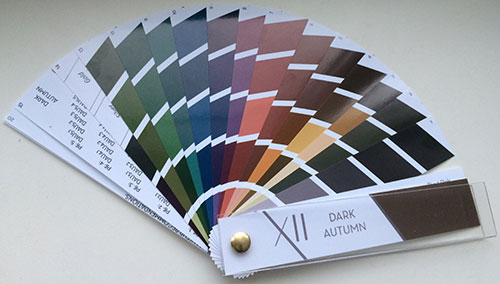
The palette also has more features than the TCI palettes. It even has an index. The extras include information on the season from Kathryn Kalisz (including some information on design lines!), which I really like having, plus the names of colors she mentioned for the season. It also has a visual representation of the season’s hue/value/chroma settings, which I’m assuming replicate the settings for the Spectrophotoometer.
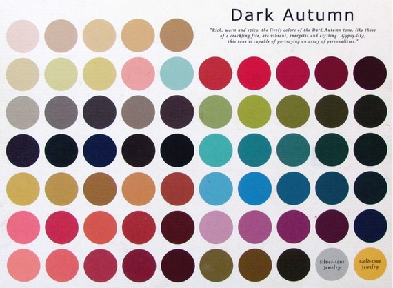
The palette definitely has a darker and more muted feel than the other palette I have. Partially it’s because the darker colors are at the top of the fan. Some Dark season people prefer this, because they find their darkest colors to be the most important. I like to have it the other way around. The light colors are the hardest to get right, and the worst when they’re wrong–for me, anyway. It also just makes the palette seem darker and heavier than it actually is. I’ll go more in depth on this in my next post, but while it looks a lot darker than the other palette, a lot of the colors are very similar–it just doesn’t have the lightest and brightest of the TCI DA fan’s colors, nor does it have an icy strip.
My overall thoughts, so far, are that I’m excited to have two options as far as Dark Autumn palettes go. I’m not sure if I would have picked this up if I didn’t want to review it and see if there were a decent option beyond the fan I already own, but now that I have it, I think it’s good to know that there is a scientific basis for these particular colors being on the palette. I will go more into the colors and how they compare to the other fan in my next post, but they are less overwhelmingly dark than it may seem from photographs or from your first impression, and I think a lot of DAs are going to find this a better option, especially if they struggle with certain aspects of the other DA palettes (i.e., the lighter and brighter colors are difficult for them to wear). I feel like our makeup options are represented better on this palette, too.
The fans can be ordered directly from the PrismX11 website and cost 54 USD. Shipping is $3.99 within the US. When I tried to order from the site, it said shipping to Europe was also $3.99, and since that didn’t make sense to me, I contacted Nikki, and she told me shipping was $13.50 and I placed my order with her personally via email. So if you’re in the US, it’s significantly cheaper than buying from TCI, whose fans are $60, but if you’re in Europe, it’s about the same.
Nikki also sells a book with the colors from all the palettes, which I think is a great tool for DIYers or for the merely color-obsessed.
Part 2 of my review, with color comparisons to the TCI palette, will be up Friday.
