Looking at Autumn Again and Adjusting Makeup

Sometimes determining your colors can feel like going around in circles. I’m really no closer to figuring out my colors than I was when I started this blog. After playing some more with the fan, I think Bright Spring results in some graying. Bright lipsticks jump off my lips like translucent candy in photographs. I think that I need some clarity and brightness, but not as much as a Bright Spring, at least.

For fun, I took the Truth Is Beauty Seasonal Analysis Quiz today, and my results were surprising. Using the knowledge I’ve gained over the past couples of weeks, I end up with three possible results, depending on the things I’m not sure of:

1. If I consider black to be overwhelming (I think sometimes it overwhelms me in photographs because the white balance gets thrown off on my phone camera, but in real life I think it’s not the worst, but it makes my eyes gray): True Autumn.
2. If I think black is good, and that pumpkin is also a good color on me (I have just never tried this color): Dark Autumn.
3. If I do not think pumpkin is good, but black is: Dark Winter.

I actually wrote about looking Spring but potentially being Autumn, True Autumn in particular, way back in July. While I feel I’m in the same spot now (see what I mean about circling?), I do think I have some more knowledge at my disposal. I know some important things about myself. These things include being high contrast as far as natural blondes go and looking awesome in bronzer. Christine Scaman talks a lot about how key bronzing is to the autumn face in this blog post. I know for a fact that my most important step, even more so than foundation (okay, well, covering undereye circles too, but that’s part of my highlighting routine anyway) is highlighting and contouring/bronzing. It really defies all logic. I have the kind of skin that’s so pale I can’t even buy foundation at MAC. You know, the kind of person for whom beauty experts say bronzer will look just look like dirt on their skin. But me? Nope, I wear bronzer, and not even the peachy kind, and all I hear is how nice and healthy and glowing my skin looks.

One of the things that has turned me away from Autumns in the past is the brownish lipstick and blush looking like dirt on me. But a couple of months ago, Cate Linden, herself a very pale Dark Autumn, posted about her own DA makeup struggles. It has made me realize that makeup recommendations are definitely not one size fits all. As a non-typical DA (pink overtones, very pale skin), she has had some trouble figuring out the makeup angle. While we would have separate issues–I would say my overtone isn’t particularly pink, but it is very porcelain and clear as hers is–it seems that whatever season I do end up in, unless it’s one where I would basically fit the stereotype, which would be Light Summer, I am going to most likely have to deviate from the standard makeup to fit my own extreme coloring.

9ae6a9ddd9ac6a5c6fbbb8e35ca8e811
Source

While we most often associate Dark Autumn with dark makeup looks with very dark, reddish-brown lip colors, there are other colors on the palette that seem like they would work as lipsticks that are not as dark, and clearer and not as brown. On a Dark Autumn who is as dark as the stereotype, these colors might be too light to work as lip colors. On someone whose starting point is much lighter, however, it may create the right contrast level with the rest of the face.

I am not saying I am Dark Autumn, of course. This is just how I would approach makeup if I did turn out to be one. (Look at how gorgeous the DA colors are! I would LOVE to be one.) Just like you address contrast level in your Kibbe according to your season (e.g., an SSu FG doing high contrast in the context of the low-contrast SSu palette), perhaps we also have to expect makeup to look normal on our face according to the coloring we have on our face already, while staying in harmony with our season’s palette overall.

Belle Northrup, “Art and Fashion in Clothing Selection”: Part Three

This post concludes my series on Belle Northrup’s article. The other two posts can be found here. One thing I would like to mention is that I have included all of the information and examples in Northrup’s article in these posts. There are no examples left out.

This post will deal with what is probably most interesting to all of you: yin and yang in women. Before we begin, however, I need to make an important point. For some reason, there is the misconception in the color and style community that Belle Northrup created the types that we are familiar with (Classic, Natural, Gamine, etc.) and McJimsey simply wrote them down. The only reference I have found for Northrup and something vaguely resembling these types is found here–see “Athletic Girl in Subdued Colors.”

With that out of the way, let’s move on to what Northrup did talk about. Northrup’s reason for talking about yin and yang in nature, architecture, art, and music is “to set up a clear and meaningful personality scale so that we may learn more easily to appraise ourselves and others.” We are to set up a personality scale with yin gentleness at one end, and yang strength on the other.

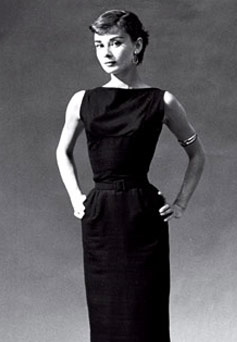
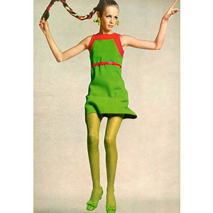
The women she uses for her examples of yin are Janet Gaynor, Joan Bennett, Lillian Gish, Mary Pickford, Helen Chandler, and Anne Morrow Lindbergh.


(Sources: 1, 2, 3, 4, 5, 6)

The women she uses for her examples of yang are Greta Garbo, Alla Nazimova, Katharine Cornell, Helen Wills Moody, Kay Francis, and Jane Addams.


(Sources: 1, 2, 3, 4, 5, 6)

From the theater, we have the characters of Electra, Cleopatra, and Lady Macbeth (no mention of whether they are yin or yang; I am going to guess that Electra is yin and Cleopatra and Lady Macbeth are yang, but I welcome other ideas in the comments); yin Mignon and Mimi; and Yang Aida and Brunhilde.

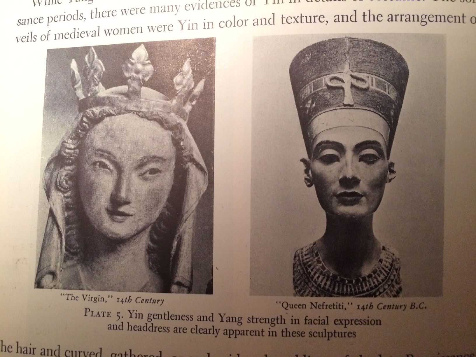
Northrup says we can also associate yin and yang women with flowers, trees, or buildings. Some yin women are birch trees, trim and delicate. Some yin children are gentle and flowerlike, and thus reminiscent of sweet peas or Queen Anne’s lace. In contrast, there are yang girls and women who remind us of the pine and the oak, and calla lilies rather than lily of the valley. They are the march and not the minuet; they are the cathedral and not the cottage.

Janet Gaynor and Greta Garbo are the two Northrup uses to epitomize the opposition of extreme yin and extreme yang. Some individuals on the list earlier may be less yin or yang, but extremes nonetheless. She says that this suggests that we can use this scale as a gauge, from Gaynor to Garbo.

Yin qualities are gentleness, delicacy, demureness, lightness, grace, piquancy, naiveté, and youth. Yang qualities are strength, force, dignity, power, serenity, vigor, sophistication, and maturity.

YIN
Physique: short, slight, graceful
Coloring: fair, light hair
Head: delicately poised
Features: small, rounded
Facial Expression: gentle, winsome
Voice: soft, light, mild
Walk: tripping, easy

YANG
Physique: tall, strong, erect
Coloring: dark hair, eyes
Head: well set on steady shoulders
Facial Expression: direct, forceful
Voice: deep, clear
Walk: strong, firm

Northrup adds that both yin and yang traits will always be seen as positives for these purposes. Yin is not weakness, frailty, and subjection, but instead gentleness, mildness, and delicacy. Yang is not aggressiveness, crudeness, or overbearing mannishness, but instead strength, poise, and dignity.

Extremely yang people are tall, dark, and strongly built. Their voices are deep, their features are forceful and well molded but not small, and their eyes are direct. Extremely yin people are short, light, and fair, with small features and soft voices. There is an ease and a lightness in their body movements.


(Source)

By establishing these opposites of what Northrup calls “personality-expression,” we can set up a scale to be used to interpret and understand not only extremes like Garbo and Gaynor, but the larger majority of people who fall somewhere along this scale.

Like in art and music, each woman has an intermingling of yin and yang. The subtlety of this intermingling makes each woman a “fascinating, individual study.” Northrup does not want to make women into yin/yang “types,” but “to see clearly their possibilities and limitations of personality-appearance with a view to dressing them accordingly.”

To understand the yin/yang balance of an individual, we should observe the person as a whole. We learn that ”

…each of her individual traits depends upon the others and forms the sum total of her personality. We will not then rate this person as a “type” because she has blonde hair or is tall and willowy–partial and inadequate judgements–but we will form a picture of her in her completeness. No one part will be overemphasized, and a fairer, broader basis for dress selection will be established.

Northrup says that during this process, you will often find hidden, attractive qualities in both personality and appearance in a person that you will want to emphasize. Using yin and yang, we can get an insight into someone’s “essential and interesting” personality. Once we have learned to appraise and “see” an individual or ourselves, the answers to problems of dress become clear.

Once you know what you are aiming for, what you want to express in a person’s appearance, selecting or designing clothes becomes even more interesting and significant.

That is how she ends the paper, and unfortunately, it seems to be where our access to her theory and methods ends as well. This paper was supposed to be a chapter of a longer book, which I assume would have gone into depth about both how to evaluate a person’s personality-appearance, and how to design for it. From what I can find, this book never materialized. This article has Northrup telling us what 1939 fashions would be suitable for yin and yang types.

I hope that you have found these interesting and helpful. If you have any information or sources that I haven’t covered here, please let me know.

Bright Spring Blonde

I finally received my Bright Spring fan, and while I haven’t really been able to go out and do a thorough try-on session in Bright Spring colors, what I have done so far seems promising. A t-shirt here, a few lipsticks there. So far, it seems to work pretty well. I know I said in a previous post that I felt like I couldn’t relate to other Bright Springs, but what I have discovered since is that there tends to be a lot of variation among Brights. Brights are tricky. They seem to usually look like something else. Tina covers this well in her post. I think I could very well be the second type she describes:

2) Those who really wear the darker colors quite well and have to use the lightest and darkest colors in combination to get the contrast they need (especially common in dark haired/dark skinned or dark haired/light complexioned Bright Springs.) Neon and almost neon colors on them are beautiful. They cannot go too bright.

Of course, I am blonde, but whatever. This is what seems to work on me. It could be a line influence, since FG is so high contrast.

I am still open to any type except Light Spring, since I saw how terrible it is. Getting every fan makes no sense, so I won’t have a definite answer until I get draped. But for now, I am going to play around in the Bright Spring color space and see what happens.

Belle Northrup, “Art and Personality in Clothing Selection”: Part Two

Today, I will finally continue my series documenting the information in Belle Northrup’s 1936 article, “Art and Personality in Clothing Selection.”

Last post, I talked about how she saw yin and yang generally, and the examples she gave of yin and yang in nature. This time, I will share her examples of yin and yang in architecture, art, period dress, and music.

Pagodas, the “cusped arches of Moorish doorways,” the decorative walls and balustrades of the Alhambra, and the Taj Mahal’s marble carvings and delicate mosaics are all yin. So are “prim little green-shuttered cottages of New England.”


(Sources: 1, 2, 3, 4, 5)

Early Doric temples, the “massive columns of the Great Hall at Karnak in Egypt,” the masonry arches of Romanesque or Norman buildings, and the “white-pillared Georgian mansions of the [US] South” are all yang. Grain elevators of the prairies and modern industrial buildings lacking ornamentation are also yang.


(Sources: 1, 2, 3, 4, 5, 6)

Gothic cathedrals combine both yin and yang. Their “towering structure and vaulted heights” represent their yang, and their “slender pinnacles and lacelike carving” are yin.

4496664562_6eba9112e6_z
(Source)

In art, Botticelli’s fragile figures, da Vinci’s subtle and tender faces, and Marie Laurencin’s pale, child-like women are all yin. The use of color gives a general impression of gentleness and delicacy.


(Sources: 1, 2, 3)

Tintoretto, Rubens, Hals, and many modern artists use pigment in a very yang way.


(Sources: 1, 2, 3)

Painting in the Sung period blended yin with yang.

220px-Chinesischer_Maler_des_11._Jahrhunderts_(III)_001
(Source)

In early Greek sculpture, we see them in contrast to one another. An Ancient Greek dancer in bas relief is yin. “Juno, Hera of Samoa” is yang. Stone as a medium is essentially yang.


(Sources: 1, 2)

Egyptian queens and medieval women wore yang costumes, regal and dignified. The portals of Chartres have carved kings and queens of Judah in austere yang forms. Smaller carvings, such as this 14th-century “Virgin,” show this dignified costume in a yin way. The statue of Nefertiti is dressed in a yang way.


(Sources: 1, 2, 3)

IMG_2025 (1)

Medieval women’s soft veils were yin in color texture, and so were Renaissance women’s hairstyles and the embroidered necklines of the late Renaissance. Yin began to predominate in the 19th century. Fichus, lace, ribbons, ruffled sleeves, bonnets, and “the short, full skirts of Marie Antoinette’s time gave to women more piquancy and delicacy than was possible in the days of Charlemagne.”


(Sources: 1, 2, 3)

Puritan dress was yang. Loyalists dressed in a yin way akin to the fashions in England and France.


(Sources: 1, 2)

In music, Debussy’s delicate strangeness is yin (listen) and the mighty sweep of a Beethoven movement is yang (listen). Chopin, Grieg, and MacDowell are yin, and Bach, Brahms, and Wagner are yang.

Graceful yachts are yin. Sturdy tugboats are yang. The Sheraton settee is yin, while the low-slung sofas of Northrup’s period are yang.


(Sources: 1, 2, 3, 4)

Next, I will cover yin and yang in women, featuring 1930s celebrity examples.

Shopping for Your Kibbe Type: Line or Vibe?

img-thing
(Source

This is an issue that came up recently in the Flamboyant Gamine Facebook group. Flamboyant Gamine is often associated with the 60s Mod fashion, with generally features a lot of short shift dresses with A-line skirts. If you read the recommendations for Flamboyant Gamine and even Gamine, however, A-line skirts are seen as “too symmetrical” and get a “No” from Kibbe for both types.

Now, these do often work on FlamGam bodies, especially if the FlamGam in question is narrow-hipped, like Twiggy. This look is, in fact, so closely associated with FG that I think that people who would look good in actual FG recommendations might question themselves if they don’t look all that great in what Twiggy was wearing in the 60s. I would consider myself among this group of people–I looked great in it in high school, when I was very thin, not so much now.

This all comes back to the question of “vibe,” and how important it is. It also raises the idea of people making something a certain type, not the clothes themselves being a certain Image Identity, something that has gained a lot of traction in Kibbe circles recently.

I think this idea, more or less what Kibbe himself says now, but something that we can’t take to an extreme, comes from the fact that clothes now are constructed differently than they were in the 80s, when Kibbe wrote the book. Most things now come with stretch. If you take a bodycon-type dress and put it on a Romantic, you see sexy curves. If you put it on a Flamboyant Natural, you see their strength and power. If you put it on a Flamboyant Gamine, it looks fun. And so on. On the other hand, if you take something that is very specifically Soft Natural, like a jersey wrap dress (my clothing nemesis!), and put it on an FG, the dress won’t magically become or look FG. It will just look bad. So you have to be careful, I think, when you go outside the guidelines. It may work. It may not. If absolutely everything were simply to be shared across types and your body would just alter it, there would be no reason for Kibbe types at all, because we’d all just look fabulous in everything.

Some would say that a wrap dress has the wrong vibe, and that’s why it doesn’t work. It probably doesn’t. It is my opinion, however, that if we spend too much time looking for vibe, we end up with something akin to Dressing Your Truth: everyone in a type more or less dressing the same. Sometimes, people are shocked when they see the photos of outfits that are Kibbe-selected, especially for types like Soft Natural and Soft Gamine, which happen to be types that have their stereotypes (“boho” and “cute, in a Zooey-Deschanel way,” respectively) firmly entrenched on Pinterest, Polyvore, etc. When this happens, I think we have to ask ourselves whether Kibbe is stretching the boundaries of what a certain Image Identity can wear, or if he is actually following the rules he set out, and it is the outfits that people found looking for an SN or SG “vibe” that actually were the ones that broke the rules. As I’ve written before, I doubt that people in the Facebook groups would recognize the outfit worn by the SG in the book as Soft Gamine if someone posted it as a try on.

As for what the role of “vibe” is in clothing selection done using your Kibbe Image Identity, well, Kibbe basically contradicts himself on this one, even in the book. He says that our inner self is infinite, yet our physical self is finite, and we should express our inner self through our outer appearance. Which is great. It is a shame that his section on how to dress Shirley MacLaine is her New Age phase has never made it online, because I think it would be helpful for people who feel at odds with their Kibbe, personality-wise. The Fantasy Quiz is also not online, sadly. But the long-winded personality descriptions for each of the types ARE readily available, and I think this can lead some astray, both in finding their Kibbe type and how to dress in it once they have found it.

Among people with certain Kibbe types, you’ll find as wide a range of personalities as you would with any random group of people. You will likely have had some common experiences due to your physical similarities (e.g., for FGs, feeling like your appearance is kind of “weird”), but you will have different tastes and interests and values. You will not be a homogeneous group.

So what should Flamboyant Gamines do with A-line Mod shift dresses? Try them on. If they look good on you and you like them, great! I think they have enough crispness to fudge the rules. I think they can successfully convey an FG look. But if you are considering a type, I think it’s important to look carefully at the recommendations, and examine things with a critical eye using these recommendations before deciding whether something is a certain type or not. Don’t blow off a type because things seen as having this type’s vibe don’t work for you. The actual recommendations may suit you perfectly.

Dark Winter Blonde, Part Two

Since I found blogging about it while going through the process to be incredibly helpful during my Kibbe journey, I thought I’d do the same thing with my season.

Unlike with my Image Identity, I don’t expect to be able to DIY my color analysis. While the tone of my last blog post may have seemed like I had settled on Dark Winter, what it was really about was realizing that Dark Winter is actually a door that is open to me, and not one that is automatically locked shut just because I happen to have blonde hair, pale skin, and (seemingly) light eyes. (Plus I just love that palette!)

Getting the Light Spring fan and seeing just how bad it was a real turning point for me because I had always just assumed that I would be a Light season, and probably Light Spring, since I wear foundation with neutral/warm undertones and it never looks weird or mismatched on me. But as Cate Linden wrote on her post on the subject, it’s extremely difficult to see these things yourself, and it’s rare that a person will be correct about themselves, no matter how good their color sense is.

So what do I expect to gain from examining my colors myself? I hope to identify certain things that can tide me over, shopping/makeup-wise, until I can get draped. So far, I have learned things like I can wear colors that are much deeper and/or saturated than you would expect from someone with my skin tone, and they look normal on me, but sheer lipstick tends to be better, especially with no other makeup. Black may not be my BEST color, but I can balance it just fine, and having both lights/brights and darks is a good thing. Heat level does not seem as important for me as intensity. Dark Winter is still in the running, but Bright Spring and Bright Winter are likely contenders. I will probably stay in this area, clothes-wise, but I will not make any investment purchases until I have had a PCA.

So that is where I’m at right now. And thank you to everyone who commented on my last post; you guys were very helpful and had some great insights and advice.

Dark Winter Blonde

b389917793843ccc60a38bfc97b483ba
(Source)

Several months ago, I wrote a couple of posts on “Banning Black from My Wardrobe” (part two is here. Over the next couple of months, I went back and forth on whether I was a Light Spring. Many told me that I just had to be some kind of Spring. I have blonde hair, blue-green eyes, and pale, almost-translucent skin with a warmth to it. Spring, right?

So I got my Light Spring fan in the mail. When I began color-matching things to the fan, I could immediately tell that it was not where I belonged. I could go darker. Many colors brought out gray shadows on my face that didn’t exist otherwise. I didn’t tick any of the boxes of how a Light Spring person reacts to colors; I just fit the stereotype.

So this inspired me to do more drapes. Everyone agreed that Light Spring was as terrible as I thought. Soft Summer was brought up, but most agreed that I was Bright Spring. Kelly green was good. Coral had something good about it, but the shade (fan-matched to Light Spring) was a little off. Some even thought black was my best.

I went to the Bright Spring group on Facebook, and like when I thought I was a Soft Natural, I felt like I really didn’t fit in. Like my experiences with clothes among the Soft Naturals, I felt like I was having a different experience with colors than the Bright Springs were having. I look great in bronzer and a smoky eye. Bright Spring lipsticks leap off my face as if the color was photoshopped on. Tina has a great post on signs you might be a Bright Spring, but none of her points applied to me.

A little voice in my head began making itself heard. It brought up the handful of non-stereotypical Dark Winters I’d seen, ones who didn’t look like Kim Kardashian and instead had similar skin tones to me. Some of them weren’t even brunettes. Cate Linden posted a beautiful picture of a little blonde girl that she had draped as Dark Winter.

Then I found this post by Rachel Nachmias, on Dark Winters who people think are Bright Springs. Every point she makes in the post could be taken from my Facebook thread where I posted my drapes. (I take draping shots with messy hair and no makeup, so I’m not posting them on the blog for posterity. I promise, though, that when I do finally get draped professionally, I will post those pictures.)

The only difference between me and the theoretical light Dark Winter in Rachel’s post is that I love dark colors. Nothing makes my heart sing more than a very dark purple, which, coincidentally, has been my most flattering drape to date. Dark circles that require two different kinds of concealer? Gone. Skin? Looks photoshopped. Face? Totally in focus.

Finding out about the possibility of me being Dark Winter makes me feel like I did when I came home to Flamboyant Gamine. All of the disparate parts about my natural appearance that weren’t making sense feel like they are suddenly coming together. I can wear very dark colors and turquoise and bright green and coral, and I am never going to try to get rid of black again. I am going to continue to experiment with Dark Winter, and let you know how it’s going.

Did your season surprise you? Do you fit the stereotype for a person of your season?

Book Review: Toni Hartman, Fabulous You!

I’m taking a Northrup breather today because I recently got this book in the mail from the always-helpful and lovely Carrie, who was cleaning out her stash and generously sent this to me. I want to talk about the book while it’s still fresh in my mind.

513HR87C7XL._SX258_BO1,204,203,200_

(Source)

As you might be able to tell from the mid-’90s realness being served up by the cover, this book was published in 1995. As such, there is an inordinate amount of attention paid to the Shoulder Pad Question, but otherwise, I think that the advice is pretty timeless.

Toni Hartman was a petite model before she became a style consultant (and now she is, apparently, a psychic). Her book differs from all of the other books and systems I’ve looked at in one major way: it does not mention taking any cues from your external appearance. Your style is not determined by your body type or facial features. You do not find out your season by draping, but instead are supposed to think about how you feel in colors and how others react to them. Your season is determined by the colors you get the most compliments in, but if you don’t feel like dressing in that season, that’s okay too.

It is the total focus on your personality and your actual lifestyle that makes me think that this book would be great for someone who is having trouble reconciling their Kibbe with their real life. Hartman, I think, really understands what it’s like to be a woman and to have to deal with all kinds of things and issues while getting dressed in a way that the male style gurus, wonderful as they are, can’t always relate to. She even covers mother/daughter relationships and dating compatibility by style type (she has style types for men, too). But I’m getting a little ahead of myself.

She divides women into six types: Sporty (closest to FN, a woman focused on her physical well-being), Romantic (closest to SN, a woman focused on love), Traditional (closest to SC, a woman focused on family), Classic (closest to DC, a woman focused on her career), Dramatic (closest to SD, a woman focused on attention), and Trendy (closest to FG, a woman focused on doing her own thing). You can also be, say, Romantic with an accent of Dramatic. You determine your type by doing a personality and style/beauty habits quiz and making a collage.

Once you know your type and your accent, if applicable, she tells you how each type should dress for certain occasions, what they should pack on a trip, etc. She gives other helpful shopping and wardrobe tips, like department store vs. boutique shopping and what “misses” and “juniors” really mean, as well as a guide to colors and what they represent and what they make you feel. Plus the mom/daughter and men stuff, as mentioned above.

As an FG who is very comfortable in FG and doesn’t have any problems with shopping, packing, etc., this book wasn’t terribly helpful for me, personally. But I think this could be great for someone to pick up who knows their Kibbe type, but doesn’t know how to make it work with their real life or how to express themselves within the parameters of their Kibbe. I think used in conjunction with something that addresses your physical appearance, it can be used to create a cohesive, flattering look that actually works in everyday life.

Belle Northrup, “Art and Personality in Clothing Selection”: Part One

I recently got Art Education Today, published by the Teachers College at Columbia University in 1936. The reason for this purchase was, of course, the Belle Northrup article contained in this journal, “Art and Personality in Clothing Selection.”

This is the only relevant publication, besides the book I reviewed, that I have found that was written by Northrup herself. (I also found an article on teaching sewing and costume design in high schools, but I will not be reviewing or summarizing that for obvious reasons.) It says that it is a chapter of a longer book that she was working on, but unfortunately, I haven’t been able to find any evidence that this book was ever published. It seems that this article is the only work we have by her that describes her approach to yin and yang.

In this article, Northrup introduces the ideas that are key to our current understanding of style identity and harmony. She begins with a fundamental question: “Who shall wear what?” She says that dress and personality bring together the costume (outfit) and the person wearing it. Emotional and physical traits are sensed as a whole. All aspects of personality and all aspects of appearance must be taken into account. We must consider what the clothes do to the individual wearing them.

Understanding the answers to these questions requires new terms to explain the complex meanings that we have only been able to “feel” previously. Northrup used “yin” and “yang” because she saw no terms in English that described this fundamental opposition, found in everything around us, as succinctly as “yin” and “yang” do. In Chinese philosophy, yin and yang set up a scale of universal opposites. Yin came to mean quiescence, absorption, and gentleness, and yang strength, penetration, and vigor.

Northrup gives many examples from nature, the animal kingdom, art, architecture, and music to illustrate her point.

YIN is tenderness: darkness and the moon, the yielding nature of water, the softness of moss, and the exquisiteness of frost traces in winter.


(Sources: 1, 2, 3, 4

YANG is force: the sun and the light of heaven, the weightiness of granite, the rigidity of metal, and the potency of flame.


(Sources: 1, 2, 3, 4)

We can see this opposition in everything around us.

A silver birch tree, a graceful willow tree, lilies of the valley, and field daisies are yin plants.


(Sources: 1, 2, 3, 4)

A gnarled oak, a towering pine, calla lilies, and sunflowers are yang.


(Sources: 1, 2, 3, 4)

Yin animals include deer, race horse, fox terriers, pekingeses, and panthers.


(Sources: 1, 2, 3, 4, 5)

Yang animals include elephants, oxen, great danes, shepherd dogs, and lions.


(Sources: 1, 2, 3, 4, 5)

In my next post, I will cover yin and yang in architecture, music, and art.

Seasonal Color Analysis and Makeup Complaints

I love makeup, and there are few things I like more than getting a really great new makeup palette. Since delving into seasonal color analysis, however, I now look at them with a more critical eye.

Take one I saw today. It’s the Stila Convertible Color Palette.
spring2015_stilaconvertiblecolor001
(Source)

Looking at it, I just have to ask myself, “Who was this palette made for?” It’s autumn on top and spring on bottom, and I don’t think there’s a woman alive who can wear both halves of the palette equally well. Any woman who is going to buy this will quickly learn that one (or neither, I think, for summers and winters) half will look great, and the other will make her look like yesterday’s leftovers.

It would have made so much more sense to come out with two $25 palettes. If they had done that, that palette would have already started on its way to me from Sephora.com. The only way I’d be able to justify purchasing the palette as is would be to split the cost with my autumn friend and then de-pot it and split it up.

Some want a “full wardrobe” of color that will “work for everyone” from a palette. But that is simply impossible, and really, then you end up with only a few select shades out of many in a palette that will actually work for you, and you’d get a better deal just buying the shades individually. I think palettes are much more successful when they focus around color as their unifying factor, rather than some theme like “flowers,” as in the case of the Stila palette above.

Take the Sephora + Pantone collaboration. I think it’s great because while yes, there are years where the chosen color will only look good on a few people. But if it’s a year when the color selected is in your palette, you have some great makeup options.

Here’s the Marsala collection eyeshadow palette.

s1658699-main-hero-300

The grays I’m not too sure about, but everything else will look so beautiful on autumn women, as will the rest of the collection.

This is the approach I wish all makeup brands would take. Group colors into groups that go together and maybe sell smaller palettes instead of trying to please everyone with one palette. We’d all get much better value for our money that way.

1 19 20 21 22 23 26