As I mentioned, I had placed an order with Kati at Fantastical Beauty. I commissioned a guide for the Iris subtype as an early birthday present for myself. I had written about Iris and why it appeals to me a couple of months ago. Once subtype commissions opened up, I knew that they wouldn’t be available for very long, so I decided to just eat the cost and commission it on my own.
In commissioning Iris, I wasn’t looking for something that perfectly fit the style I already have. When I saw on her Facebook page that Iris would pull from Dragon Princess as an influence, if anything, I knew that it wouldn’t be 100% in line with my tastes and what I already do–and that’s exactly what i wanted. I wanted something that would expand my vision for myself. When I got the Wood Puck guide, it appealed to me, but it didn’t offer me anything new. It contained what I was doing before I ever discovered Kibbe or color analysis.
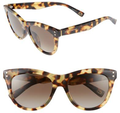
So I wanted something different, something that would help me stretch my boundaries. I am in love with the story of Iris how Kati sees it, and the color scheme, especially, resonates with me (Iris is the rainbow, so I think you can infer what her colors look like!). Being a bold and bright communicator is as close as you can get to my own mythology.
I think I will still attempt a pure Iris look, mixing it with Cat. But to make it seem more manageable to me, I would like to bring in some different elements, too. To that end, Kati posted the video on Fae and its subtypes a couple of days ago:
Fae was one of the first Fantastical Beauty types I considered, and while my s-curve is on the subtle/moderate line, I don’t think that my face is linear–more balanced/full. The lines of the recs do fit pretty well, but it’s mostly not anything that I can’t get from my Animal Familiar. The imagery of Fae and playing tricks didn’t seem right for me either.,
Puck is a subtype found in all three linear face types. I knew all about Wood Puck from the guide, obviously, but I knew very little about Puck in Fae. Here are the notes I took:
-Artistic, firecracker
-Puck in A Midsummer Night’s Dream
-Spunky Cupid
-High energy
-Romantic in a sassy/spunky way
-Romantic in a bright way, intensity
-Mischievous
-Lives in the clouds; appearing and disappearing world
-Wings/ability to fly through magic
I found a lot of common ground between Iris and Fae Puck. Both are winged beings living in the clouds, bold and intense, acting as a kind of intermediary between the gods and man. A Midsummer Night’s Dream uses an Ancient Greek setting. In some versions of the myths, Iris is actually Eros’s (Cupid’s) mother. I see a real through line from Iris to Fae Puck, even if it’s not official.
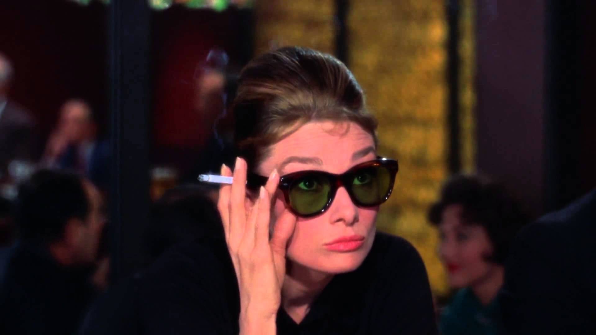
While we don’t have a guide for Fae Puck and we won’t for a while, I can see how adding a little Puck influence can bring Iris to something that suits me perfectly. Short hair, oversized sunglasses, and small touches of sass are just some examples things that Iris is really lacking and a Fae subtype could provide. I think the core would still be Angel/Iris–“duality” and “messenger” are really my key ideas, but I think maybe even a Fae lean would provide the little extra sass and whimsy I need.
Have Kati’s subtype videos given you any clarity on your place in her system?