This post uses affiliate links. A click or a purchase may result in a commission, although nothing in this post is sponsored.
I recently wrote about adding Type 3 to my style mix. In addition to clothing style, however, I am also interested in interior design, and as I look to the next year, I’ve also started thinking about the new room I’ll have after my move. Now, I have no idea how things will work out financially, but I’ve decided that the time has come for me to break up with IKEA.
I would like my space to express my energy type and my individual style. I’ve decided that the things I’ll be looking for are:
-mid-century modernesque lines/modern/art deco (FG)
-rich, saturated color palette (DA, T3)
-texture (T3)
-fun (FG)
Things I’m trying to avoid are cool metals, black, and gray. My preferred metal is brass, but gold is okay too. Textiles are something I’m going to concern myself with later, but so far, this is what I have picked out for my room… provided I somehow end up with thousands of dollars to spend on furniture.
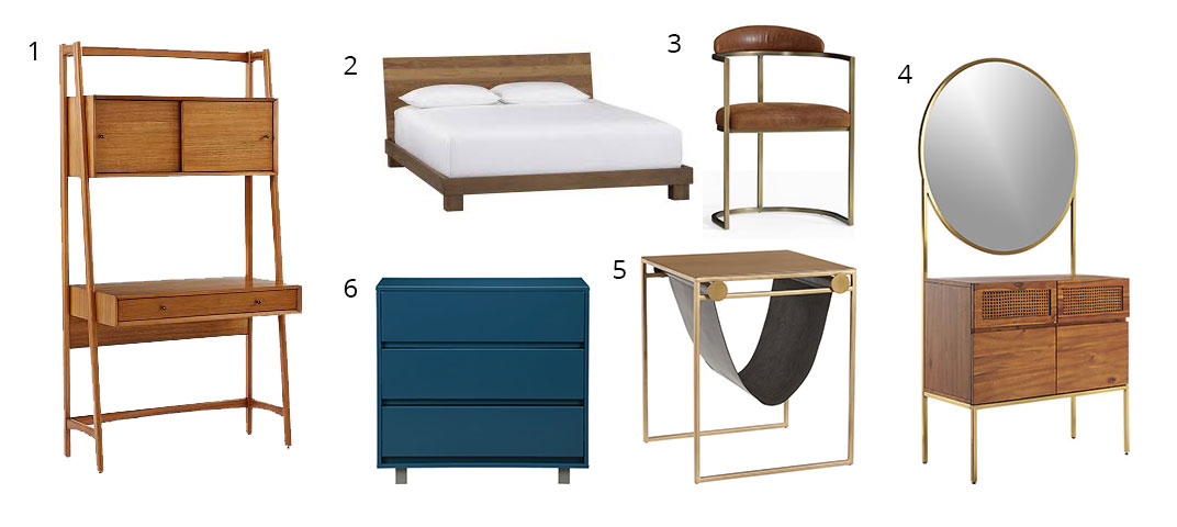
1. Mid-Century Wall Desk, $799; 2. Dondra Bed, $899; 3. Sanford Chair, $499; 4. Memento Mirror Cabinet, $749; 5.
SAIC Sling Nightstand-Side Table, $249; 6. Shop Blue Chest, $429
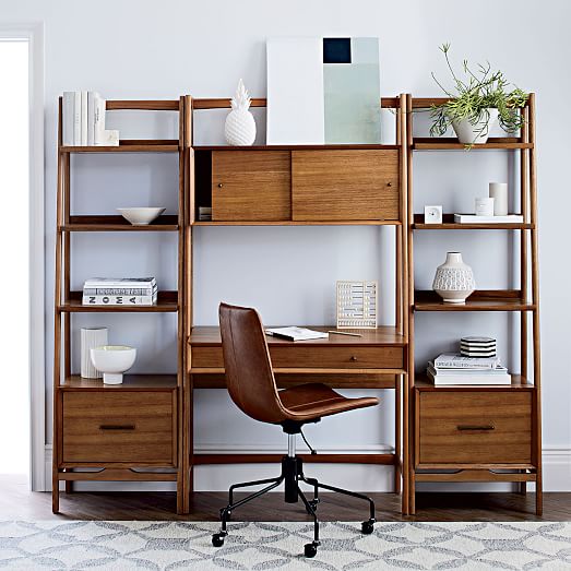
1. Mid-Century Wall Desk, $799, West Elm.
West Elm actually has an entire Mid-Century collection, and while it’s tempting and easy to just get the whole collection, I think taking a more eclectic approach looks more contemporary. But it means that there are shelves that pair perfectly with them, if you have the space (and the cash).
2. Dondra Bed, $899, CB2.
I like the textured look of the wood in this bed (very Type 3), as well as the clean lines. I want a bed with a solid headboard, but I don’t like the upholstered ones. I’m a little concerned how this wood would look with the rest of what I picked out, but it’s something I’d have to see in person.
Sanford Chair, $499, Pottery Barn.
This chair reminds me of the kind of a chair you’d find on a very fashionable 1930s film set. It was actually relatively hard to find a chair that was brass instead of silver. I’m not sure how comfortable this would be, and I may have to continue searching for an office chair, but I think this would be great as a chair to sit in and do my makeup at…
4. Memento Mirror Cabinet, $749, CB2.
I love this. As I said, I would use it as a dressing table, but it’s also something that is very flexible, and in the future, when I have an entire house or apartment to decorate, it would go great in an foyer, for example, or it could serve as a liquor cabinet (if you want a mirror above your liquor cabinet, that is…).
5. SAIC Sling Nightstand-Side Table, $249, CB2.
Yes, this has some black, but I think it makes for a very cool nightstand. The brass will pick up the other brass in the room, while also breaking up all the wood. It’s also just such a unique, creative design. There is a desk from the same line that is also unique and cool, but while I’m willing to compromise with a touch of black, so much metal that isn’t brass or gold isn’t happening.
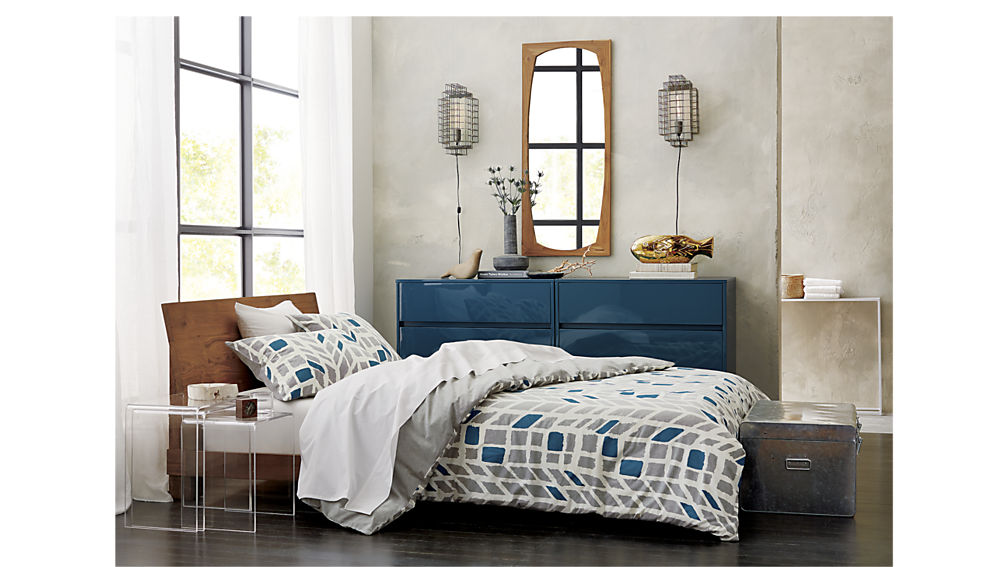
6. Shop Blue Chest, $429, CB2.
This will also break up the wood and add some color. It’s a little small, but buying two and pushing them togehter would work, as you can see in this picture with the Dondra Bed:
Now, my hope is that this would also look purposefully eclectic, rather than just mismatched… but I guess I’d have to see everything in person to be sure. If not, well, back to the drawing board–not like it’s likely I’ll be getting any of this anytime soon, unless I win the lottery.
A lamp, however, is well within my reach.

1. Cylinder Task Table Lamp + USB, $119; 2. Pillar Table Lamp + USB, $199
These lamps from West Elm are especially cool because they have USB PORTS built into them. No struggling with a wall outlet behind the nightstand, or between the bed and the wall. Technology is amazing.
Anyway, these are my fantasy picks for when I start furnishing a room with “adult” furniture, keeping my various types in mind. How do you furnish your living space? Do you consider your style types?