This post uses affiliate links.
This music video is a little strange, but the song fits where I am with my style right now.
Sometimes, we treat our style and season as if it’s going to last our whole lives. Often, though, it’s more of a stop along the way, rather than a lifelong thing.
I have noticed that I tend to change my style in some way when something major in my life changes. I started looking at Kibbe and Dressing Your Truth after I felt a shift in my life toward coming into my adult self, having my first real job, etc. I stayed in a kind of autumnal space until it just didn’t feel right anymore, and I went with 4/3 for the entirety of my time in grad school.
Now that I am done with grad school, and am working in my profession, I am again faced with my color palette feeling off. Flamboyant Gamine has been pretty constant, but wearing the T4 color palette no longer feels right to me. I know that these colors do not exist in my body, and it feels like at this point in my life, I would feel more self-assured wearing the colors that exist in me.
Wearing my season or body colors has always been something I’ve had resistance to, because I don’t get black, or neon, or many other colors that 4/3 “allowed” me to wear. For a long time, it felt like a compromise. But perhaps I’ve gotten it out of my system, because wearing the colors I loved now feels somewhat artificial.
Zyla is a system that I have been looking into for as long as I have been looking into Kibbe, Dressing Your Truth, and Sci\ART (which I no longer have faith in). But it was one where I felt like I didn’t have an archetype that felt “right” out of the box, meaning the description in the book. Zyla customizes the archetypes to the person, so some people end up with recommendations that vary greatly from what is in the book, and I’ve long felt that I would be one of those people. I couldn’t even narrow down my season apart from ruling out Summer.
But as I was thinking about it this weekend, something clicked for me. High Autumn is an archetype where other people have said that I come to mind when they read the description in the book. High Autumn is a direct, take-charge type, and that describes me pretty well.
When I was in Dark Autumn, it worked for me because it is the brightest Autumn available in Sci\ART. I do not really have the depth of Dark Autumn, though, so that was where I ran into trouble. I felt like I was a brighter Autumn. High Autumn, on the other hand, is based around the colors of Ancient Egypt. If you google this, this is one of the results that comes up:
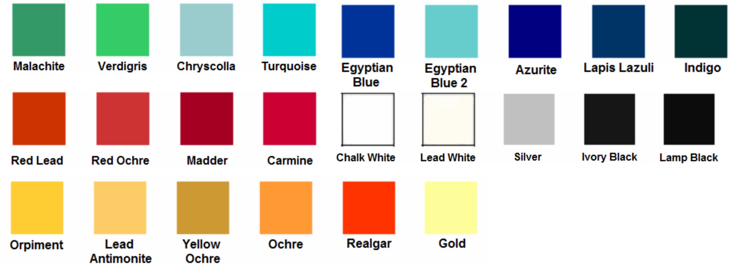
Indeed, I recognize many of these colors from Zyla’s High Autumn Pinterest board. In particular, the realgar color seems to be the classic High Autumn color, and one that actually many who know me in real life have referred to as my “signature” color. I also find all the colors in the top row in my eyes. I went hiking yesterday, and as I looked at the water, I wondered why I have been so resistant to my body colors:
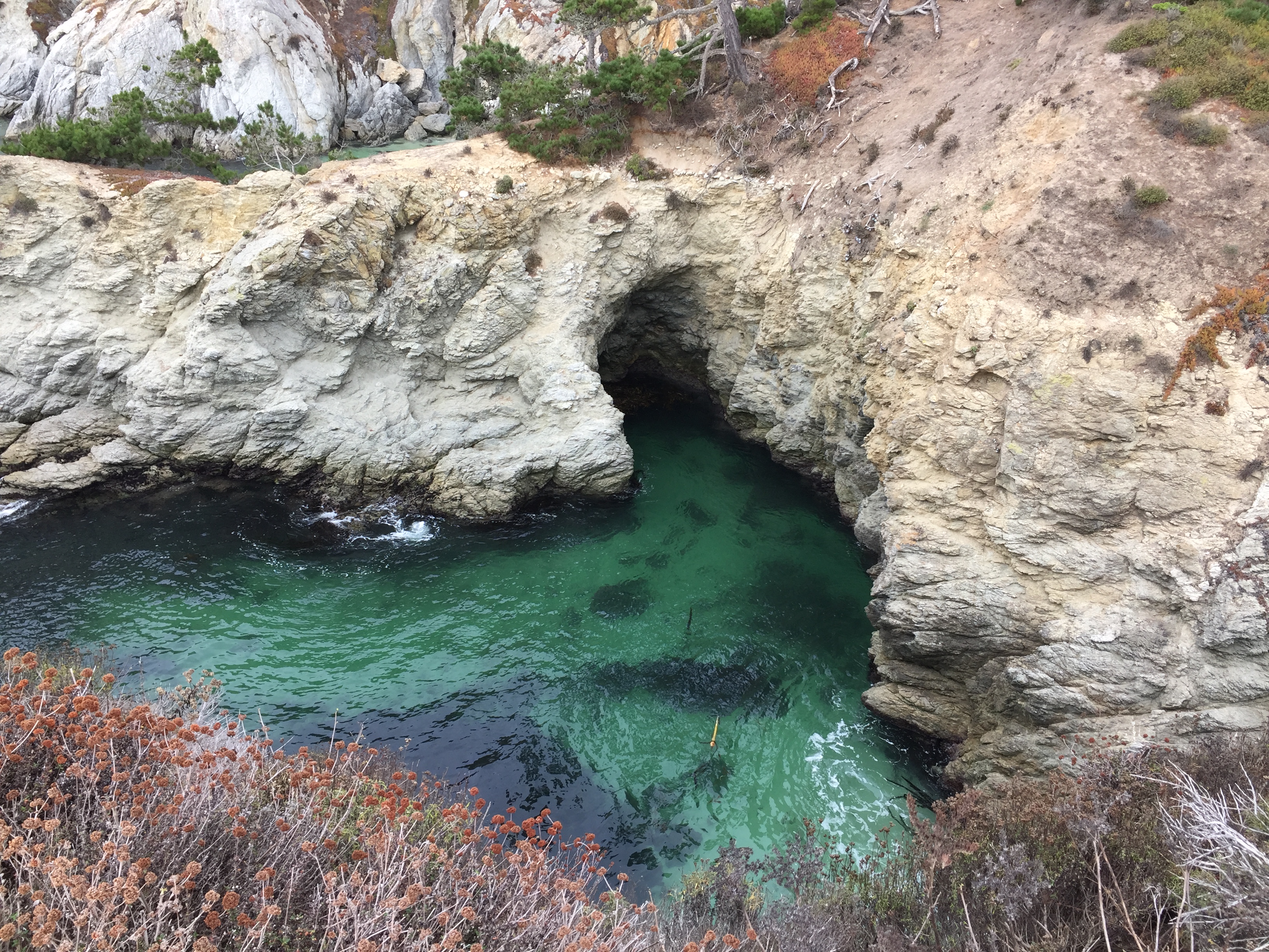
Point Lobos, Carmel, CA. October 2020.
As odd as it may seem to use someone’s Ancient Egypt college project as my color palette, I think it seems like a suitable base for a wardrobe (apart from the black and white) until things open up again and I can make an appointment with Zyla. I will perhaps add an olive green and a honey brown as additional neutrals.
The bigger challenge, I think, will be making sure I retain my style personality with the new color palette. Black is an easy way to give an Edgy sensibility to your look, and without it, it can be easy to lose it at the Core of my palette. Sporty and Sophisticated should be much easier, but they’re also not my Core. I can see that this is where I had issues with the Autumn palette before–it could be difficult for me to retain my focus on expressing what I wanted with my style, and not just buying things in the right colors.
Another issue with this High Autumn approach is that there is so little information on High Autumn. David has his Pinterest board and his book, and I have seen some information from the handful of High Autumns in the community. But it’s not like, say, Tawny Spring, where there are a ton of people in the archetype within the online community, so there is a variety of versions of that archetype you can read about, and see where you resonate in terms of style.
I have created my own Pinterest board, using some of Zyla’s High Autumn pins, some other High Autumn pins on Pinterest, and some of my own.


How my style will work with this new palette, and how to bring out the special qualities of High Autumn, are something I’m going to be working out as I plan new outfits over these next few months. It is definitely a new stage in my style evolution, and I’m excited to share it with you!
Note: I know it has been a while since I have worked on some of my other projects, like putting a new video on my YouTube channel, finishing my next Cheat Sheet, or continuing my series on The Looks Men Love. The changes that led to the change in my style have also made it harder for me to work on these projects that take a lot of time and energy, but I hope that as things settle and I adjust that I will be able to pick them back up. So don’t worry; I haven’t abandoned anything. 🙂
Stylesyntax.com is a participant in the Amazon Services LLC Associates Program, an affiliate advertising program designed to provide a means for sites to earn advertising fees by advertising and linking to Amazon.com.
Elizabeth Stewart
October 27, 2020 at 5:59 amIt’s interesting that you felt the need to change your colours after a major change in your life. I agree with you that using our own body colours is often the best way to enhance our self-presentation. I had my colours “done” in this way 30 years ago by Color1, and the palette still works well for me. When I tried to figure out my Zyla archetype I got well and truly lost, so had to give up. In person I’m sure it would be different. But when I do stick with my Color1 palette, all my colours seem right and I’m pleased with the results. The actual palette is a sort of mixture of Warm Spring and Warm Autumn, which all the “experts” say doesn’t work! It is quite like your palette of Egyptian colours above, in fact. Sci/Art in particular is quite stuffy about not mixing palettes. But whatever, if it works, it works, so go for it!
stylesyntax
October 27, 2020 at 11:45 amZyla can be really difficult if you don’t immediately relate to the one-dimensional depiction of the archetype that he has in the book.
I really cannot stand Sci\ART, lol.
Katja
October 30, 2020 at 5:43 pmI think a big problem with Sci/Art is that it covers the space it lives on in a very uneven way.
In the 4-season-system, we had two axes: warm/cool and muted/clear. That gives us four quadrants (winter for cool/clear, summer for cool/muted, etc.) and some issues around the borders. The 12-season systems evolved by adding another dimension (light/dark) as I understand it, so we are now living in 3D and would get octants, if we continued to treat the axes as binary. i.e. we would get a type for dark/bright/warm, light/muted/cool, light/soft/warm, etc.
Except that we don’t with Sci/Art. At least not in my understanding. The True and Bright/Soft seasons still cover most of the light/dark axis for historical reasons, but not a lot of color along the bright/soft and warm/cool axes, respectively. i.e. a Bright Spring goes from quite light to quite dark, but does go to no comparable amount into the direction of warm/cool — a little cooler than a True Spring, yes, but not even close to all the way. The Light/Dark seasons, on the other hand, seem quite confined to their corners of light/dark + warm/cold and bright/soft. As in, a Dark Winter can go warmer and more muted than other winters, but it can’t go anywhere near as much in the soft direction as a Bright Spring can go in the light/dark direction.
Therefore, we get holes in the system through which people that are somewhat in the middle of the warm/cool and/or the bright/soft axes fall. I have the feeling that this is what happens in my case — I am clearly some kind of winter, but too bright for DW to really fit, can tolerate too much warmth for a TW, but can’t pull off some BW combinations without makeup. To me it makes sense to conceptualize myself as a “high, but not super high contrast BW” – or in terms of octants as bright/cool/dark but not extremely so in any direction.
I miserably failed to DIY Zyla a few years ago (I have brown eyes and hair – you can imagine how it went ^^,), but in hindsight I found the exercises quite helpful to understand why something like Bright Winter works. *looks at very colorful palm*
I am very much looking forward to what you come up with in terms of an Edgy wardrobe without black. (The “Egyptian palette” above reminds me of tartan – is that an option for you?)
Best,
Katja
stylesyntax
November 2, 2020 at 12:54 amHmm I don’t have a particular fondness for tartan…
Lilit
November 1, 2020 at 9:57 pmInteresting to read you’re losing faith in Sci/Art and exploring Zyla in more detail. That’s exactly where I’ve found myself right now…. exploring Zyla because I just couldn’t find myself boxed into a single Sci/Art season. I’m some kind of winter, no arguments there, but I could draw from most of the Winters (even BSp sometimes!), but sci/art doesn’t encourage swaying from your paletter. I started looking into Zyla and what do you know – my Energy and R colours closely resemble BSp than any of the Winters. Good luck on your Zyla journey, it is difficult but so rewarding once you work it all out!
stylesyntax
November 2, 2020 at 12:54 amOh, it’s been years since I have believed in what Sci\ART is selling! I have written about it here before, but you’d have to go back quite a bit.
Dolores
November 5, 2020 at 12:14 pmNew to your blog, but can relate to feeling like sci/art is not really working for me. I was draped as DW YinG by 12B/sci/art analyst back in 2015. While it does seem that some of the DW colors are very flattering on me, I can’t help but wonder why the natural colors in my hair and eyes are not really found in the palette? Also, the cutesy YinG stuff works for some aspects of my body but when she gave me her “test”, I was between the “soft” gamine and natural categories. After research and realizing that Kibbe’s book has sort of been corrupted by all the analysts out there, I purchased the Zyla book. Still trying to figure it out but I am enjoying the facebook group and live videos he’s been offering lately. Anyway, so glad to have found your log to add to my discovery process. Thanks for sharing your resources and insight with us!
stylesyntax
November 9, 2020 at 7:57 pmYes, YinG and SG are two very different things! David himself is a part of the Strictly Kibbe group on Facebook, of which I am an admin, if you want the Kibbe information from the source. 🙂
I’m glad my blog has helped you! 🙂
Ayee
December 12, 2020 at 10:23 pmI relate so much to this post because I too have made my way through the different systems. I finally through it all out and combined them all at the same time lol. What I did was I made photo collages of as many pics of myself as I could find to determine my depth, chroma, and value. I made a collage for each of the following: One collage of me wearing black/darks and one of me wearing whites/lights to determine my depth and contrast. One collage of me wearing brights and another of me wearing muteds to determine my chroma. One collage of me wearing warms and another of me wearing cools. I discovered I have high contrast depth, I am very bright, and I am warm but not completely warm because I have light olive skin and there is a bit of coolness in my skin. In the 12 color system, I would say I am right on the cusp between dark autumn and dark winter. I am brighter than dark autumn and very high contrast, but slightly warmer than deep winter. So I use the brightest dark autumn colors and the warmest dark winter colors. After digging around, I found a book from the 80s called Uniquely You by Betty Nethary and she includes a “Bright Autumn” in her color system that I feel perfectly at home in! I also really like Jen Thoden’s system of coloring because she breaks it down by depth, chroma, and value. I am bright/warm/deep in her system. Good luck!
Keturah
December 26, 2020 at 12:05 pmLove this post so much!! I hope you’re doing well with all the life changes and thriving.
I gave up on Sci/Art as well. I am a winter of that doesn’t fit neatly into any of the boxes whatsoever. I have golden-peach skin , warm golden green eyes, and ash brown hair without a tinge of red or gold. Some of the bright winter and deep autumn shades look and feel divine on me—including realgar, despite the assertion that Winters can’t or don’t wear orange well.
I haven’t quite figured out Zyla. His system is intriguing and his Pinterest boards are stunning. The ladies who consult him have beautiful results. The archetypes associated with the palettes makes it harder to navigate for me. But I love his palettes and how he reflects body colors. In fact, that’s where I’ve landed. I have been following Carla Mathis for many years. She and John Kitchener both use a person’s body colors and make palettes unique to them. And it works so beautifully! So I’ve begun working with an image consultant who trained with Carla. It’s been utterly freeing! The deep golden moss green I love? I get to wear it as it’s part of my eye color. So is a really unique ocher golden green shade. I still love and wear fuschia. But I also have some coral reds and salmon colors. Essentially, I am a winter with some “hidden” autumn and a tinge of spring. It’s really satisfying to finally feel myself in colors rather than worrying about the “rules” and following specific palettes. I love the Egyptian palette you’ve shared. It’s stunning and very 1920s in a lot of ways too. xo
stylesyntax
January 25, 2021 at 5:46 pmThank you!
Erika
January 30, 2021 at 8:31 amThe brightest autumn available is actually True/Warm Autumn
stylesyntax
February 20, 2021 at 1:13 amIn my research, I have found that Dark Autumn is brighter, or has the highest chroma, since it has the Winter influence, much like how Bright Spring is the brightest Spring. See these sliders at the bottom of the color palettes? Dark Autumn is higher chroma and therefore brighter.
