A while back, I created a DIY Zyla palette for myself using the instructions in his book. Instead of using paint chips, I used my Dark Autumn palette, since I was already using that to guide my wardrobe. I found it easy to find my literal body colors on the palette, and my result looks like this, approximately (since the colors don’t render properly on the screen):
While I find that the top row is perfect as it is, the bottom row was giving me some trouble. I would never wear the Third Base. The Tranquil didn’t connect with me one way or the other. The Second Base is the only one I really liked.
I asked for feedback on my possible Archetype in the Zyla group. There was a general consensus that my most likely type was Gamine Autumn, with Mellow as the runner up. With the help of some very educated Zyla eyes, I realized that the ring around my iris connected more with dark gray, rather than the petrol blue I had assumed would work. I thought more about the colors in Dark Autumn I’ve been drawn to since I claimed it as my season.
Zyla palettes are rarely literal. Zyla is not looking for exact matches, per se, but evocative colors, I think. So he’ll give people a purple base, even though they don’t really have purple hair or eyes. With that in mind, I thought about how colors function on me, and came up with this.

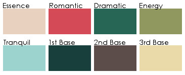
Essence: 1.1 FN (unchanged)
Romantic: 2.8 A, 2.7 A, 6.2 A
Dramatic: 4.9 A, 4.8 A, 4.7 A, 4.6 A
Energy: 3.9 A, 2.8 A, 3.7 A
Tranquil: 5.3 A, 5.2 A, 5.1 A
First Base: 3.3 FN, 3.2 FN, 3.1 FN
Second Base: 6.10 FN, 6.9 A, 6.7 A
Third Base: 7.8 A, 7.7 A, 7.6 A
(Numbers correspond to the True Colour International Dark Autumn Classic fan)
These are the DA colors that have resonated with me the most, and the ones that have made their way into my wardrobe already. My favorite casual outfit this year has been a cropped sweatshirt in my lightest/brightest tranquil over a tunic tank top in my darkest 1st base with some lighter 1st base shades thrown in with jeans in the middle Second Base color. Yellow and purple may sound a bit garish, but I don’t think it reads that way on me at all–a good case for deep purple being a neutral for me.
I did have to sacrifice the base color I liked, but it can still act as an alternate. In this new version, with the addition of yellow and purple, I can see myself. It feels more like me. If you are going with a limited palette for wardrobe planning, it has to speak to you. If you’re looking to do the same with your own 12-season palette, I recommend starting with what you already own and love, and see if these colors don’t somehow fit into a framework like Zyla’s.
tordis
September 8, 2015 at 6:57 amThis was my approach, too. I kept pinching my hand, but not understand what the hell this exercise should point to. I then thought, well, I already know which colors work and which I love. So instead of the strange green greyish pinkish tomato red of my pinched palm (I’m light olive skinned) I chose the deep fuchsia from my Winter palette for Romantic. I know that a dark foresty emerald green looks very dramatic on me. I chose a deep royal blue as my energy color because somehow, blue always gives me energy. I’m not so happy about the petrol I chose for “tranquil”. Turquoise and petrol are colors that somehow make me tired and I don’t really like them on me most of the times. 1st base black of course. Second base a deep bloody red, because somehow, I would use red in a business setting rather than elsewhere (rather than a flirty fuchsia). Third base dark grey, but to be honest, I don’t like to wear grey. No idea about pastels, I’m allergic to light colors on me. I wasn’t sure about metals, but I chose matte silver and lots of glitter, because with glitter, you can never go wrong hehe. (Especially if you’re a SG as I finally found out). Not sure about the essence color. I used the tone of my best matching foundation, but I get that this is the wrong approach. It should be a skin color that evens our own skin nicely out, as I have read somewhere.
I have no idea really which zyla typemI could be. Making the palette was just a fun exercise and as a minimalist, I really love such a reduced color palette. Going just by my quite royal jeweltones, I could be a Winter version of Jeweltone Summer for example. Going by Kibbe type, Playful Winter wouldn’t work I think, the colors are too light. Or maybe I just don’t get Zyla.
stylesyntax
September 8, 2015 at 2:05 pmI didn’t do pastels at all because they’re so bad on me and I would never use them. Metals I haven’t thought much about, but I suppose just the DA ones.
If you’re making your own palette and have complete freedom–choose colors you’ll actually wear! It’s a limited palette, so if there are two colors you’ll never wear, that’s a lot of space on your palette. What’s a neutral that you’d feel comfortable wearing? What color relaxes you? In my first iteration, I recognized early on that I’d never wear anything approaching khaki and always kept olive in mind as an alternate third base, but now I see that there’s no point in having colors on my palette I’d never reach for.
Nikki
September 24, 2015 at 6:53 amI’ve been really missing 4.9, in the way I used to miss red when I thought I was a BSp. So important to listen to your intuition! The interesting thing is that, for me at least the colors that I had already tried and loved where all in my palette except that one. 1st base was a gold mine, so much better than what I’d been doing before, and I probably wouldn’t have been drawn to that color, without making a Zyla. The light color that I originally was using as my romantic (7.1/7.2) was a fail (and here again, I simply refused to give up 7.5– intuition!)
stylesyntax
September 24, 2015 at 11:11 amI think a light Romantic is impossible for a DA 🙂
Observer
October 2, 2015 at 11:57 amI think combining the knowledge about our palette with concepts of overall value impression, value contrast, and colour contrast is a good approach. There are good articles on Imogen Lamport’s site about these colour concepts, with real life examples.
Observer
October 2, 2015 at 12:17 pmI meant this comment for Part 8 – darkness, lightness; sorry.
stylesyntax
October 2, 2015 at 12:30 pmHer site actually won’t load for me at the moment, but I did do some of the exercises. I’m not sure how well that approach would work for me, though, because I feel like my skin reacts in surprising ways. I have far more difficulty with light colors than dark ones, for instance, despite having very light skin and fairly light hair. I sometimes feel like even the lighter/brighter DA colors don’t provide as much definition as I’d like. The only place where I really tend to consider it is makeup. Christine Scaman pointed this out in her article on makeup for Dark Winter (http://www.12blueprints.com/best-makeup-colours-dark-winter/):
So as someone with light skin and hair, while I can do the dark lipsticks and somehow lighten them significantly, they will look darker on me than someone who is deeper overall. And I can wear a lipstick from the lighter side of our reds/corals, and it will look good on me, but it would probably wash out one of my darker DA sisters. Clothes-wise, though, it doesn’t seem to matter as much.
Observer
October 2, 2015 at 1:07 pmCan you wear head-to-toe dark colours (within DA)?
I am dark winter with medium-dark brown hair (level 5), pale skin, and still, dark long pants with dark long-sleeved shirt can be too much sometimes. I wear dark jeans now with a dark sweater – a bit too dark. I pull the sleeves a little bit higher – and voila, with more “light surface” (exposed lower arms), the darkness-lightness ratio is more harmonious. One has to experiment.
stylesyntax
October 2, 2015 at 1:15 pmI wore head-to-toe black almost exclusively before I discovered color analysis, so darkness is my comfort zone. Lighter/brighter colors are something I have to be mindful of and try to consciously incorporate into my wardrobe. Since my hair is light, that probably has the same effect as you exposing your lower arms.
C
January 16, 2017 at 3:20 amThere are several videos of Zyla on YouTube now, having brief segments of him picking out a color or two for someone. It was very enlightening. I was having trouble picking my essence and romantic color, because i was being too literal. He picks up undertones and colors that harmonize, not necessarily literal colors. My romantic color changed from a dusty rose (literal color) to a burgundy (undertone). He also said that not all colors on your body necessarily work as clothing. I have some gold flecks in my eyes that would be my literal tranquil color, but if i drape myself in it I look awful. So i picked a sage green instead, which is more the color you notice if you step back a bit and don’t over analyze. From reading about the Caygill method, it sounds like she picked colors in a very similar way.
BTW pastels and metallics are AFAIK just are light and metallic versions of the other colors, respectively. My energy color looks much better on me if it’s metallic. Matte olive does nothing for me, but metallic olive makes me glitter. 🙂
stylesyntax
January 18, 2017 at 2:57 pmI don’t have the patience for a full-on DIY palette… I’ll just save up money and go see the man 🙂
Metallics are also sometimes things like patterns, etc. They’re not just a version of your other colors.
Sara
November 30, 2017 at 1:11 pmI never thought of using my palette to find my body colors. This will help.