February 2018 archive

Why I Write About What I Write About

You may have noticed that there are some prominent style and color systems I never discuss, and some that I only speak about in a negative way.

As far as the first point goes–I only want to spend my time on systems that I consider valid and useful. If a system is well known and I never write about it–it’s one that I don’t see much value in. I will cover historical style systems even if I don’t find the system itself particularly useful, but that is out of an academic interest. I will not use my blog space to promote contemporary materials/businesses if I do not think that they provide much benefit to the consumer.

And then there are the ones I talk about, but only in the context of why I don’t recommend them or why their ideas are incorrect. These are generally systems that are either offshoots or imitations of another. If I seem to take it all a little too seriously, I genuinely feel that the systems I say negative things about have a negative impact on not only their clients, but anyone who is exposed to what they teach. Even my early blog posts, which I have been meaning to edit for a long time, show the influence of these bad ideas. Some of them were absolutely pervasive a few years back, before David Kibbe became more accessible on social media and was able to clear up misconceptions about his system himself. I feel that many of these systems are limiting, and do the exact opposite of what people like David Kibbe and David Zyla try to do, which is accept and harness the power of your own beauty. Instead, you’re placed in a narrow style box, or given a palette that makes you look seasick, or told that you look like an alien.

So if I seem like I take things a little too seriously, or if you’re wondering why I haven’t ever talked about a certain system–these are some of the reasons why.

Vibrant Autumn

In recent months, I’ve felt myself become disillusioned with the Sci\ART system, at least as it is practiced today. There are a couple of reasons for this.

1. My issues with the two main schools of thought.

The two branches of Sci\ART that are the most widespread, with the most analysts, are True Colour International and 12 Blueprints. I have issues with both, although these issues are different. I wrote about it before, but I simply don’t like the results True Colour gets. They drape a lot of Softs, and I think that the look they go for is flattening and graying. They make a lot of fuss about redraping former 12 Blueprints analysts and clients, and I don’t see an improvement. I don’t look at a TCI client and go, “Wow, this woman looks fabulous.” I see someone who now blends into the background.

I tend to prefer the way 12 Blueprints/Your Natural Design clients look, but the intertwining of this branch of analysts and the Best Dressed Kibbe knockoff system means that I can’t support them, either. My feelings on this subject are well known, but suffice to say, there are so many 12BP analysts that are now offering typing in this system that I feel I can no longer endorse it. I take Kibbe’s legacy very seriously; his system totally upends conventional wisdom and is so honoring of individual beauty, and he is such a wonderful and generous person to boot. The Best Dressed system undoes what it great about Kibbe.

2. The palettes feel limiting.

Despite the fact that Zyla gives you a limited color palette, many people who come from Sci\ART still feel liberated when they get their color palette. He gives people colors that are great for them, but may fall into various Sci\ART seasons. Sci\ART palettes can begin to feel a little confining, in my opinion. You need to hit all three markers of hue, chroma, and value, and then soemtimes it feels like your season is a compromise, which I will explain in a bit.

The wrong way to solve the latter problem, in my opinion, is to further limit your palette and make it more specific, like the systems do that have 16 or more seasons. I find that they are often redundant, further limiting your Sci\ART palette over adding new options. In recent months, I have actually begun to favor a four-season approach, which would have shocked me of a couple of a years ago. I’ve been using my T3 palette from DYT, actually.

After reading Tina’s blog post on her House of Colour experience, I feel like I’ve found my solution. House of Colour drapes you into one of four seasons, and then further refines it into a subseason, but you can use all of the colors of the main season–the subseason just has your bests.

On the Kettlewell (which I think is close to House of Colour), I found a blog post that has a Vibrant Autumn, which I think best describes me. I put myself into Dark Autumn from Sci\ART because it’s the brightest Autumn, and less because it’s the darkest. The coolest colors in DA are not my best, for sure. I stock my wardrobe with colors that are bright, but still have that muted/dirty autumnal quality.
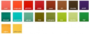
kettlewell_vibrantautumn
(source)

These are the kind of colors you’ll mainly find in my wardrobe, and the ones I get compliments on. From the descriptions on the site, it sounds like I could be their Soft Autumn (which is far less Soft than a Sci\ART Soft Autumn), since people frequently think I’m a Summer until they see how much cool colors drain me, but I think these colors are truly the best from the Autumn family for me. The Dark/Blue Autumn in Kettlewell and House of Colour is very cool, to my eye–I know we have had some people in the Dark Autumn group on Facebook who come from this methodology, and the colors they can wear are far cooler.

As I write this, I realize that the approach is very similar to what Kibbe does. He has one palette for each of the four seasons, but then the way you use the palette varies. So like with style in general, maybe once again it is Kibbe who holds the key to what works for me.

Have you looked at House of Colour at all? What do you think about what is basically a four-season approach versus Sci\ART?

February 2018 Style Update: Tawny Spring?!

This post contains affiliate links.

So a little over a year ago, I started moving away from the edgy looks of my 20s and began transitioning into style that was influenced by the late 50s/early 60s and French New Wave cinema. Since this has also coincided with a major move and weight loss, my wardrobe is almost entirely different than it was at the time I wrote that post. Anyway, as you know if you’ve been reading this blog for a while, Zyla is a system that I cycle in and out of every few months. I’m interested in his work and would love to see him, but unlike Kibbe, there isn’t an archetype that resonates with me right out of the box. And because the recommendations vary so much from individual to individual within an archetype, unless there is one where the narrow view presented in the book fits you very well, there are a number of places where you could potentially land.

I’ve generally gone back and forth between a handful of Autumn archetype and a handful of Spring archetypes. I’m back to thinking that I would likely be Spring, specifically Tawny, as recently there was a consult writeup that I read where the image he was giving is something that would suit me well. I played around and created another palette for myself:

Essence, Romantic, Dramatic, Energy, Tranquil/First Base, Second Base, Third Base

Essence, Romantic, Dramatic, Energy, Tranquil/First Base, Second Base, Third Base

I’ve also picked up some items recently that I think suit this Tawny vibe well.

The first is this Botkier bag. It’s a small crossbody, which is something that I was liking, and I was glad to find a brand that suited my style as well as Rebecca Minkoff does, but without that Scientology connection.

I love the yellow, and I also appreciate how they have matched silver hardware to the cool colorways and gold hardware to the warm. You may also have noticed that I included the large version in my Vivacious post.

I’ve never been one for button up shirts. David Kibbe is the one that pointed out that they are just somehow incompatible with my personality, and he’s right. That’s why I’ve had my eye on this shirt from J.Crew for a while, but it used to only come in blue and black pinstripes. When I saw that they had an olive for spring, I bought it immediately.

And lastly, I have been in love with the idea of a camel-colored wool coat for a while, but it had to be just the right one. The right shade of camel, a warmer and richer golden brown. And it had to have a straight cut. I finally found one, although sadly few colors and sizes remain. I’m very happy to have picked mine up and at the price I did, which was around $120.

Cocoon Coat in Italian Stadium-Cloth Wool, J.Crew, was $350, now $226.99

Cocoon Coat in Italian Stadium-Cloth Wool, J.Crew, was $350, now $226.99

So these are the key pieces I’ve added to my wardrobe lately. What have you gotten for yourself lately?

Follow me on Facebook and Pinterest.

Check out the new Resources page!

Who Should Do Your Style Analysis?

Lately, there has been a real uptick in color analysts also performing style/image analysis. I’m not talking about something like Caygill, where the style advice is built into the system. (By the way, if you haven’t seen it yet, Cornell has made Caygill’s book available for free!) I’m talking about people who were trained in systems that just look at one thing–your coloring–and now also offer some kind of style or image analysis.

Now, I can understand why a color analyst would want to offer such a service and expand their business. But just because they can doesn’t mean they should, for two major reasons.

The first is that the barrier for entry for becoming a color analyst seems to be whether someone can pay the money. Someone who is a color analyst isn’t necessarily an artist with a great eye and a great sense of style that they come by naturally. The quality of analysts, from what I’ve seen, varies widely, even with the same methodology and training. You can teach people to look for certain things, but an eye can’t be taught. The analyst, who in all likelihood is no style maven themselves, because how many of us really are, simply can’t see beyond what is in front of them, so they give you something close to what you already do, maybe just tweaking the lines a little.

Both Zyla and Kibbe have this ability to see beyond. They can look at someone and see their style potential. That is why they are geniuses. Now, you may think, “Well, [random analyst] probably isn’t a style genius like Kibbe or Zyla, but they were trained in a system to look for certain characteristics and apply this framework.” This is the second reason. Most seem to be working with some permutation of a system based off of Kibbe’s work. The fact is, there isn’t a system that is based on his work that doesn’t do the exact opposite of what Kibbe aims for with his. They put you in a box with a style stereotype, and chances are good that it’s the wrong box anyway. They don’t teach you how to apply the principles of yin/yang and express any style you want. So they are analyzing you to the best of their ability, but they are working from something that is based on an incorrect understanding of David Kibbe’s work (and there are numerous people now who profess to “teach” Kibbe; they’re all over the world, and they’re all wrong).

Now, again, I’m not talking about Caygill analysts here, or other systems where color and style are inextricably linked. I don’t know enough about these systems to criticize them, really. I am talking about color analysts who also offer some kind of “image analysis” service as something separate.

So when you see that the color analyst you’re planning to go see for a draping also offers some kind of styling or style analysis service, I would pause before adding it to your appointment. If you’ve been exploring these style systems, are you really going to get any clarity from this person, or will it just set you back more and confuse you? My money is on the latter. My suggestion would be to save up for either Kibbe or Zyla, artists who can give you their vision for your style. Being able to look at a client and see their potential is not something you can learn in a course. That’s not how you end up with this moment:

In fact, you are better off exploring on your own, learning how to apply Kibbe or Zyla’s work to yourself if you are unable to see them. At least then, you don’t have the voice of an “authority” in the back of your head and you’re not out $200 or $300.

Follow me on Facebook and Pinterest.

NEW! Resources

I’ve added a Resources page again. I used to have a list of websites I’ve found helpful, but as I got further into my studies, I realized that I no longer endorsed the content on those sites. Instead, I’ve replaced it with a list of books that I find myself referring to. I hope you all find it helpful.