March 2015 archive

Being Honest with Yourself

The great thing about knowing your Image Identity and your season is that it makes selecting clothes so much simpler. You know what lines will be flattering, and you know what colors will work. Everything more or less goes together, and dressing is easy and you always look fabulous.

At least, that’s how it’s supposed to work. But there’s a human element, too. What if you’re a “dressed up” Identity, like Soft Dramatic or Theatrical Romantic, and you’re a stay-at-home mom with four kids under ten? The dramatic looks shown on Pinterest, complete with five-inch heels, aren’t exactly practical or applicable for your everyday life. You could very well go out and buy outfits that look fabulous on you… and then they sit in your closet while you wear yoga pants every day because you really don’t wear stuff like that in your day-to-day life.

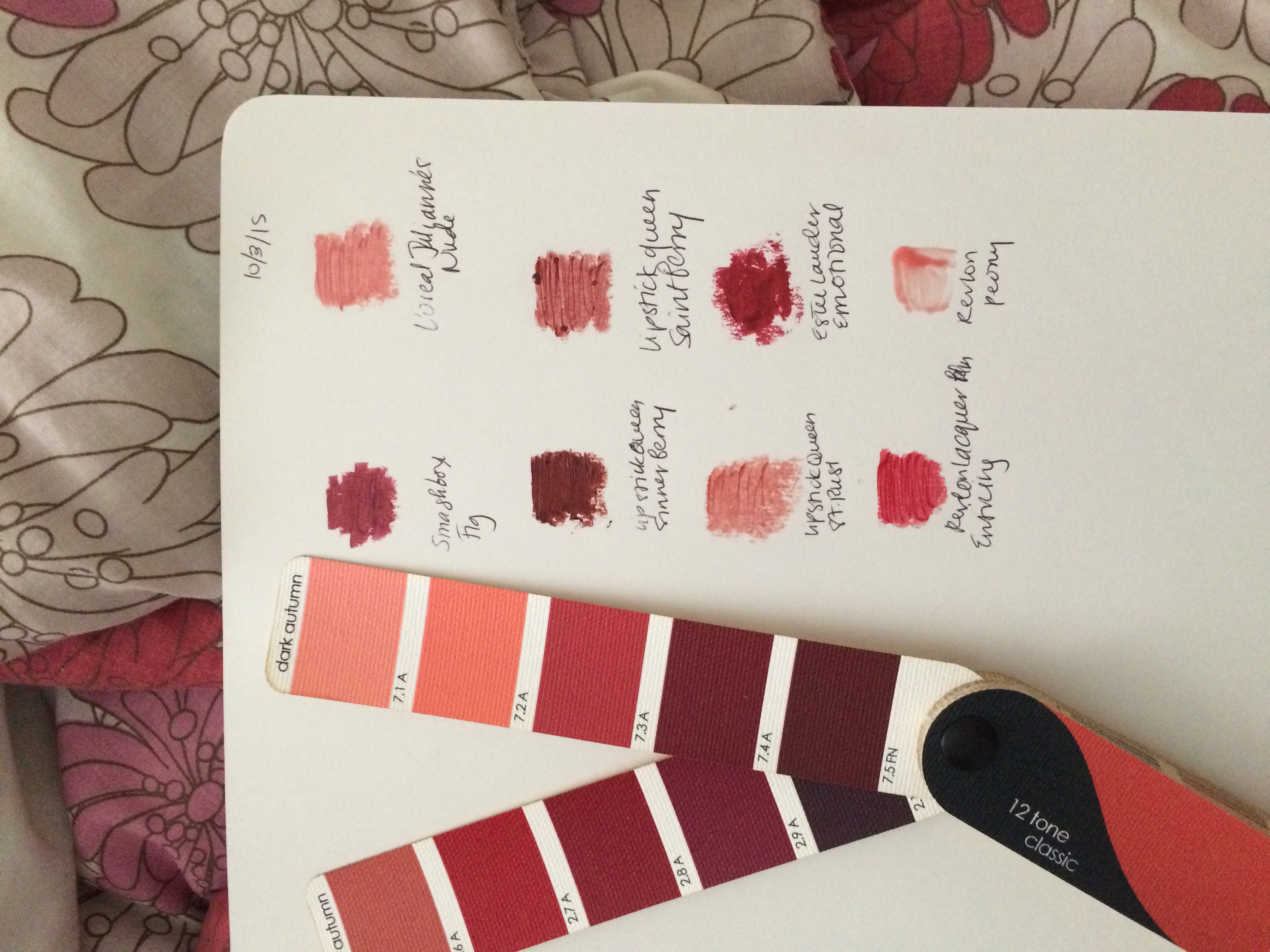
I know that I, personally, struggle with resisting to urge to buy another pair of ankle boots with heels too high for me to walk in or wear for long periods of time. I take public transport and walk long distances, often on uneven sidewalks, mud, and cobblestones. I need shoes I can walk in for two miles, not 200 feet. And yet there they sit in my closet, taunting me.

This dichotomy of loving the way something looks vs. something actually working in my real life was made abundantly clear to me recently by my hair. I love playing with makeup. I hate styling my hair. My hair is moderately wavy, but I still can’t blow dry it straight to save my life.

So naturally, I cut my hair like this.

redhair
(Source)

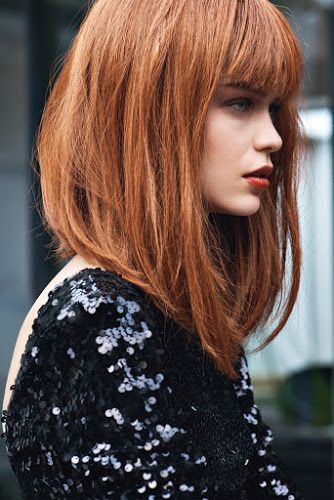
It required a full blowout every time I washed my hair, and I had to get to my bangs FAST, or it was a disaster. I’ve been going to my hairstylist for twelve years, and she tried to warn me. But I didn’t listen.

I spent a month in Florida soon after I got it cut, and the humidity there turned my waves into full-blown curls. Even a straightening iron couldn’t save me. I ended up straightening my bangs several times a day as best I could, and putting the rest into a ponytail. Someone more dedicated and better with hair probably could have found a way to make it work. But I’m not one of those people.

I realized that what I require from a hairstyle is two things:
1) Something that works with my natural hair texture
2) Something where the maximum amount of styling required is putting in some styling goo and mussing it around.

So I went back to my stylist and gave her this picture. Wham. I no longer need a blowdryer, and my waviness is an asset, rather than something I have to struggle against.

Lesson learned. High-maintenance hairstyles just don’t work for me, even when they look great with my FlamGam bone structure.

What are the things that, while they work for you aesthetically, just don’t work in your daily life?

Dark Autumn Blonde, Part Two

IMG_2380

Since I wrote my last post, I have been experimenting with the Dark Autumn color space. I have amassed a collection of Dark Autumn lipsticks, some I already owned, some that were made possible by a killer sale on Lipstick Queen at my salon, and some I just splurged on. I also stumbled upon a sweater in the color I talked about in my last post, the draping card that looked really, really good with my skin.

Unfortunately, the beginning of spring is really the wrong time to begin exploring Dark Autumn. There is next to nothing in the stores, apart from what’s on the sale rack (where that sweater was). Now that I’ve received my fan, I’ll be able to go and seek out tops from the lighter side of the palette without fearing that I’ll mistakenly dip into another season. But of course, what I really want to find are pieces in Dark Autumn’s darks, the beautiful, better-than-black, yes-it’s-a-color-but-it’s-a-fashion-neutral colors.

If you are not familiar with the way True Colour swatch books are laid out, each swatch is labeled with either “A,” for “accent,” or “FN,” for “fashion neutral.” One of the interesting things about the DA swatch book is that so many of the colors are labeled “FN.” Coming from Bright Spring, where I felt like there weren’t very many, those extra darks that count as neutrals are very intriguing to me.

On the other hand, I feel like there is less variety in my makeup possibilities. The swatches in the photo above feel like a complete lipstick wardrobe to me. Any other lipsticks that I both like and fall into DA would feel like a repeat to me. Bright Spring, you have your pinks, your reds, your corals, maybe your oranges… But I may make discoveries yet. I eagerly await Cate Linden’s updated DA makeup post.

(And if you’re a DA and see a major gap, by all means, let me know!)

Also, DA is way brighter than people think it is. Just a little PSA. 🙂

Lastly, I’m not the biggest fan of Color Me Beautiful, but I was reading the men’s book today, and read some things that I had missed when I read the version for women:
1. CMB Autumns are more likely to sunburn than CMB Summers.
2. Ivory skin and ash blonde/dark golden blonde hair are all options for CMB autumns.
3. CMB Autumns can have turquoise eyes with a teal gray ring around the iris–which is exactly what I have.

So that’s interesting. Anyway, if you are a DA and have tips, please share.

Dark Autumn Blonde

Today I did the experiment I mentioned in this post. To review, I purchased Truth Is Beauty home draping cards for six season (Light Summer, Soft Summer, Soft Autumn, True Autumn, Dark Autumn, and True Spring) and took a picture of each season’s fan underneath my chin. But before I posted the pictures, I cropped the colors out, so all you saw was my face. Online color analysis has limitations no matter what, but I felt like this got rid of one of the major problems: people see what they want to see. If they like a color, that’ll influence their opinion. If they feel in their heart of hearts that you’re a Soft Summer, that’ll influence their opinion. This way, all they were looking at was the effect of the color on my skin, not the color itself.

When I posted the photos, the results came in quickly. The worst was Light Summer. The best was… Dark Autumn. And when I posted the individual colors of Dark Autumn (again not showing the color itself), the best color was this one:
newts
(Source)

The attractively named “Newt Green.” Definitely not a color you could imagine a Spring or Summer wearing.

I think this experiment was a successful one. People looked at what I wanted them to look at–skin effects–and not my hair and eye color. I’m not taking this to be the same as being draped Dark Autumn, but it’s enough to make me seriously consider it and want to experiment with it.

What Is Kibbe (to Me)?

11/21/19: This post is ancient! I definitely no longer feel this way, since I have been able to learn from David himself. 🙂 Please see the home page for my current thoughts on everything Kibbe-related!

abstract-force-homage-to-franz-kline-1952.jpg!Blog
(Source)

When I first started this blog, I imagined that I would do things like put together Polyvores on how to, say, dress boho if your Image Identity is Dramatic Classic. But blogs, I think, end up taking a life of their own, and determine their own direction, and this particular blog has ended up more like a research notebook of my theoretical thoughts on Kibbe, as well as a journal of my own color and style journey.

Kibbe’s system is a particularly complex one. For whatever reason, he doesn’t say out loud the things that become clear if you really look at the celebrity examples he gives, things I’ve talked about in my recent posts, and things that Sarah has seen and developed further in her Guiding Lines system.

One of the problems with Kibbe is how he contradicts himself. He says that personality doesn’t matter, and then he writes a lengthy explanation of the personality of each type. He gives a list of things you won’t find in the face and body of a given type, and then in real life gives this type to people who do have these things, like hourglass FNs. So we’re left with all of this conflicting information, often feeling like we understand less about the system than we did when we started.

What ends up happening is that, after a while, we all end up with our own understanding of Kibbe’s system and how it works. Are there any that are right? Many would argue that Kibbe is always right, and the only way you can truly know your type is to go see him. But there are a couple of specific instances where I have disagreed with Kibbe on how he typed someone, and they received other analyses that seemed more suitable for them.

My personal understanding of Kibbe is as follows: 1) Your Image Identity is defined by your lines. You can see them in your face, your body shape, even the shape of your fingernails. You are matching the lines of your clothes, jewelry, hair, etc. to your own lines. 2) Style is something completely different. Your task is to figure out how to express your style using these lines. “Vibe” is a myth. While some are more challenging than others (such as the aforementioned DC boho), theoretically, anything is possible. 3) Strike the word essence from your Kibbe vocabulary because it will only confuse you.

Does everyone agree with me? Of course not. People have their own views, and some have even developed their own Kibbe-based systems. Rachel Nachmias, for instance, says she considers “the extra je ne sais quoi that some have called ‘essence.'” Who is correct? Both. Rachel’s is correct within her own system; mine is correct within my own.

I don’t have plans to go into image consulting or anything like that. But I enjoy discussing it, and I think that what Kibbe started works amazingly well. But if you are looking for information that does have to do with this “essence” business and using it to determine your Kibbe Image Identity, you’ll have to look elsewhere, since it doesn’t fit with what I have found to be true in my own study of the information presented to us by Kibbe.

An Online Color Analysis Experiment

Recently, Christine Scaman wrote a post dealing with the comments she receives that she must be a summer. She handles this all much more graciously than I would, and even still, you can see people in the comments insisting she is a Light Summer. (!) If Christine can’t get it right in the eyes of the Internet, really, what hope do the rest of us have?

This brings up a major issue with asking people online for help in determining your season when they are not an analyst standing in front of you during your draping who is trained in the system you’re exploring. Analysts trained in Sci/Art or 12 Blueprints look at your skin during a draping. Your hair is covered. No one looks to see whether your eyes have spokes or an Aztec sun.

And yet people are used to the body-color way of doing things. They want to see what they perceive as “harmony” between your hair color and your most flattering clothes. We all do it, whether we’re aware of it or not. We have our own preferences that affect our judgment. Now, I have nothing against this way of doing things. I am open to the idea of a Caygill or Caygill-derived analysis after a 12 Blueprints analysis, because I think it may help me understand where my sweet spot within my 12 Blueprints season lies. I am fully aware of and in agreement with the fact that I’d probably end up a Spring in Caygill. But this does not mean I am a Sci/Art Spring, or that I should look at Light or Bright Spring again. In Light Spring, I’m pink. Bright Spring totally overpowers me. I simply need more depth than Light Spring and can’t balance Bright Spring. Yes, I’m blonde with very pale skin that is slightly warm. That does not mean that these are my only options.

Soon, I will be receiving color cards from Truth Is Beauty in the mail. I ordered True Spring, Light Summer, Soft Summer, and the three Autumns. When I use these cards to drape, I plan to post them without the card showing, with the focus just on my face. This way, I hope, I will get a response that looks just at my skin, not at my apparent lightness in relation to what I am draping with.