Archive of ‘Personal’ category

Style Resolutions for 2016

Happy New Year
(Source)

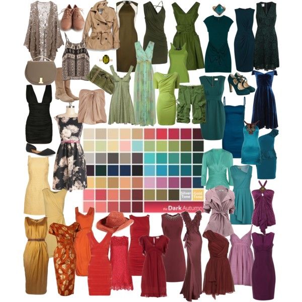
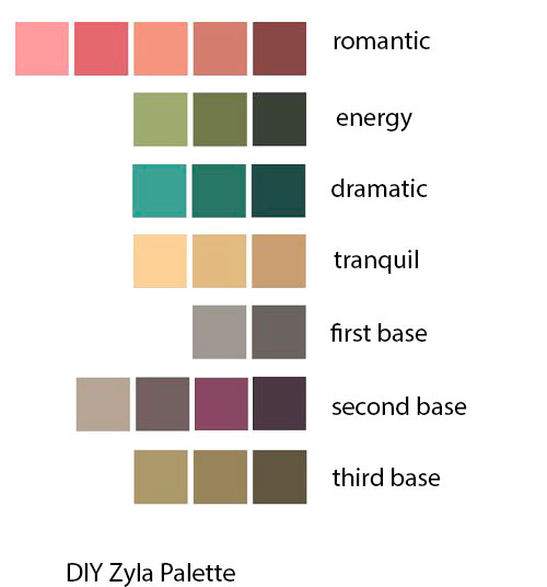
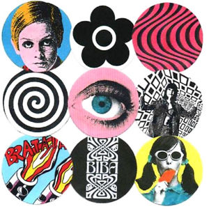
With the end of 2015 comes resolutions for 2016. This has been a year where I’ve nailed down my season as best as I can without getting draped and further developed what “Flamboyant Gamine” means to me. I’ve decided upon my Zyla archetype, and have used it to refine my season and my Kibbe. Now that the work of deciding what I am is done, for now, my task for 2016 will be wardrobe rebuilding. I created a roadmap for myself while writing the workbook, but I definitely still have a long way to go.

What I’ll be concentrating on in the coming year is:

1. Accessorizing!
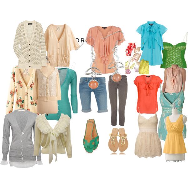
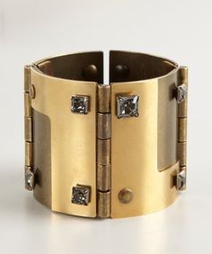
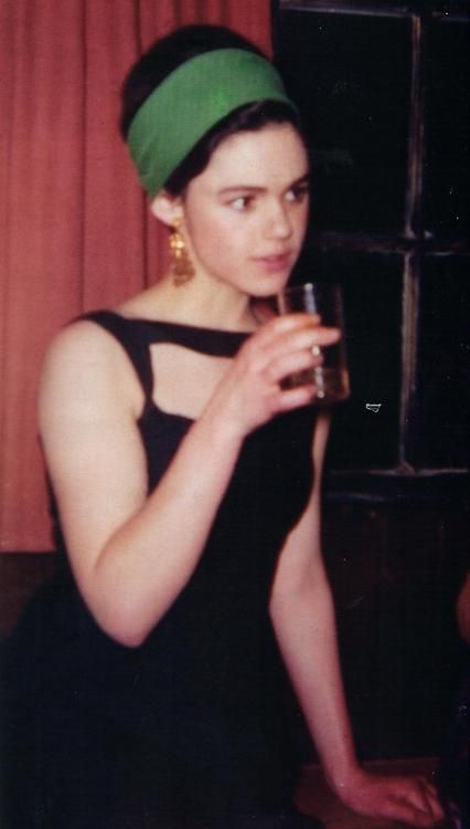
I tend to err on the side of practicality when it comes to clothing. I have a limited budget, so when I do have money to spend, I’m far less likely to purchase accessories than I am something that I need in order to stay warm or just clothed in general. You can walk around without jewelry just fine, but walking around naked in winter would certainly garner some stares (and an arrest). Jewelry is my last priority.

I also have trouble finding what works for me. I have a jewelry board, but it’s mostly out of my price range and some of may be too heavy for me. I have to be careful to stay in FG and not go too far into FN. And the kind of jewelry I like can’t be found by the basketload at a place like Charming Charlie’s.

Despite the fact that I don’t remember the last time I wore jewelry, I know that it’s an important element for creating a head-to-toe look for any Kibbe type. I need to take some cash and do some damage at H&M or Forever 21 to have something to wear while I work to supplement the cheap stuff with nicer pieces. I will probably seek out necklaces first, since they won’t bother me when trying to type at work or interfere with gloves and coat sleeves like bracelets or rings would. I also have sensitivity issues that make cheap earrings something I can’t do.

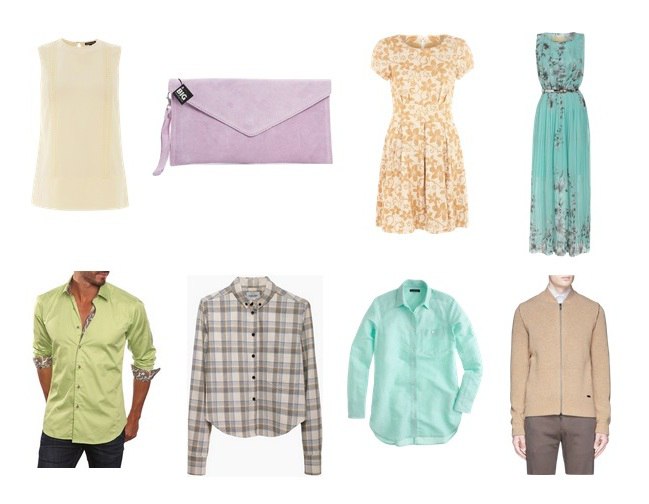
2. Building up my One-Star wardrobe.
One of the central ideas of the workbook is “The Three Levels of Dress,” so roughly casual/business/formal. I call the second level “one star,” and it’s the one that is almost completely lacking from my wardrobe. My job doesn’t have a dress code, and if given the choice, I’ll go with what’s more comfortable. But the archetype I created for myself is “Grown Up Punk,” and I think that a more polished, “higher level” daily look goes along with that. Occasions that absolutely require one-star dress come up rarely–the only one I can think of is when I’m visiting my dad and he wants to go to a restaurant that doesn’t allow jeans–but I think that if I really want to fulfill the “grown-up” part of my archetype, it’s something I need to work on.

3. Getting fully dressed.
This goes hand-in-hand with one of my personal resolutions, which is to get to bed and wake up earlier. It’s all I can do most mornings to make it out the door vaguely on time. A head-to-toe look, however, is key. I need to do more in the morning than just run a brush through my hair and slap on some moisturizer and lip balm. So if I could style my hair and put on some minimal makeup, it’d go a long way toward making my look more polished overall.

What are your style resolutions for 2016?

What Do We Get Out of Color and Style Analysis?: Color

The other day, a friend of mine commented that it was the second time in our eight-year friendship that she had seen me wear lipstick. It’s true that I never used to wear lipstick, or if I did, the shade was so nude you wouldn’t even notice it. I would buy the pinks and reds generally recommended for fair-skinned blondes, but I would never wear them out of the house. When I did, I would get comments like, “Oh, you’re wearing LIPSTICK.” I didn’t understand how to choose lipstick that I would actually wear out of the house and feel comfortable in.

Same with colors in clothes in general. Most of my wardrobe was–and still is, since replacing an entire wardrobe takes time and money–black and gray. When it came to adding color to my wardrobe, I didn’t even know where to begin. How could I be sure that something would flatter me?

There were a lot of missteps along the way, and for a good reason. Most of what I’ve heard all my life is in line with the advice for Light Summer and Light Spring: turquoise, pinks, lighter colors. Nothing too dark. When I started looking at color analysis, I assumed that this was my fate. I resigned myself to bright and light spring colors.

light_spring_colors
(Source)

But once I actually had a Light Spring fan in my hands, it was clear that it was bad. Really bad. It was a long process, but I found myself staring at Dark Autumn.

It didn’t seem to make much logical sense. How could my leading characteristic be darkness when I was so light to look at? But the colors worked, even notoriously difficult colors like yellow. Putting together Dark Autumn colors is easy and feels right. Dark Autumn lipsticks, even some that look very dark in the tube, look right on my face. I’ve gone from never wearing lipstick to having it often be the only makeup I’ll put on.

dark_autumn_dresses
(Source)

The colors in the Dark Autumn palette are so unexpected for my natural coloring that, although they are colors that I am drawn to and appeal to me, if I hadn’t come to Dark Autumn through color analysis, I never would have reached for them myself. It would never have occurred to me that this is the color family that suits me. You’ll never find a picture of someone with my coloring as a celebrity example of a Dark Autumn palette–although blonde hair with a lot of depth, eyes that are a deep mix of green/blue/gray with spots of yellow, and pale skin are fairly common among draped Dark Autumns in 12-season analysts’ portfolios.

What color analysis has enabled me to do is understand how to use color. I have a fairly strong background in art, so I know how to use color more generally, but I was at a loss at how to use it on myself. It freed me from literal my-lips-but-better colors and always selecting black or gray.

Seasonal analysis can seem quaint and old fashioned to those whose only reference is something like this video. But contemporary color analysis enables us to pinpoint exactly which colors flatter us and bring out our best selves. It enables us to select clothing and makeup with confidence, and more practically, it creates a wardrobe where everything coordinates perfectly.

————————————————————————————————–
Know your type in several systems but having trouble putting it all together? My workbook can help.

Zyla Update

I always know when something’s not working when I stop shopping. It’s been especially noticeable this fall, since it’s the time of year when Dark Autumn colors are easy to find, and I think this year has been especially kind to Autumns.

But something wasn’t clicking for me. While there were a lot of things in-store that looked like they should fit the idea of Dark Autumn-Flamboyant Gamine-Gamine Autumn I’d created for myself, I just didn’t feel particularly motivated to buy anything. Something was off.

I love my DA palette. I love being Flamboyant Gamine. It was the Zyla archetype that was off. It was limiting me in ways that gave me the same feeling as trying out Soft Natural and Soft Gamine did. It wasn’t really appealing to my personal aesthetic and it felt too boho.

As it turns out, I think my Zyla designation was only partially correct. I got the season right, but not the archetype.

When I realized I was experiencing Zyla confusion, I first wondered if I could be a Spring in Zyla (but still keeping the same color palette). My DIY palette seemed to be on the brighter side. In real life, I also come across as very young. Maybe I was missing some fun in my wardrobe. Tawny Spring seemed almost right, but a little too rounded for me. And could my colors really be translated into a Spring archetype?

I made collages and a video, and posted them in a Zyla group on Facebook. I’d never done an essence video before, as I don’t think they’re really effective for Kibbe because people tend to concentrate on personality when they see a video. But Zyla does rely more heavily on things like personality and voice quality. I thought people would see me as relatively scattered and ineloquent on video. But to my surprise, people still saw Autumn. More specifically, people saw Mellow Autumn.

Here’s the thing with Zyla, and what makes it so complicated to do by yourself. Each person not only gets a unique palette, but they get unique style recommendations. I’ve seen some Mellow Autumn Pinterests, but nothing connected with me. Then I read the Mellow Autumn recommendations of a woman who also identifies with Flamboyant Gamine in Kibbe, and hers were very edgy, and very in line with the clothes I wear already.

I wouldn’t wear this…
Mellow_no

…But I’d definitely wear this:
mellow_yes

(Source: Zyla’s MA Pinterest board)

I also refined my DIY palette a bit, fixing my color settings in Photoshop so that the colors were truer to the palette and adding some secondary color choices:
diy_zyla_new

I hope that keeping Mellow Autumn in mind–I think of it as sophisticated, yet edgy and avant-garde–can help get me back into the style groove. Maybe I’ll actually buy some clothes soon.

Dark Autumn Blonde, Part Eight: Clearing Up Misconceptions

The names of the seasons can sometimes lead people in the wrong direction. The two seasons where I think this comes into play the most is the two “dark” seasons. It was difficult for me to claim Dark Autumn for myself without a lot of support from the online community–I felt kind of crazy, being as as light-to-look-at as I am and claiming this rich, dark season.

This is what people think Dark Autumn looks like:

вф_судуиы
(Source)

But it can absolutely look like this.

I wouldn’t fit into the first image, and who knows if these women are even Dark Autumns at all. Out of the women and men I’ve seen who have gone to analysts and come back as Dark Autumns, you’ll find everyone from natural blondes to the darkest brunettes.

I do think that with the Light seasons, they do tend to look more like you imagine. The light-to-dark range in these palettes isn’t very dark, and you need to have a person who truly cannot handle a wide range of depth–this is especially true with Light Spring.

дыздыг

(Source)

You can see how wide the range is for Dark Autumn and Dark Winter in comparison:

da_dw

(These palettes are the Invent Your Image palettes.)

I was reminded by this the other day, when Color Harmony posted a blog post breaking down the Dark Autumn palette into groups–groups of color and then light/soft/dark/bright. (Blog post is in Russian, but you can run it through Google Translate.) Many seem to think that the only way the Dark Autumn palette can look in clothes is like this image from Sabira’s blog post, representing the dark colors in DA:

dark_da

But this set is no less Dark Autumn than the one above:

light_da

What Dark Autumn colors seem to have in common to me, and what I can see in myself, despite my apparent lightness, is that it is like all of the colors just have a touch of Burnt Umber in them. The colors can be bright or even light, but there is always that touch of brown. When I got my prescription sunglasses with dark brown lenses this summer, my first thought was, “Whoa, the entire world is Dark Autumn when I look through these.”

The names of the seasons are just that, names, helpful ways to categorize the seasons. Sure, Dark Autumn and Dark Winter go deeper than other seasons. But that doesn’t mean that’s the only trick they have up their sleeves. (For a look at Dark Winter through new eyes, check out Rachel’s blog post on Dark Winter’s brightness.)

Dark Autumn Blonde, Part Seven: Revisiting My “Zyla” Colors

A while back, I created a DIY Zyla palette for myself using the instructions in his book. Instead of using paint chips, I used my Dark Autumn palette, since I was already using that to guide my wardrobe. I found it easy to find my literal body colors on the palette, and my result looks like this, approximately (since the colors don’t render properly on the screen):

Untitled

While I find that the top row is perfect as it is, the bottom row was giving me some trouble. I would never wear the Third Base. The Tranquil didn’t connect with me one way or the other. The Second Base is the only one I really liked.

I asked for feedback on my possible Archetype in the Zyla group. There was a general consensus that my most likely type was Gamine Autumn, with Mellow as the runner up. With the help of some very educated Zyla eyes, I realized that the ring around my iris connected more with dark gray, rather than the petrol blue I had assumed would work. I thought more about the colors in Dark Autumn I’ve been drawn to since I claimed it as my season.

Zyla palettes are rarely literal. Zyla is not looking for exact matches, per se, but evocative colors, I think. So he’ll give people a purple base, even though they don’t really have purple hair or eyes. With that in mind, I thought about how colors function on me, and came up with this.

zyla_palette_new

Essence: 1.1 FN (unchanged)
Romantic: 2.8 A, 2.7 A, 6.2 A
Dramatic: 4.9 A, 4.8 A, 4.7 A, 4.6 A
Energy: 3.9 A, 2.8 A, 3.7 A
Tranquil: 5.3 A, 5.2 A, 5.1 A
First Base: 3.3 FN, 3.2 FN, 3.1 FN
Second Base: 6.10 FN, 6.9 A, 6.7 A
Third Base: 7.8 A, 7.7 A, 7.6 A

(Numbers correspond to the True Colour International Dark Autumn Classic fan)

These are the DA colors that have resonated with me the most, and the ones that have made their way into my wardrobe already. My favorite casual outfit this year has been a cropped sweatshirt in my lightest/brightest tranquil over a tunic tank top in my darkest 1st base with some lighter 1st base shades thrown in with jeans in the middle Second Base color. Yellow and purple may sound a bit garish, but I don’t think it reads that way on me at all–a good case for deep purple being a neutral for me.

I did have to sacrifice the base color I liked, but it can still act as an alternate. In this new version, with the addition of yellow and purple, I can see myself. It feels more like me. If you are going with a limited palette for wardrobe planning, it has to speak to you. If you’re looking to do the same with your own 12-season palette, I recommend starting with what you already own and love, and see if these colors don’t somehow fit into a framework like Zyla’s.

Dark Autumn Blonde, Part Six: Looking at Soft Autumn

In response to a fairly recent post, I got a comment telling me check out seasons called Deep Autumn Soft and Soft Autumn Deep, which I believe are part of the 16-season system, a system used by Lora Alexander at Pretty Your World.

This system, despite having similar-sounding names, is an entirely different animal from the Sci\ART-based systems. For one, draping is not required. Season can be discerned through the harmony of body colors–eye color and hair color are definitely considered. This is the issue I’ve had with people annoying me by insisting that I’m summer that I wrote about in my last post in this series.

So anyway, I knew that I would not be either of these seasons anyway, because I would be far too light to qualify. But it did plant a little seed of doubt about Soft Autumn in my mind. Could I be Soft Autumn? It would seem more logical, sure. Right as I was pondering this, a Russian-language blog on color and style did a post breaking down the different colors in Soft Autumn. (You don’t need to know Russian or even use Google Translate to understand what I’m talking about in regard to this post, since the visuals accompanying the text make it pretty clear). The lights, neutrals, darks, and brights of Soft Autumn have been separated. This gives me a very different impression of what Soft Autumn looks like than what I normally think of it looking like, which is this:

saleaves
(Source)

Compared to other palettes, it has always seemed a bit dull to me. All of the colors seem watered down and a sort of murky green or coral. But it’s true that in order to appreciate a palette, you have to see the colors. You have to see them in a context other than square boxes of color lined up to represent a seasonal palette. You need to see the clothes. And in Color Harmony’s interpretations, the dark and the bright Soft Autumn colors look pretty good to me. They look like things I could wear easily.

But the neutrals and the lights… This is where it falls apart. My winter jacket, for instance, is a Soft Autumn olive green. Does it have awful effects on my skin? No. But does it do anything special for me? No again. Out of curiosity, I decided to how I’d do in a lighter Soft Autumn color. I have a coral towel that seems to be SA’s coral. So I draped myself with it, and immediately noticed redness around my nose. I do have some, but when I put on a Dark Autumn color, it’s not noticeable. In fact, in Dark Autumn, I usually just put on lipstick and don’t bother with anything else. I also saw some reflection around the sides of my face that I didn’t like. While seeing the Soft Autumn colors together like they are in the blog made it seem more logical as an option for me, somehow, real life showed me otherwise.

Sometimes you need doubt to really confirm something for yourself. And while I might see what happens if I swipe a few of SA’s brightest and darkest colors, I have again come to conclusion that DA is where I belong.

Dark Autumn Blonde, Part Four: DIYing a Zyla Palette

My views on color analysis have changed drastically over the past few months. I used to believe strongly that Sci\ART and Sci\ART-based systems were the absolute Truth when it comes to color analysis. Stuff based on energy or body colors, or even the 16-season system, rang false to me. I believed that the absolute best results possible could only be found in the accomplished hands of a trained Sci\ART analyst. I believed that anyone who did not go this route was doing themselves a disservice, that they would never unlock their true beauty.

But after spending a lot of time in the online color and style community, I’ve learned that Sci\ART is just one way of looking at it. Some people don’t like the look that the Sci\ART result gives. Some strongly prefer their Zyla or Beauty Valued or 16-color result, and their Sci\ART palette sits and gathers dust. Some get a draping result they don’t like or don’t agree with, and spend hundreds more dollars getting redraped or getting custom palettes in other systems.

As someone who hasn’t been draped, I’ve come to a place where I feel like getting draped isn’t something I need. I was reading a blog post by Light Marigold Spring today. This blogger has been draped in Sci\ART/12 Blueprints twice, has a Beauty Valued fan, had a Zyla consult, and has some other fans. Anyway, she made the point that it comes down to personal preference, and in the end, you just choose which approach and which result you like best. No one way of looking at coloring is more right than the other. No system is “more correct” than all the others.

My approach to my own colors has been haphazard at best, and would probably make a professional color analyst shudder. I’ve simply deduced, from trial and error, that some colors are really, really bad for me. Too light and bright I turn red. White makes me puffy and gives me a fuzzy beard. I need some darkness. These factors have led me to Dark Autumn.

Would I be draped Dark Autumn? Maybe, maybe not. But the very worst thing that happens to my skin in Dark Autumn is that the line between my chin and my neck fades a little, and if that’s the worst thing that happens to you in a season, you’re not doing too badly. I can look at my fan and pick out my body colors. It connects with me energetically–maybe Dressing Your Truth is on to something with colors and energy, rather than draping. I love the colors and feel like myself in them.

Another advantage to using a palette like this is that the colors all work together. So I can create a wardrobe where everything matches, and I don’t have to think about it. That was what kept me in black for the past ten years or so: I found color selection intimidating. Now I just look for the slightly burnt, rich, and slightly warm colors of Dark Autumn, and everything looks good together.

In the interest of minimalism, I got to thinking about capsule wardrobes and color. Zyla is a system where you get a series of colors to use in certain ways in order to achieve different aesthetic goals. I decided to take my Dark Autumn palette and use it to create a Zyla palette. As I mentioned, my body colors are found on the Dark Autumn palette, so pulling the correct colors was pretty easy. Of course, Zyla could potentially give me something totally different if I ever do see him. But I think this is a pretty good approximation. (I didn’t do metals or pastels because I don’t know how to choose them, and I feel like pastels are something I wouldn’t be able to use much anyway.)

Untitled

The colors are not true to fan, obviously, but here is the list of what I used from the Classic True Colour International fan:
Essence: 1.1 FN
Romantic: 6.2 A
Dramatic: 4.9 A
Energy: 3.8 A
Tranquil: 2.5 A
1st Base: 5.10 FN
2nd Base: 3.5 FN
3rd Base: 2.3 A

Some of these colors, like my Energy color, are ones that I know are special on me. My Romantic is a great lipstick/blush color on me. I love the 2nd Base. And I managed to get these colors by following Zyla’s instructions, no cheating to get my favorites on there. (Although I think in my Dramatic “extension” I’ll give myself one of the purples!)

To me, my Dark Autumn palette is simply a way to make my life easier. I’m not seeking my absolute true beauty. Simply put, they seem to work and I like them, and that’s good enough for me.

Dark Autumn Blonde, Part Three

Yesterday I received the first edition of Grace Morton’s The Arts of Costume and Personal Appearance in the mail. The second edition from 1955 is available online, complete and completely free thanks to Cornell University. The one I have is slightly different; for instance, in the clothing personality chapter, Morton uses “masculine” and “feminine,” and the revised, posthumous 1955 edition uses “yin” and “yang.” Regardless of which edition you read, it’s a book filled with dense information about everything we care about: style, line, movement, color… It’s definitely a book I recommend either downloading from the Cornell site or picking up cheaply on Amazon. A lot of it is antiquated, such as the section on how your personal appearance should make you “marriageable,” and the fact that there is no information on coloring for women of color. The information it does have, however, is incredibly helpful, and echoes of her work can be found in everyone who came after her.

(This book also solidified my view that McJimsey is the one who came up with the “types” as such. There are a few more books from this era I want to obtain, but so far, I haven’t really found anything that predates her that uses Dramatic, Classic, Romantic, etc.)

A lot of the masculine/feminine (yin/yang) stuff basically repeats what we already know from Northrup. I haven’t had a chance to read the whole thing, since, as I said above, the material in this book is pretty dense, but from what I have read, what has interested me the most is the information about color. She groups people by hair color, and then hair color subgroups.

Obviously what interested me most is the section that applies to me, the blondes. She says that the best colors for blondes are blue-greens and violets, of both the red-violet and blue-violet variety. I find this true, for the most part–these are easy colors for me to wear, the ones I can steal from most palettes.

But I also found some kind of recognition for the thing that confuses me the most about my coloring:

11036669_962184793861407_2007178547272524766_n

This is the first thing I’ve found that says that some blondes do better in medium-to-dark value colors. Conventional wisdom gives blondes light pink lipsticks and puts them in light blue dresses. Getting the Light Spring palette was life-changing moment for me; the sheer terribleness of the colors on me turned everything I had always been told about color in relation to myself on its head. I’d never seen myself look so red and unhealthy. It took me a long time to figure out what was missing. It turned out to be darkness.

Darkness, for me, is magical. Even colors on the Dark Autumn palette that fall on the brighter side of things are hard for me to wear. I love Dark Autumn yellow, but if I wear it by itself, I lose some jawline definition. When I put on a lipstick described as “warm, rusty brown,” it loses all brown and looks like a nice, rosy pinkish-red. I used to gravitate toward spring colors in makeup. Now I understand why I’d look at myself in the mirror and wipe off my lipstick before I left the house. I didn’t even wear lipstick on a regular basis before this year because I had no idea what colors worked for me.

I’m a blonde, but I happen to need darkness to come alive–which is something the color world has seemed to kind of forgotten since 1942. Certainly beauty magazines and makeup companies have. It’s always nice to get a little confirmation about what you see in the mirror and in yourself.

Using Zyla to Customize Your Kibbe Type

Flamboyant Gamine is a type usually represented in colors from the Bright color palettes and True Winter. A lot of black and white, graphic geometric prints, and so on. This works with the idea of Flamboyant Gamine as funky, colorful, and offbeat.

But of course, being a Bright season or a True Winter are not prerequisites for being a Flamboyant Gamine. While my self-designation of Dark Autumn hasn’t been confirmed, I know that I am not in the Brights or True Winter.

This is not what I have to work with.

quant

(Source)
This is closer to what I am. Texture. Leopard-print fur.

2290749356_1cac00d6ed

(Source)

But still, I often try to make the other vibe work for me, basically taking what you’d give a Winter or a Spring and trying to find it in DA colors. It works, because I’m a Flamboyant Gamine and the shapes work, but it’s still not what I want it to be.

Lately, I’ve been thinking about what archetype Zyla would give me if I did see him. I don’t talk about Zyla very much on here. This is because Zyla’s system is one that is truly about a single person’s vision and the results are hard to DIY.

The types in the book are so specific that it’s hard to see yourself in them. You see yourself in none of them and all of them at the same time, kind of like horoscopes. I have often felt that in the descriptions, there’s really no room for me.

I was discussing Zyla in the Flamboyant Gamine group a while back, and Gamine Autumn was suggested for me. Of course. I had discounted Gamine Autumn before, because it seemed to be relatively Soft Natural-looking on Pinterest. But as we all know, Pinterest is one of the greatest hindrances out there to really discovering a type, since it locks you into someone else’s perception of what a type looks like.

When I read the reports of people who have been typed Gamine Autumn, a lot of things clicked for me. Lots of texture. Brushed metals. Prints from nature. And he said something very important in all of the Gamine Autumn reports I read:

You are not a Mondrian.

Whoa.

piet-mondrian-composition-with-yellow-red-black-blue-and-grey-19201

(Source)

Not everything would work for me personally. But a lot of what he said resonated. And when I went back and looked, the things that resonated could be found in the Flamboyant Gamine recommendations as well. They just get ignored, often in favor of things actually found in the Gamine recommendations. But that’s a story for another time.

I realized that I don’t need to find an autumn version of a chevron print. My Autumn influence causes me to look toward nature: my beloved animal prints and perhaps a splashy botanical. Blanche Deveraux’s bedroom decor, which is originally from the Beverly Hills Hotel, would be perfect for me.

blanch+golden+globes
(Source)

So while I don’t think I’m going to make it to see Zyla anytime soon, and I don’t know for sure that he’d give me Gamine Autumn, the information he has still helped me figure out how to make Flamboyant Gamine my own, and I’m excited to explore and develop it further.

This segues into another big announcement of mine. In addition to launching styling services and working on my ultimate guide to Kibbe types, I’m also writing a workbook. This workbook will help you to DIY the customization of your Kibbe type. Using a system as a springboard to creating a personal style is really what this site is all about, so I’m very excited about it.

I also finally launched my Facebook page today. So go and check it out. 🙂

Does Weight Gain Make You More Yin?

This is a question that occasionally comes up among people exploring Kibbe. My answer to this, as it is for so many things involving Kibbe, is yes and no.

It makes you more yin in that you are more likely to get more yin points on the Kibbe quiz. Your arms are thicker; you’re more likely to have volume on your face. But although your test results might show something different, in reality, if you are a yang type, you actually probably become even more yang. The quiz is not calibrated to reflect the types at different weights. The physical descriptions include a section on how each type gains weight, but it can be hard to see past the physical description for the non-overweight versions of types. (Here are the weight gain descriptions.)

edieheavier1
(Source)

This is a picture of Edie Sedgwick at a heavier weight than the one that she was when she was famous.

orig-14088921
(Source)

Does she look more yang in the photos where she is skinny? Sure. We see a sinewy, curveless figure. But I like the photo of Edie with the dark hair and heavier weight because I can see myself in it, and I see how the extra yin we see is an illusion. My arms now are a similar shape, and don’t have the length commonly associated with Flamboyant Gamine. In fact, that is why I spent so much time considering Soft Gamine. I am soft. But I am not yin-dominant.

I actually follow the Flamboyant Gamine weight gain pattern perfectly: “Body tends to become stocky and square. Excess weight usually collects from the waist down, rarely above. Arms and legs tend to become thick, as does the waist and hip area. Face may become very puffy and fleshy.”

My ribcage has remained pretty much the same, but my limbs and hip area have gotten decidedly thicker–and more and more square. I came to Kibbe because of weight gain. I used to be very skinny and didn’t even understand what a “problem area” was, because everything looked good on me. But with weight gain, I no longer knew how to dress myself without hating what I saw in the mirror. In the Flamboyant Gamine recommendations, my problem areas were no longer a problem. Breaking the line in the right place emphasizes the nice shape my upper torso still has and and breaks up the boxiness of my bottom half. I see the magic that knowing your Kibbe type can do–which is why I can only shake my head when people try to dismiss the recommendations as being “too 80s.” Some details need to be tweaked, and we have to make allowances for the wonders of spandex, but the basic outline of how your type should dress has not changed. What flatters your body hasn’t changed.

I asked some other Flamboyant Gamines what they thought, and the consensus seems to be that when skinny, an FG can borrow more from straight Gamine, and maybe even some from Soft Gamine. But with weight gain, you’re better off sticking strictly to the Flamboyant Gamine recommendations and not wandering off. I don’t know how it works in other types, but I wager that the results would be the same.

So in my case, I have found that while weight gain may make me seem more yin at first glance, it has actually emphasized the yang qualities of my shape, and has made sticking to my yang FG recommendations far more important.

Have you gone through a similar experience with weight gain and Kibbe?

1 4 5 6 7 8