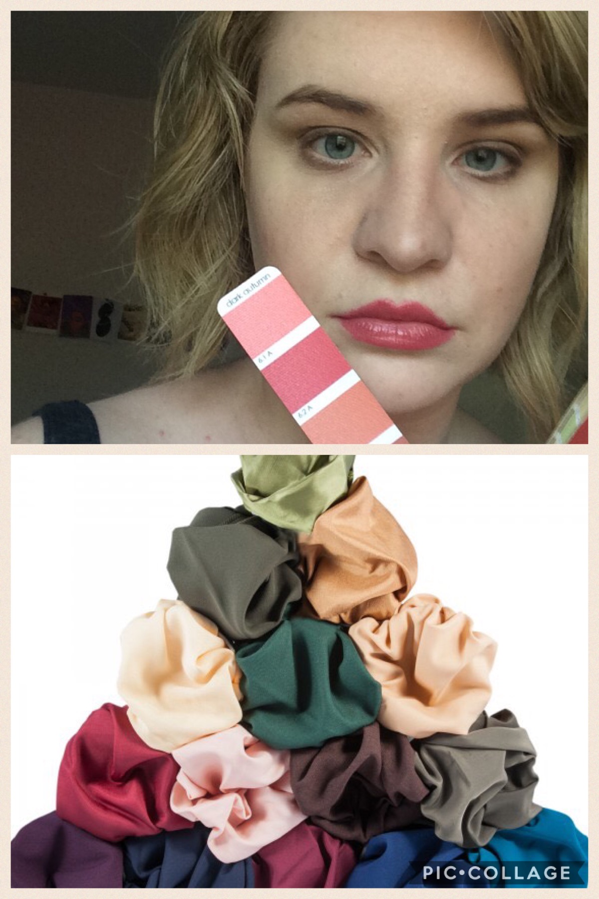
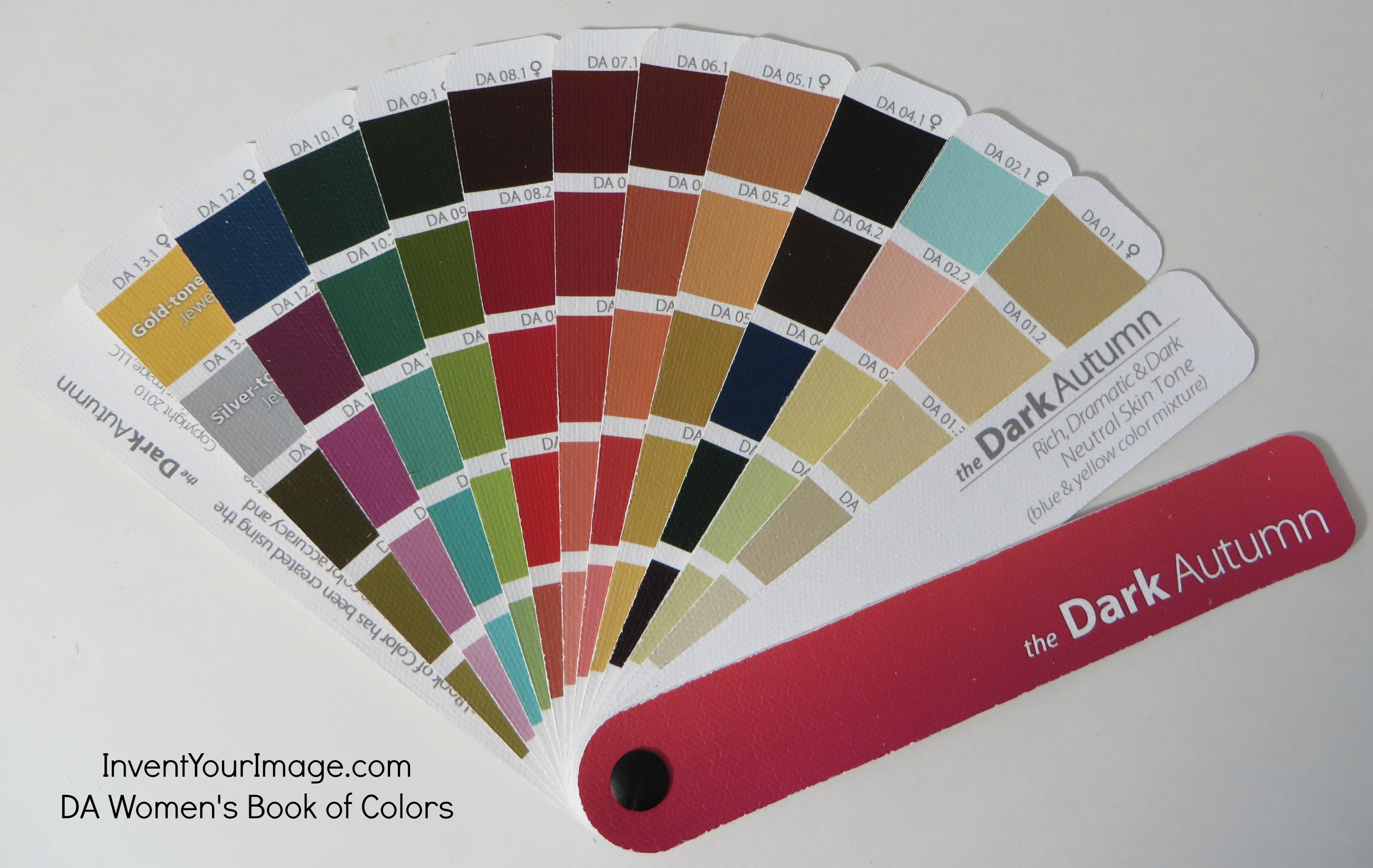
There is now another brand of Sci\ART palettes at a similar price point to the standard True Colour International and Invent Your Image palettes. They are by PrismX11, and have been developed with a Munsell color scientist. Each color on the palettes has been measured using a spectrophotometer. I go into the specifics of this palette in the first part of the review.
Today, I’m going to talk about the differences in the colors on the palette.

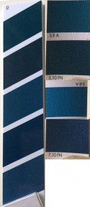
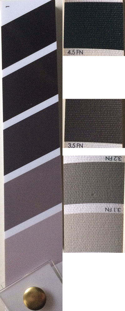
TCI (left) and PrismX11 (right)
The general first impression is that the PrismX11 is significantly darker. Part of this is because the dark colors are at the top of the palette. The Invent Your Image palette similarly seems darker, even though the colors are actually more or less the same as the TCI’s. But the PrismX11 does not have the brightest colors on the TCI palette, the saturated colors along the top.
Direct Comparisons

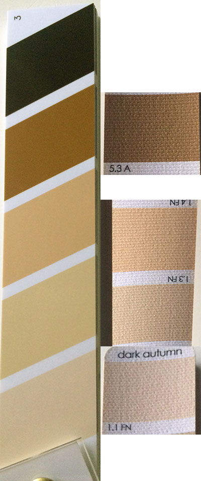
The first strip has grays. The darkest gray and black seem warmer; the lighter shades seem cooler. The TCI lighter grays I would describe more as stones or taupes; the PrismX11’s are true grays.
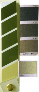
The second strip has some deep, neuutral olive greens and a nice avocado/pistachio color. This strip of olives is less yellow than the TCI versions, and there are no real midtones. The light color is more complex than the one found on the icies strip. It was hard to get the colors to render correctly in Photoshop, but I did the best I could. The photo of the palette as a whole is probably a better representation of what this strip looks like.

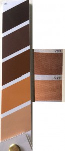
Strip three is pale oranges/creams and some browns. The TCI versions have a pinker cast to them. Even the lighter brown is more yellow on the PrismX11 palette. Note the dark brown, for which there is no TCI equivalent–this palette has a LOT more browns. If you are looking for a palette with more neutrals, this is a good option.

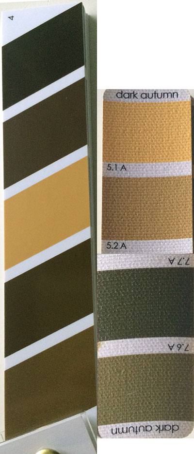
Strip four is more browns and a yellow. This yellow falls between the two shades on the TCI palette. The closest shades on the TCI palette to the bottom two are the olives, but unlike the first olives we saw, these are less green than the TCI olives.
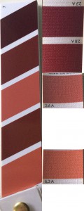
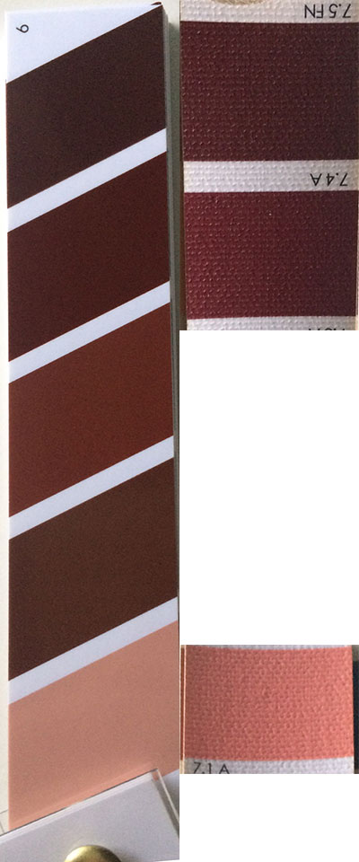
Strip five is more browns and oranges, and the darkest browns are redder than any of the ones of the TCI palette. The shades that are similar have more depth and more yellow in the TCI version. The pale color basically looks like a medium-warm skin tone.

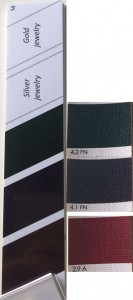
Strip six has blood reds. I think this would be a great strip to have when you go lipstick shopping. Many of our lipsticks are in the category, and the TCI palette doesn’t have great equivalents. The colors I have here are much cooler, kind of plummy. As far as the light shades go, the lighter shade from the TCI palette is a light warm coral/pink, and the TCI color is basically a band-aid color.
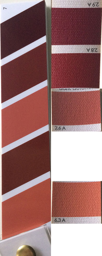
Strip seven is full of great lipstick colors! The biggest difference is probably the color at the bottom. Its closest TCI equivalent is the bright coral shade, and I think the more muted and deeper version in PrismX11 will probably be considered more wearable by most DAs. Otherwise, the colors are a little richer/less clear, apart from the pretty rosy brown that is missing altogether.
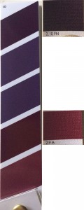
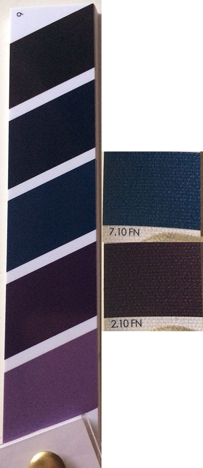
Strip eight has purples, and I think the fact that the TCI palette has only orchid or very dark purples is one of the most confusing things about it. Here we have some true purple and red-violet shades, which I’m sure will be welcome. The bottom two shades would also function nicely as bold wintry lipstick choices. It’s a little less red than its TCI equivalent. And the darkest purple here is slightly lighter and cooler than the TCI version.

Strip nine has even more purples and we start to move into the blues. The light purple here is kind of unexpected for DA, but I’m into it. And again the darker purple is cooler. It’s a very classic darkish purple, no real strong plummy tones. The one blue I did find that works with this strip of blues from the TCI palette fits nicely, but it’s that odd lone blue found on the strip of olives. Here this blue is taken darker as well.
Strip ten’s blues are pretty similar to ones found on the TCI palette, but you can see the brightness level never gets quite as high as it does on TCI.
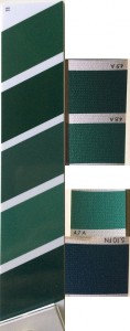
The blue-greens of strip 11 are a similar story. There is just an increased complexity that is hard to describe. The brightest blue-green on TCI is one you could easily mistake for a spring color. The brightest/lightest green on the PrismX11 palette is one I could perhaps imagine on the walls of a stately country home.

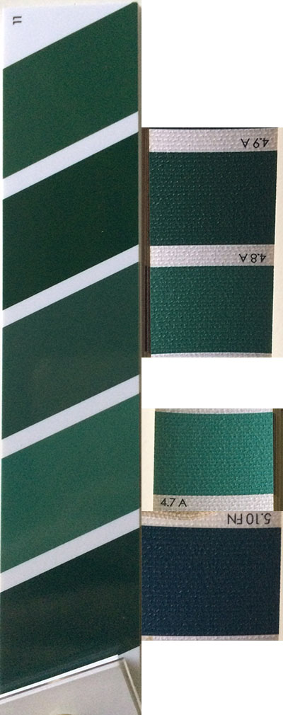
Strip 12 is green with no additional descriptors needed–it’s not jade or teal or pea or olive. It’s just plain old shades of green. Grass, maybe? I like these kinds of colors on myself, so I’m glad to have this added branch of the green family.

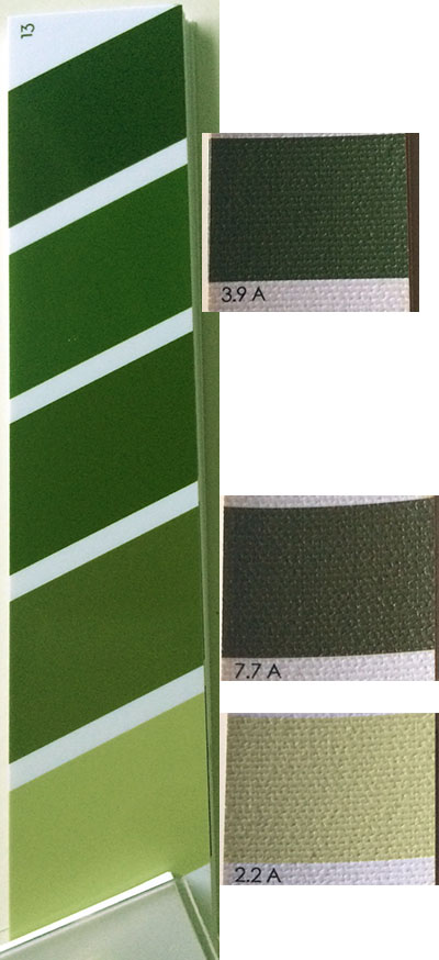
Strip 13 is the pea greens, mainly, but oddly enough, I couldn’t find much in common with the TCI pea greens. They are much more in your face, I guess. These feel more like a yellower version of Strip 12.
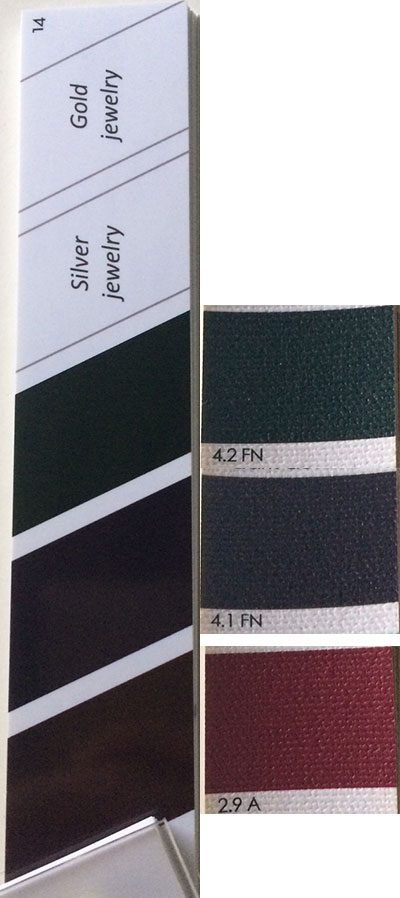
And last is strip 14. There are similar colors on the TCI palette, but the PrismX11 are almost-blacks, and I had to hold them up to the light to see what they really were.
My Thoughts
The PrismX11 Dark Autumn palette has a certain sophistication. It’s darker all over, the colors are complex, and it has a much better range of neutrals. If I were going shopping for makeup, this is definitely the palette I’d take with me, no question. If I were putting together a Level Two wardrobe, I’d also probably take this palette.
As a lighter Dark Autumn, though, I find that the brighter colors that are missing are important to me, especially as a Flamboyant Gamine–I need to use color in fun and bold ways. I would miss that bright marigold yellow! I am really glad to have options for purple and green beyond orchid and pea, though.
So which should you get? I would consider how you like to use color, or really just which appeals to you more. I think darker DAs will likely prefer the PrismX11, because I have heard from some that they struggle with the bright colors, whereas DAs who appear more spring-like might like the TCI one better. I think that if you already have the TCI palette, the PrismX11 is a better buy than the TCI Corporate palette, since for DA, the difference between the two TCI palette versions seem minimal. The PrismX11 will give you a far greater range of neutrals.
Which do you like better? Have you compared the PrismX11 in your season to its TCI equivalent?


