September 2015 archive

Dark Autumn Blonde, Part Eight: Clearing Up Misconceptions

The names of the seasons can sometimes lead people in the wrong direction. The two seasons where I think this comes into play the most is the two “dark” seasons. It was difficult for me to claim Dark Autumn for myself without a lot of support from the online community–I felt kind of crazy, being as as light-to-look-at as I am and claiming this rich, dark season.

This is what people think Dark Autumn looks like:

вф_судуиы
(Source)

But it can absolutely look like this.

I wouldn’t fit into the first image, and who knows if these women are even Dark Autumns at all. Out of the women and men I’ve seen who have gone to analysts and come back as Dark Autumns, you’ll find everyone from natural blondes to the darkest brunettes.

I do think that with the Light seasons, they do tend to look more like you imagine. The light-to-dark range in these palettes isn’t very dark, and you need to have a person who truly cannot handle a wide range of depth–this is especially true with Light Spring.

дыздыг

(Source)

You can see how wide the range is for Dark Autumn and Dark Winter in comparison:

da_dw

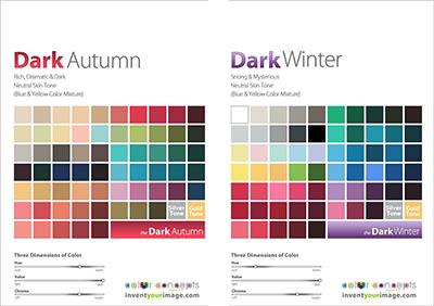
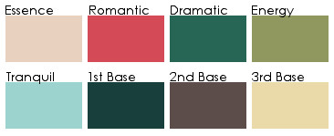
(These palettes are the Invent Your Image palettes.)

I was reminded by this the other day, when Color Harmony posted a blog post breaking down the Dark Autumn palette into groups–groups of color and then light/soft/dark/bright. (Blog post is in Russian, but you can run it through Google Translate.) Many seem to think that the only way the Dark Autumn palette can look in clothes is like this image from Sabira’s blog post, representing the dark colors in DA:

dark_da

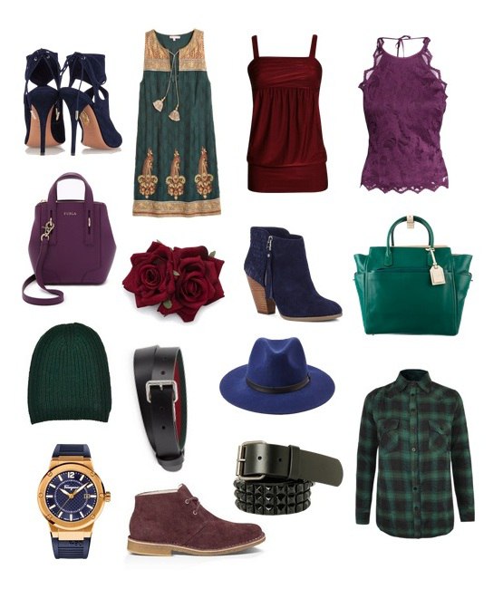
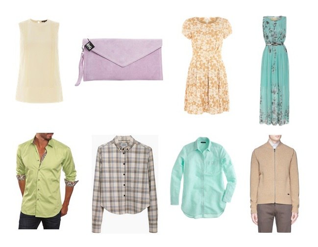
But this set is no less Dark Autumn than the one above:

light_da

What Dark Autumn colors seem to have in common to me, and what I can see in myself, despite my apparent lightness, is that it is like all of the colors just have a touch of Burnt Umber in them. The colors can be bright or even light, but there is always that touch of brown. When I got my prescription sunglasses with dark brown lenses this summer, my first thought was, “Whoa, the entire world is Dark Autumn when I look through these.”

The names of the seasons are just that, names, helpful ways to categorize the seasons. Sure, Dark Autumn and Dark Winter go deeper than other seasons. But that doesn’t mean that’s the only trick they have up their sleeves. (For a look at Dark Winter through new eyes, check out Rachel’s blog post on Dark Winter’s brightness.)

Dark Autumn Blonde, Part Seven: Revisiting My “Zyla” Colors

A while back, I created a DIY Zyla palette for myself using the instructions in his book. Instead of using paint chips, I used my Dark Autumn palette, since I was already using that to guide my wardrobe. I found it easy to find my literal body colors on the palette, and my result looks like this, approximately (since the colors don’t render properly on the screen):

Untitled

While I find that the top row is perfect as it is, the bottom row was giving me some trouble. I would never wear the Third Base. The Tranquil didn’t connect with me one way or the other. The Second Base is the only one I really liked.

I asked for feedback on my possible Archetype in the Zyla group. There was a general consensus that my most likely type was Gamine Autumn, with Mellow as the runner up. With the help of some very educated Zyla eyes, I realized that the ring around my iris connected more with dark gray, rather than the petrol blue I had assumed would work. I thought more about the colors in Dark Autumn I’ve been drawn to since I claimed it as my season.

Zyla palettes are rarely literal. Zyla is not looking for exact matches, per se, but evocative colors, I think. So he’ll give people a purple base, even though they don’t really have purple hair or eyes. With that in mind, I thought about how colors function on me, and came up with this.

zyla_palette_new

Essence: 1.1 FN (unchanged)
Romantic: 2.8 A, 2.7 A, 6.2 A
Dramatic: 4.9 A, 4.8 A, 4.7 A, 4.6 A
Energy: 3.9 A, 2.8 A, 3.7 A
Tranquil: 5.3 A, 5.2 A, 5.1 A
First Base: 3.3 FN, 3.2 FN, 3.1 FN
Second Base: 6.10 FN, 6.9 A, 6.7 A
Third Base: 7.8 A, 7.7 A, 7.6 A

(Numbers correspond to the True Colour International Dark Autumn Classic fan)

These are the DA colors that have resonated with me the most, and the ones that have made their way into my wardrobe already. My favorite casual outfit this year has been a cropped sweatshirt in my lightest/brightest tranquil over a tunic tank top in my darkest 1st base with some lighter 1st base shades thrown in with jeans in the middle Second Base color. Yellow and purple may sound a bit garish, but I don’t think it reads that way on me at all–a good case for deep purple being a neutral for me.

I did have to sacrifice the base color I liked, but it can still act as an alternate. In this new version, with the addition of yellow and purple, I can see myself. It feels more like me. If you are going with a limited palette for wardrobe planning, it has to speak to you. If you’re looking to do the same with your own 12-season palette, I recommend starting with what you already own and love, and see if these colors don’t somehow fit into a framework like Zyla’s.