I love makeup, and there are few things I like more than getting a really great new makeup palette. Since delving into seasonal color analysis, however, I now look at them with a more critical eye.
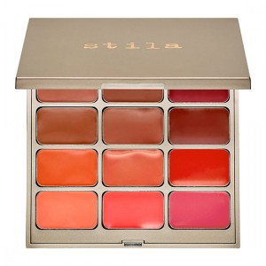
Take one I saw today. It’s the Stila Convertible Color Palette.

(Source)
Looking at it, I just have to ask myself, “Who was this palette made for?” It’s autumn on top and spring on bottom, and I don’t think there’s a woman alive who can wear both halves of the palette equally well. Any woman who is going to buy this will quickly learn that one (or neither, I think, for summers and winters) half will look great, and the other will make her look like yesterday’s leftovers.
It would have made so much more sense to come out with two $25 palettes. If they had done that, that palette would have already started on its way to me from Sephora.com. The only way I’d be able to justify purchasing the palette as is would be to split the cost with my autumn friend and then de-pot it and split it up.
Some want a “full wardrobe” of color that will “work for everyone” from a palette. But that is simply impossible, and really, then you end up with only a few select shades out of many in a palette that will actually work for you, and you’d get a better deal just buying the shades individually. I think palettes are much more successful when they focus around color as their unifying factor, rather than some theme like “flowers,” as in the case of the Stila palette above.
Take the Sephora + Pantone collaboration. I think it’s great because while yes, there are years where the chosen color will only look good on a few people. But if it’s a year when the color selected is in your palette, you have some great makeup options.
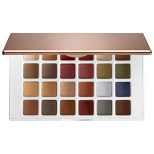
Here’s the Marsala collection eyeshadow palette.
The grays I’m not too sure about, but everything else will look so beautiful on autumn women, as will the rest of the collection.
This is the approach I wish all makeup brands would take. Group colors into groups that go together and maybe sell smaller palettes instead of trying to please everyone with one palette. We’d all get much better value for our money that way.

ithinklikeme
January 7, 2015 at 10:43 pmI couldn’t agree more! I finally have all but forced myself to look away from beautiful palettes on offer, b/c how much of a good deal are you really getting when you can only wear 1/2 the colors?
Then I think about the fact that even if it’s still a good deal with only being able to wear 1/2 of the colors, that’s that much more space I’m giving up in my house for something I know from the start I’ll never, ever wear. Grrrr. I agree, the Pantone+Sephora Collaboration is fantastic for this reason.
stylesyntax
January 8, 2015 at 9:43 pmI really hope next year they choose a spring color! 😉 But I have the feeling we’re moving into an autumn period, like the ’70s.
I did get a palette I really like recently; it’s the Too Faced Semi-Sweet Chocolate Bar. But it specifically says in the description that all the colors are warm.