My views on color analysis have changed drastically over the past few months. I used to believe strongly that Sci\ART and Sci\ART-based systems were the absolute Truth when it comes to color analysis. Stuff based on energy or body colors, or even the 16-season system, rang false to me. I believed that the absolute best results possible could only be found in the accomplished hands of a trained Sci\ART analyst. I believed that anyone who did not go this route was doing themselves a disservice, that they would never unlock their true beauty.
But after spending a lot of time in the online color and style community, I’ve learned that Sci\ART is just one way of looking at it. Some people don’t like the look that the Sci\ART result gives. Some strongly prefer their Zyla or Beauty Valued or 16-color result, and their Sci\ART palette sits and gathers dust. Some get a draping result they don’t like or don’t agree with, and spend hundreds more dollars getting redraped or getting custom palettes in other systems.
As someone who hasn’t been draped, I’ve come to a place where I feel like getting draped isn’t something I need. I was reading a blog post by Light Marigold Spring today. This blogger has been draped in Sci\ART/12 Blueprints twice, has a Beauty Valued fan, had a Zyla consult, and has some other fans. Anyway, she made the point that it comes down to personal preference, and in the end, you just choose which approach and which result you like best. No one way of looking at coloring is more right than the other. No system is “more correct” than all the others.
My approach to my own colors has been haphazard at best, and would probably make a professional color analyst shudder. I’ve simply deduced, from trial and error, that some colors are really, really bad for me. Too light and bright I turn red. White makes me puffy and gives me a fuzzy beard. I need some darkness. These factors have led me to Dark Autumn.
Would I be draped Dark Autumn? Maybe, maybe not. But the very worst thing that happens to my skin in Dark Autumn is that the line between my chin and my neck fades a little, and if that’s the worst thing that happens to you in a season, you’re not doing too badly. I can look at my fan and pick out my body colors. It connects with me energetically–maybe Dressing Your Truth is on to something with colors and energy, rather than draping. I love the colors and feel like myself in them.
Another advantage to using a palette like this is that the colors all work together. So I can create a wardrobe where everything matches, and I don’t have to think about it. That was what kept me in black for the past ten years or so: I found color selection intimidating. Now I just look for the slightly burnt, rich, and slightly warm colors of Dark Autumn, and everything looks good together.
In the interest of minimalism, I got to thinking about capsule wardrobes and color. Zyla is a system where you get a series of colors to use in certain ways in order to achieve different aesthetic goals. I decided to take my Dark Autumn palette and use it to create a Zyla palette. As I mentioned, my body colors are found on the Dark Autumn palette, so pulling the correct colors was pretty easy. Of course, Zyla could potentially give me something totally different if I ever do see him. But I think this is a pretty good approximation. (I didn’t do metals or pastels because I don’t know how to choose them, and I feel like pastels are something I wouldn’t be able to use much anyway.)
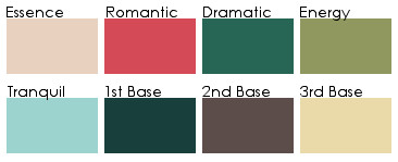
The colors are not true to fan, obviously, but here is the list of what I used from the Classic True Colour International fan:
Essence: 1.1 FN
Romantic: 6.2 A
Dramatic: 4.9 A
Energy: 3.8 A
Tranquil: 2.5 A
1st Base: 5.10 FN
2nd Base: 3.5 FN
3rd Base: 2.3 A
Some of these colors, like my Energy color, are ones that I know are special on me. My Romantic is a great lipstick/blush color on me. I love the 2nd Base. And I managed to get these colors by following Zyla’s instructions, no cheating to get my favorites on there. (Although I think in my Dramatic “extension” I’ll give myself one of the purples!)
To me, my Dark Autumn palette is simply a way to make my life easier. I’m not seeking my absolute true beauty. Simply put, they seem to work and I like them, and that’s good enough for me.