Posts Tagged ‘My Color Journey’

Cheating on Your Palette

I wrote about this today, among other things in a similar vein, for the workbook Facebook group as a sort of “bonus chapter,” but I’ve decided to go ahead and share about this specific topic in more detail here on the blog. This topic is, of course, how to cheat on your palette.

Cheating on your palette isn’t ideal. The ideal is, of course, to have a wardrobe where everything harmonizes together because it’s in the same palette. But we’re limited by what’s in stores and what we can afford. If you add in the fact that we have also each have a specific set of lines to deal with, finding things that are both in your season AND your line type can feel like finding a unicorn.

Sometimes, we have to make compromises. There are situations where I’d never make compromises (i.e., a wedding dress), but for everyday casual wear, I feel okay about it. I would never compromise on my lines–it’s very important to me that clothes fit the Flamboyant Gamine guidelines. Most stuff that isn’t FG is N in some way, and that’s my personal worst. But as long as I avoid my horrible colors, which tend to be light and springy, I can get away with cheating on my color palette.

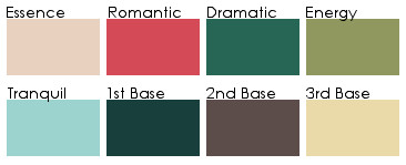
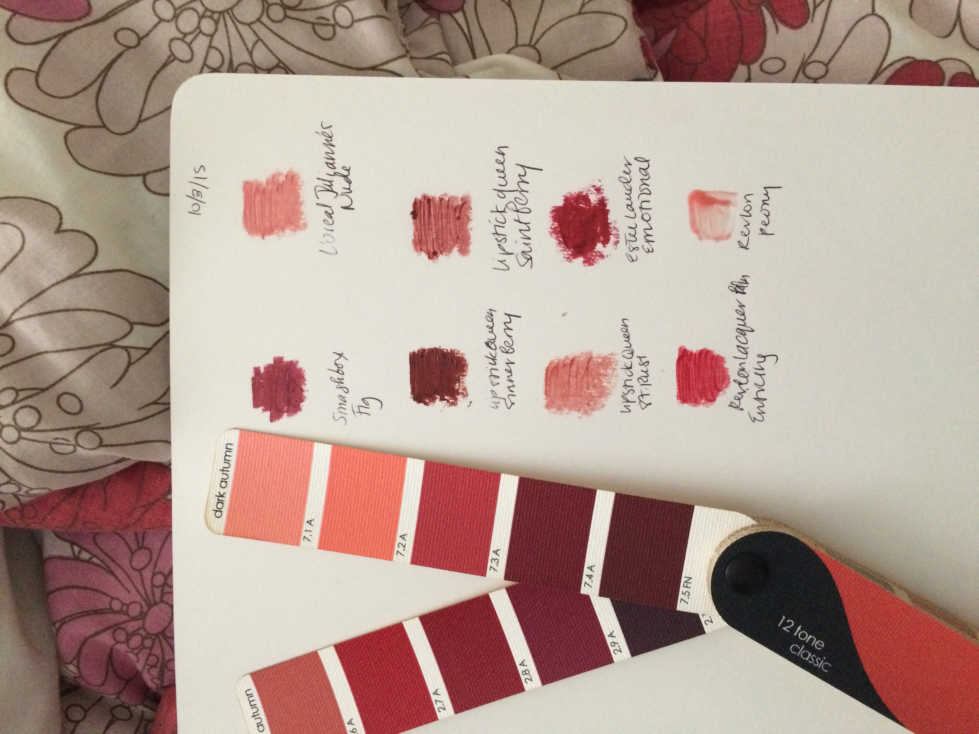
The two sweatshirts I mentioned buying in this post are both really clearer than Dark Autumn. It’s evident when they are paired with my blanket scarf, which perfectly replicates the strips of browns and reds on the DA fan, that they do not harmonize exactly. But DA stuff can be hard to find in FG lines, especially in casual wear.

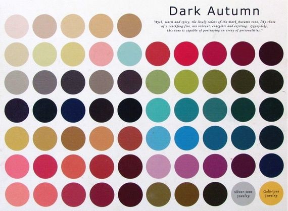
What’s important to me in my casual wear, which is generally just jeans or leggings with some kind of tunic/sweatshirt/tshirt, is that there are FG lines, with the boxy layer on top of the narrow base layer. It is way easier to find this in Dark Winter than it is in Dark Autumn. Dark Winter shares the most important trait with Dark Autumn, which is of course darkness. There are some Dark Winter colors I’d never be able to wear–anything approaching white, basically–but a lot of it, while I see it’s not quite as good, is a pretty good substitute for the real thing.

dw_brights

dw_darks

(Source)

For the most part, these colors will look okay on me, and no one who is not super into this stuff would be able to detect a difference. Again, the real issue is disrupting the harmony of your wardrobe. But for everyday casual pieces that are going to go through a lot of wear and tear and mostly be paired with very neutral basics, I think it’s a decent compromise while I try to build up a lasting, quality wardrobe of Dark Autumn pieces.

For Levels 2 and 3, I don’t think I’d be as willing to compromise. These clothes are generally more expensive, and things I’d want to last for a long time. But for a sweatshirt, Dark Winter warm blue instead of Dark Autumn warm blue isn’t a huge seasonal sacrifice.

Dark Autumn Blonde, Part Seven: Revisiting My “Zyla” Colors

A while back, I created a DIY Zyla palette for myself using the instructions in his book. Instead of using paint chips, I used my Dark Autumn palette, since I was already using that to guide my wardrobe. I found it easy to find my literal body colors on the palette, and my result looks like this, approximately (since the colors don’t render properly on the screen):

Untitled

While I find that the top row is perfect as it is, the bottom row was giving me some trouble. I would never wear the Third Base. The Tranquil didn’t connect with me one way or the other. The Second Base is the only one I really liked.

I asked for feedback on my possible Archetype in the Zyla group. There was a general consensus that my most likely type was Gamine Autumn, with Mellow as the runner up. With the help of some very educated Zyla eyes, I realized that the ring around my iris connected more with dark gray, rather than the petrol blue I had assumed would work. I thought more about the colors in Dark Autumn I’ve been drawn to since I claimed it as my season.

Zyla palettes are rarely literal. Zyla is not looking for exact matches, per se, but evocative colors, I think. So he’ll give people a purple base, even though they don’t really have purple hair or eyes. With that in mind, I thought about how colors function on me, and came up with this.

zyla_palette_new

Essence: 1.1 FN (unchanged)
Romantic: 2.8 A, 2.7 A, 6.2 A
Dramatic: 4.9 A, 4.8 A, 4.7 A, 4.6 A
Energy: 3.9 A, 2.8 A, 3.7 A
Tranquil: 5.3 A, 5.2 A, 5.1 A
First Base: 3.3 FN, 3.2 FN, 3.1 FN
Second Base: 6.10 FN, 6.9 A, 6.7 A
Third Base: 7.8 A, 7.7 A, 7.6 A

(Numbers correspond to the True Colour International Dark Autumn Classic fan)

These are the DA colors that have resonated with me the most, and the ones that have made their way into my wardrobe already. My favorite casual outfit this year has been a cropped sweatshirt in my lightest/brightest tranquil over a tunic tank top in my darkest 1st base with some lighter 1st base shades thrown in with jeans in the middle Second Base color. Yellow and purple may sound a bit garish, but I don’t think it reads that way on me at all–a good case for deep purple being a neutral for me.

I did have to sacrifice the base color I liked, but it can still act as an alternate. In this new version, with the addition of yellow and purple, I can see myself. It feels more like me. If you are going with a limited palette for wardrobe planning, it has to speak to you. If you’re looking to do the same with your own 12-season palette, I recommend starting with what you already own and love, and see if these colors don’t somehow fit into a framework like Zyla’s.

Dark Autumn Blonde, Part Six: Looking at Soft Autumn

In response to a fairly recent post, I got a comment telling me check out seasons called Deep Autumn Soft and Soft Autumn Deep, which I believe are part of the 16-season system, a system used by Lora Alexander at Pretty Your World.

This system, despite having similar-sounding names, is an entirely different animal from the Sci\ART-based systems. For one, draping is not required. Season can be discerned through the harmony of body colors–eye color and hair color are definitely considered. This is the issue I’ve had with people annoying me by insisting that I’m summer that I wrote about in my last post in this series.

So anyway, I knew that I would not be either of these seasons anyway, because I would be far too light to qualify. But it did plant a little seed of doubt about Soft Autumn in my mind. Could I be Soft Autumn? It would seem more logical, sure. Right as I was pondering this, a Russian-language blog on color and style did a post breaking down the different colors in Soft Autumn. (You don’t need to know Russian or even use Google Translate to understand what I’m talking about in regard to this post, since the visuals accompanying the text make it pretty clear). The lights, neutrals, darks, and brights of Soft Autumn have been separated. This gives me a very different impression of what Soft Autumn looks like than what I normally think of it looking like, which is this:

saleaves
(Source)

Compared to other palettes, it has always seemed a bit dull to me. All of the colors seem watered down and a sort of murky green or coral. But it’s true that in order to appreciate a palette, you have to see the colors. You have to see them in a context other than square boxes of color lined up to represent a seasonal palette. You need to see the clothes. And in Color Harmony’s interpretations, the dark and the bright Soft Autumn colors look pretty good to me. They look like things I could wear easily.

But the neutrals and the lights… This is where it falls apart. My winter jacket, for instance, is a Soft Autumn olive green. Does it have awful effects on my skin? No. But does it do anything special for me? No again. Out of curiosity, I decided to how I’d do in a lighter Soft Autumn color. I have a coral towel that seems to be SA’s coral. So I draped myself with it, and immediately noticed redness around my nose. I do have some, but when I put on a Dark Autumn color, it’s not noticeable. In fact, in Dark Autumn, I usually just put on lipstick and don’t bother with anything else. I also saw some reflection around the sides of my face that I didn’t like. While seeing the Soft Autumn colors together like they are in the blog made it seem more logical as an option for me, somehow, real life showed me otherwise.

Sometimes you need doubt to really confirm something for yourself. And while I might see what happens if I swipe a few of SA’s brightest and darkest colors, I have again come to conclusion that DA is where I belong.

Dark Autumn Blonde, Part Four: DIYing a Zyla Palette

My views on color analysis have changed drastically over the past few months. I used to believe strongly that Sci\ART and Sci\ART-based systems were the absolute Truth when it comes to color analysis. Stuff based on energy or body colors, or even the 16-season system, rang false to me. I believed that the absolute best results possible could only be found in the accomplished hands of a trained Sci\ART analyst. I believed that anyone who did not go this route was doing themselves a disservice, that they would never unlock their true beauty.

But after spending a lot of time in the online color and style community, I’ve learned that Sci\ART is just one way of looking at it. Some people don’t like the look that the Sci\ART result gives. Some strongly prefer their Zyla or Beauty Valued or 16-color result, and their Sci\ART palette sits and gathers dust. Some get a draping result they don’t like or don’t agree with, and spend hundreds more dollars getting redraped or getting custom palettes in other systems.

As someone who hasn’t been draped, I’ve come to a place where I feel like getting draped isn’t something I need. I was reading a blog post by Light Marigold Spring today. This blogger has been draped in Sci\ART/12 Blueprints twice, has a Beauty Valued fan, had a Zyla consult, and has some other fans. Anyway, she made the point that it comes down to personal preference, and in the end, you just choose which approach and which result you like best. No one way of looking at coloring is more right than the other. No system is “more correct” than all the others.

My approach to my own colors has been haphazard at best, and would probably make a professional color analyst shudder. I’ve simply deduced, from trial and error, that some colors are really, really bad for me. Too light and bright I turn red. White makes me puffy and gives me a fuzzy beard. I need some darkness. These factors have led me to Dark Autumn.

Would I be draped Dark Autumn? Maybe, maybe not. But the very worst thing that happens to my skin in Dark Autumn is that the line between my chin and my neck fades a little, and if that’s the worst thing that happens to you in a season, you’re not doing too badly. I can look at my fan and pick out my body colors. It connects with me energetically–maybe Dressing Your Truth is on to something with colors and energy, rather than draping. I love the colors and feel like myself in them.

Another advantage to using a palette like this is that the colors all work together. So I can create a wardrobe where everything matches, and I don’t have to think about it. That was what kept me in black for the past ten years or so: I found color selection intimidating. Now I just look for the slightly burnt, rich, and slightly warm colors of Dark Autumn, and everything looks good together.

In the interest of minimalism, I got to thinking about capsule wardrobes and color. Zyla is a system where you get a series of colors to use in certain ways in order to achieve different aesthetic goals. I decided to take my Dark Autumn palette and use it to create a Zyla palette. As I mentioned, my body colors are found on the Dark Autumn palette, so pulling the correct colors was pretty easy. Of course, Zyla could potentially give me something totally different if I ever do see him. But I think this is a pretty good approximation. (I didn’t do metals or pastels because I don’t know how to choose them, and I feel like pastels are something I wouldn’t be able to use much anyway.)

Untitled

The colors are not true to fan, obviously, but here is the list of what I used from the Classic True Colour International fan:
Essence: 1.1 FN
Romantic: 6.2 A
Dramatic: 4.9 A
Energy: 3.8 A
Tranquil: 2.5 A
1st Base: 5.10 FN
2nd Base: 3.5 FN
3rd Base: 2.3 A

Some of these colors, like my Energy color, are ones that I know are special on me. My Romantic is a great lipstick/blush color on me. I love the 2nd Base. And I managed to get these colors by following Zyla’s instructions, no cheating to get my favorites on there. (Although I think in my Dramatic “extension” I’ll give myself one of the purples!)

To me, my Dark Autumn palette is simply a way to make my life easier. I’m not seeking my absolute true beauty. Simply put, they seem to work and I like them, and that’s good enough for me.

Dark Autumn Blonde, Part Three

Yesterday I received the first edition of Grace Morton’s The Arts of Costume and Personal Appearance in the mail. The second edition from 1955 is available online, complete and completely free thanks to Cornell University. The one I have is slightly different; for instance, in the clothing personality chapter, Morton uses “masculine” and “feminine,” and the revised, posthumous 1955 edition uses “yin” and “yang.” Regardless of which edition you read, it’s a book filled with dense information about everything we care about: style, line, movement, color… It’s definitely a book I recommend either downloading from the Cornell site or picking up cheaply on Amazon. A lot of it is antiquated, such as the section on how your personal appearance should make you “marriageable,” and the fact that there is no information on coloring for women of color. The information it does have, however, is incredibly helpful, and echoes of her work can be found in everyone who came after her.

(This book also solidified my view that McJimsey is the one who came up with the “types” as such. There are a few more books from this era I want to obtain, but so far, I haven’t really found anything that predates her that uses Dramatic, Classic, Romantic, etc.)

A lot of the masculine/feminine (yin/yang) stuff basically repeats what we already know from Northrup. I haven’t had a chance to read the whole thing, since, as I said above, the material in this book is pretty dense, but from what I have read, what has interested me the most is the information about color. She groups people by hair color, and then hair color subgroups.

Obviously what interested me most is the section that applies to me, the blondes. She says that the best colors for blondes are blue-greens and violets, of both the red-violet and blue-violet variety. I find this true, for the most part–these are easy colors for me to wear, the ones I can steal from most palettes.

But I also found some kind of recognition for the thing that confuses me the most about my coloring:

11036669_962184793861407_2007178547272524766_n

This is the first thing I’ve found that says that some blondes do better in medium-to-dark value colors. Conventional wisdom gives blondes light pink lipsticks and puts them in light blue dresses. Getting the Light Spring palette was life-changing moment for me; the sheer terribleness of the colors on me turned everything I had always been told about color in relation to myself on its head. I’d never seen myself look so red and unhealthy. It took me a long time to figure out what was missing. It turned out to be darkness.

Darkness, for me, is magical. Even colors on the Dark Autumn palette that fall on the brighter side of things are hard for me to wear. I love Dark Autumn yellow, but if I wear it by itself, I lose some jawline definition. When I put on a lipstick described as “warm, rusty brown,” it loses all brown and looks like a nice, rosy pinkish-red. I used to gravitate toward spring colors in makeup. Now I understand why I’d look at myself in the mirror and wipe off my lipstick before I left the house. I didn’t even wear lipstick on a regular basis before this year because I had no idea what colors worked for me.

I’m a blonde, but I happen to need darkness to come alive–which is something the color world has seemed to kind of forgotten since 1942. Certainly beauty magazines and makeup companies have. It’s always nice to get a little confirmation about what you see in the mirror and in yourself.

Why I Haven’t Gotten Draped Yet

yarn
(Source)

I’ve had this blog for nearly a year, and I’ve been involved for the color and style community for even longer. And yet I still haven’t gotten draped, and I don’t have an appointment scheduled.

My main reason for this is primarily financial. Going to an analyst requires getting an appointment, arranging travel, and then dropping a sum of money that, while it is not a lot in the grand scheme of things, especially considering how much money it saves you in the long run, is still a fair amount of money to spend at one time. The scenario where I have the money and the timing has lined up to make an appointment just hasn’t happened yet.

But the further along I am in my color and the style journey, the more trepidation arises.

The name of the blog comes from the idea that we have our natural parameters of what will look good on us (the “syntax,” as it were). So I feel pretty stupid that I have a hard time dealing with finding out what my color parameters are. But I do.

My own experimentation in the color world has taken me from Light Spring to Dark Autumn. Dark Autumn colors seem to not have any ill effects on my skin, I like the colors, and they suit my style and personality. I don’t have any of the redness that comes with lighter colors, and I don’t have the white fuzzy beard that shows up when I wear white. Overall, I’m satisfied with the Dark Autumn color space and find that it works for me.

But there is always the question that I don’t really know that Dark Autumn is my season, and if you read this post by Cate Linden, you’ll probably come to the conclusion that, chances are, it is not my actual season.

I recognize this. I could easily end up being something entirely different. I know I’d end up looking better, if Dark Autumn is indeed the wrong season for me, but a new season would still take some getting used to. Like many people, I don’t really like Soft colors. I know that they are beautiful and more colorful than they are given credit for. But I still have a mental roadblock. If I were draped and given a Soft season, it would be difficult for me to adjust to (and combine with Flamboyant Gamine!).

I know I need to get over it, though. Except in the case of a misdrape, even though it may take some time to mentally adjust, people who have been draped see a huge improvement in how they look and feel. I know this! I blog about it! But I’m still really scared to get a result that I don’t want.

Perhaps some of this is the prescriptive nature of some people’s attitude toward seasons, that there is no room to cheat. I like this post by Lisa K. Ford, where she tells you how to make your season work for you, and how to cheat effectively if you have to. Which brings me to something I think we sometimes lose sight of: the whole point of this color analysis and style typing business is to make you feel better about yourself and look healthier and more stylish. It is, in short, meant to make you happy. The point is not to get a gold star for following the rules exactly.

And I’m sure I could take a season and find a way to fake what it is I love so much about Dark Autumn, like I suggest people do with their Kibbe type. I would find the level of darkness that reads dark on me and make it work. But still, I know that the process is not the easiest one.

Have you had similar feelings in regard to finding out your own season? How have you dealt with it?

Dark Autumn Blonde, Part Two

IMG_2380

Since I wrote my last post, I have been experimenting with the Dark Autumn color space. I have amassed a collection of Dark Autumn lipsticks, some I already owned, some that were made possible by a killer sale on Lipstick Queen at my salon, and some I just splurged on. I also stumbled upon a sweater in the color I talked about in my last post, the draping card that looked really, really good with my skin.

Unfortunately, the beginning of spring is really the wrong time to begin exploring Dark Autumn. There is next to nothing in the stores, apart from what’s on the sale rack (where that sweater was). Now that I’ve received my fan, I’ll be able to go and seek out tops from the lighter side of the palette without fearing that I’ll mistakenly dip into another season. But of course, what I really want to find are pieces in Dark Autumn’s darks, the beautiful, better-than-black, yes-it’s-a-color-but-it’s-a-fashion-neutral colors.

If you are not familiar with the way True Colour swatch books are laid out, each swatch is labeled with either “A,” for “accent,” or “FN,” for “fashion neutral.” One of the interesting things about the DA swatch book is that so many of the colors are labeled “FN.” Coming from Bright Spring, where I felt like there weren’t very many, those extra darks that count as neutrals are very intriguing to me.

On the other hand, I feel like there is less variety in my makeup possibilities. The swatches in the photo above feel like a complete lipstick wardrobe to me. Any other lipsticks that I both like and fall into DA would feel like a repeat to me. Bright Spring, you have your pinks, your reds, your corals, maybe your oranges… But I may make discoveries yet. I eagerly await Cate Linden’s updated DA makeup post.

(And if you’re a DA and see a major gap, by all means, let me know!)

Also, DA is way brighter than people think it is. Just a little PSA. 🙂

Lastly, I’m not the biggest fan of Color Me Beautiful, but I was reading the men’s book today, and read some things that I had missed when I read the version for women:
1. CMB Autumns are more likely to sunburn than CMB Summers.
2. Ivory skin and ash blonde/dark golden blonde hair are all options for CMB autumns.
3. CMB Autumns can have turquoise eyes with a teal gray ring around the iris–which is exactly what I have.

So that’s interesting. Anyway, if you are a DA and have tips, please share.

Dark Autumn Blonde

Today I did the experiment I mentioned in this post. To review, I purchased Truth Is Beauty home draping cards for six season (Light Summer, Soft Summer, Soft Autumn, True Autumn, Dark Autumn, and True Spring) and took a picture of each season’s fan underneath my chin. But before I posted the pictures, I cropped the colors out, so all you saw was my face. Online color analysis has limitations no matter what, but I felt like this got rid of one of the major problems: people see what they want to see. If they like a color, that’ll influence their opinion. If they feel in their heart of hearts that you’re a Soft Summer, that’ll influence their opinion. This way, all they were looking at was the effect of the color on my skin, not the color itself.

When I posted the photos, the results came in quickly. The worst was Light Summer. The best was… Dark Autumn. And when I posted the individual colors of Dark Autumn (again not showing the color itself), the best color was this one:
newts
(Source)

The attractively named “Newt Green.” Definitely not a color you could imagine a Spring or Summer wearing.

I think this experiment was a successful one. People looked at what I wanted them to look at–skin effects–and not my hair and eye color. I’m not taking this to be the same as being draped Dark Autumn, but it’s enough to make me seriously consider it and want to experiment with it.

An Online Color Analysis Experiment

Recently, Christine Scaman wrote a post dealing with the comments she receives that she must be a summer. She handles this all much more graciously than I would, and even still, you can see people in the comments insisting she is a Light Summer. (!) If Christine can’t get it right in the eyes of the Internet, really, what hope do the rest of us have?

This brings up a major issue with asking people online for help in determining your season when they are not an analyst standing in front of you during your draping who is trained in the system you’re exploring. Analysts trained in Sci/Art or 12 Blueprints look at your skin during a draping. Your hair is covered. No one looks to see whether your eyes have spokes or an Aztec sun.

And yet people are used to the body-color way of doing things. They want to see what they perceive as “harmony” between your hair color and your most flattering clothes. We all do it, whether we’re aware of it or not. We have our own preferences that affect our judgment. Now, I have nothing against this way of doing things. I am open to the idea of a Caygill or Caygill-derived analysis after a 12 Blueprints analysis, because I think it may help me understand where my sweet spot within my 12 Blueprints season lies. I am fully aware of and in agreement with the fact that I’d probably end up a Spring in Caygill. But this does not mean I am a Sci/Art Spring, or that I should look at Light or Bright Spring again. In Light Spring, I’m pink. Bright Spring totally overpowers me. I simply need more depth than Light Spring and can’t balance Bright Spring. Yes, I’m blonde with very pale skin that is slightly warm. That does not mean that these are my only options.

Soon, I will be receiving color cards from Truth Is Beauty in the mail. I ordered True Spring, Light Summer, Soft Summer, and the three Autumns. When I use these cards to drape, I plan to post them without the card showing, with the focus just on my face. This way, I hope, I will get a response that looks just at my skin, not at my apparent lightness in relation to what I am draping with.

Looking at Autumn Again and Adjusting Makeup

Sometimes determining your colors can feel like going around in circles. I’m really no closer to figuring out my colors than I was when I started this blog. After playing some more with the fan, I think Bright Spring results in some graying. Bright lipsticks jump off my lips like translucent candy in photographs. I think that I need some clarity and brightness, but not as much as a Bright Spring, at least.

For fun, I took the Truth Is Beauty Seasonal Analysis Quiz today, and my results were surprising. Using the knowledge I’ve gained over the past couples of weeks, I end up with three possible results, depending on the things I’m not sure of:

1. If I consider black to be overwhelming (I think sometimes it overwhelms me in photographs because the white balance gets thrown off on my phone camera, but in real life I think it’s not the worst, but it makes my eyes gray): True Autumn.
2. If I think black is good, and that pumpkin is also a good color on me (I have just never tried this color): Dark Autumn.
3. If I do not think pumpkin is good, but black is: Dark Winter.

I actually wrote about looking Spring but potentially being Autumn, True Autumn in particular, way back in July. While I feel I’m in the same spot now (see what I mean about circling?), I do think I have some more knowledge at my disposal. I know some important things about myself. These things include being high contrast as far as natural blondes go and looking awesome in bronzer. Christine Scaman talks a lot about how key bronzing is to the autumn face in this blog post. I know for a fact that my most important step, even more so than foundation (okay, well, covering undereye circles too, but that’s part of my highlighting routine anyway) is highlighting and contouring/bronzing. It really defies all logic. I have the kind of skin that’s so pale I can’t even buy foundation at MAC. You know, the kind of person for whom beauty experts say bronzer will look just look like dirt on their skin. But me? Nope, I wear bronzer, and not even the peachy kind, and all I hear is how nice and healthy and glowing my skin looks.

One of the things that has turned me away from Autumns in the past is the brownish lipstick and blush looking like dirt on me. But a couple of months ago, Cate Linden, herself a very pale Dark Autumn, posted about her own DA makeup struggles. It has made me realize that makeup recommendations are definitely not one size fits all. As a non-typical DA (pink overtones, very pale skin), she has had some trouble figuring out the makeup angle. While we would have separate issues–I would say my overtone isn’t particularly pink, but it is very porcelain and clear as hers is–it seems that whatever season I do end up in, unless it’s one where I would basically fit the stereotype, which would be Light Summer, I am going to most likely have to deviate from the standard makeup to fit my own extreme coloring.

9ae6a9ddd9ac6a5c6fbbb8e35ca8e811
Source

While we most often associate Dark Autumn with dark makeup looks with very dark, reddish-brown lip colors, there are other colors on the palette that seem like they would work as lipsticks that are not as dark, and clearer and not as brown. On a Dark Autumn who is as dark as the stereotype, these colors might be too light to work as lip colors. On someone whose starting point is much lighter, however, it may create the right contrast level with the rest of the face.

I am not saying I am Dark Autumn, of course. This is just how I would approach makeup if I did turn out to be one. (Look at how gorgeous the DA colors are! I would LOVE to be one.) Just like you address contrast level in your Kibbe according to your season (e.g., an SSu FG doing high contrast in the context of the low-contrast SSu palette), perhaps we also have to expect makeup to look normal on our face according to the coloring we have on our face already, while staying in harmony with our season’s palette overall.

1 2